A <Panel> rendered clean on the blog and came out as a bare, unstyled <div>
on the portfolio. Same Markdown file, same post, two different renders,
because one site was a version behind on the shared renderer package. That’s
the actual bug that made this page necessary: one post that exercises every
component in the registry, tag spelling and directive spelling both, so a
drift like that shows up here, in public, before a reader ever sees it.
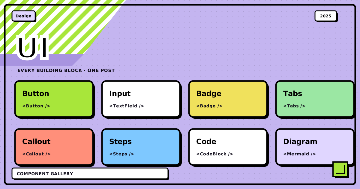
That list above is the registry in one screen: layout, structure, data, marginalia, media, tabs, and two spellings for every one of them. Everything under a heading below has its own live demo.
why components at all#
Plain Markdown gets you prose, lists, tables, code. Fine for a tutorial. Not enough for a plan, a comparison, or a postmortem, the kind of document that wants structure the reader can see instead of infer from paragraph breaks.
So the renderer adds a closed set of components on top of that. Not MDX. Nothing gets imported, nothing gets evaluated, on purpose. A tag either resolves against the registry or it just sits there as ordinary HTML. That constraint is the whole point: it’s what lets a post travel over the API as a plain string and still render the same way on three different sites.
Everything here can be written as a tag (<Steps>) or as a directive
(:::steps). They parse to the same tokens. Tags nest more legibly; directives
survive being read on GitHub, where an unknown tag would simply vanish.
layout#
columns#
The wide column takes the argument, and the narrow one takes the aside. That break point is about 34rem of container width, not viewport, since posts render inside resizable windows. Below it the columns stack and a rule appears between them.
Anything works in here: lists, code, even another component.
Equal columns: <Cols cols={2|3|4}>. Unequal tracks: ratio values such as
1:1, 2:1, 1:2, 1:1:1, 2:1:1, 1:1:1:1. Unknown ratios fall back to
equal columns and fail the publish check.
Three equal columns, the layout behind the feature cards:
panels#
Icons work standalone too, not just inside a panel title:
Tape works solo too, with nothing under it, pure decoration:
ink band#
House rules
An inverted section, for a break in the page. Everything inside follows the
inverted colour rather than the page’s, including links and code.
strips#
- Each list item becomes its own card
- With a small alternating nudge, where tilt is enabled
- Good for a set of short, unordered points
document structure#
steps#
-
Install
Run
bun installand copy.env.exampleto.env. -
Configure
Set
GITHUB_TOKENandEDITOR_SESSION_SECRET. The secret must be at least 32 characters.openssl rand -base64 32 -
Publish
Numbering comes from a CSS counter, so inserting a step here would not mean renumbering the ones below by hand.
phases#
Registry, tag syntax, validation.
The components in this post.
Blog theme, API manifest, portfolio, editor palette.
checklist#
Before publish
- Directives validate
- Images attached
- Cover image set
collapsible detail#
Why not just use MDX?
MDX compiles to JavaScript with arbitrary imports. The API serves Markdown text, the portfolio fetches it at build time, and the editor’s reading pane renders a string. None of those can evaluate a module. A closed registry keeps the authoring ergonomics and drops the runtime.
data#
headline numbers#
scored rubric#
One canonical package, mirrored by a script with a --check mode that fails on
drift.
Contained by keeping the Python side regex-level and advisory, with a shared fixture and a version constant asserted in both suites.
The renderer field lets a consumer notice and warn rather than print a raw
tag into the page.
bars#
- Parser
- Styles
- Checks
marginalia#
Inline components sit inside a sentence: a highlighted phrase, a NEW stamp, or a note in the margin where the handwriting face is enabled.
Standing alone, the same component becomes a block instead, since a span
cannot hold paragraphs. The element follows the position.
media#
diagrams that markdown would mangle#
  editor ──▶ POST /api/publish ──▶ GitHub (src/blogs/*.md)
                                        │
                    ┌───────────────────┴───────────────────┐
                    ▼                                       ▼
            blog.tashif.codes                        tashif.codes
            (renders locally)                      (fetches at build)
The body of an Ascii block is captured verbatim. The alignment, the pipes,
the underscores, all of it survives untouched, because none of it passes
through the Markdown parser the way a normal paragraph would.
figures#
flowchart LR
  A[Markdown] --> B[Registry]
  B --> C[HTML]
  C --> D[Blog]
  C --> E[Portfolio]
  C --> F[Editor]
embeds#
Only an allowlisted provider with a pattern-checked id ever turns into a frame. Anything else stays a plain link. This content crosses an API boundary and renders on two other sites I don’t control frame by frame, so an arbitrary embed URL isn’t a risk worth taking.
tabs#
bun
bun add @tashif/markdown
npm
npm install @tashif/markdown
pnpm
pnpm add @tashif/markdown
Kill the JavaScript and every panel just stays visible, stacked under its own heading. It reads like a document that happens to have subheadings, not like a widget that failed to load. That distinction is deliberate: a tab strip that goes blank without JS is a worse failure than no tabs at all.
the directive spelling#
Everything demonstrated above also works written with colons instead of angle brackets. That’s the syntax already-published posts use, and it’s the one that stays readable if someone opens the raw file on GitHub instead of the rendered site:
:::tip and <Tip> produce byte-identical HTML. The two-col name is kept as
an alias for Cols so nothing published before this change had to be edited.
Directive
:::steps
:::step First
do it
:::
:::
Tag
<Steps>
<Step title="First">
do it
</Step>
</Steps>
callouts#
The six callouts predate the registry and are unchanged.
A callout takes a title as a bare value or as {title="..."}.
All six exist: note, tip, important, warning, caution and danger.
Each maps to its own colour token, so a site can tune the palette without the renderer knowing about it.
The tag spelling and the directive spelling produce identical markup.
The GitHub alert spelling still rewrites into the same markup, so a post reads correctly on GitHub as well as on both sites.
Bottom line: this page is the documentation and the regression test in one file. Every component the renderer understands shows up here, in both spellings, across three sites that only ever receive this post as a plain Markdown string over an API. If one of them breaks, it breaks here first, in the open, not quietly on a reader’s screen somewhere I’m not looking.
That’s the whole gallery. Next time a <Panel> misbehaves on one of the
sites, this is the first page I open.
Discussion
0Leave a comment