Schedule Display & Editing
This document covers the visual presentation of generated timetables and the inline editing capabilities that allow users to modify events, add custom entries, and manage their schedule display. The system uses a card-based layout with color-coded events and provides modal dialogs for editing.
For information about how schedules are generated from user input, see 4.2. For export and sharing capabilities, see 9.
Overview
The Schedule Display & Editing system consists of three primary components:
ScheduleDisplay: Renders the timetable in a responsive grid layout with color-coded cardsEditEventDialog: Modal interface for creating, modifying, and deleting schedule eventsActionButtons: Provides export controls and Google Calendar integration
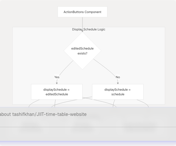
The system maintains two schedule states: the original generated schedule and an optional editedSchedule that contains user modifications. All display and export operations prioritize the edited version when available.
Component Architecture
Sources: website/components/schedule-display.tsx1-151 website/components/edit-event-dialog.tsx1-238 website/components/action-buttons.tsx1-152
Display Component Structure
ScheduleDisplay Component
The ScheduleDisplay component is the primary rendering engine for timetables. It receives a schedule prop but prioritizes editedSchedule from context.
Key Features:
- Responsive grid: 1 column (mobile), 2 columns (tablet), 3 columns (desktop)
- Color-coded event cards based on type
- Hover-activated edit buttons
- Click-to-edit functionality
- Plus button for adding new events to each day
Component Flow:
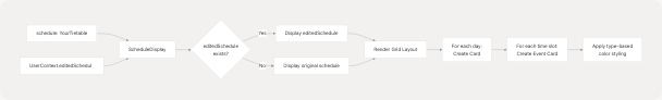
Sources: website/components/schedule-display.tsx12-49
Grid Layout Implementation
The display uses a responsive grid system that adapts to screen size:
| Screen Size | Columns | Class |
|---|---|---|
| Mobile (< 768px) | 1 | grid-cols-1 |
| Tablet (768px - 1024px) | 2 | md:grid-cols-2 |
| Desktop (> 1024px) | 3 | lg:grid-cols-3 |
Each day renders as a motion.div with backdrop blur and glassmorphic styling:
- Background:
bg-[#131010]/50 - Border:
border-[#F0BB78]/20 - Blur effect:
backdrop-blur-lg
Sources: website/components/schedule-display.tsx48-60
Color Coding System
Events are color-coded based on their type field using predefined color palettes. The system uses Tailwind CSS utility classes with custom color values.
Type-Color Mapping
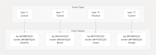
Type Colors Object
The typeColors object maps each class type to its corresponding Tailwind classes:
const typeColors: Record<ClassType | "C", string> = {
  L: "bg-[#F0BB78]/10 border-[#F0BB78]/20 hover:bg-[#F0BB78]/20",
  T: "bg-[#543A14]/10 border-[#543A14]/20 hover:bg-[#543A14]/20",
  P: "bg-[#FFF0DC]/10 border-[#FFF0DC]/20 hover:bg-[#FFF0DC]/20",
  C: "bg-[#FF9B50]/10 border-[#FF9B50]/20 hover:bg-[#FF9B50]/20",
};
The typeLabels object provides human-readable labels:
| Type Code | Label |
|---|---|
| L | Lecture |
| T | Tutorial |
| P | Practical |
| C | Custom |
Sources: website/components/schedule-display.tsx26-38
Event Card Layout
Each time slot renders as a clickable card with the following information hierarchy:
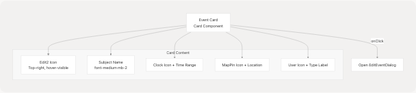
Card Structure
-
Edit Button (absolute positioned, top-right)
- Opacity 0 by default, transitions to opacity 100 on group hover
- Uses
Edit2icon from Lucide React - Stops propagation when clicked
-
Subject Name (h4 heading)
font-medium mb-2
-
Metadata Section (space-y-2, text-sm, opacity-80)
- Time:
Clockicon + formatted time range - Location:
MapPinicon + location string - Type:
Usericon + type label
- Time:
Sources: website/components/schedule-display.tsx86-131
Time Formatting
The formatTime function adds spacing around the hyphen for improved readability:
const formatTime = (time: string) => {
  return time.replace("-", " - "); // "09:00-10:00" → "09:00 - 10:00"
};
Sources: website/components/schedule-display.tsx42-44
Edit Event Dialog
The EditEventDialog component provides a modal interface for modifying or creating schedule events. It handles both editing existing events and adding new custom events.
Dialog Data Flow
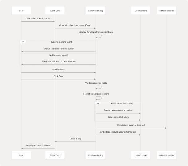
Sources: website/components/edit-event-dialog.tsx36-147
Form Fields
The dialog includes the following editable fields:
| Field | Input Type | Values | Validation |
|---|---|---|---|
startTime |
time | HH:mm format | Required |
endTime |
time | HH:mm format | Required |
type |
Select | L, T, P, C | Required |
subject_name |
Input | Free text | Required |
location |
Input | Free text | Required |
Form State Management:
const [formData, setFormData] = useState({
  subject_name: currentEvent?.subject_name || "",
  type: currentEvent?.type || "C",
  location: currentEvent?.location || "",
  startTime: time ? time.split("-")[0] || "" : "",
  endTime: time ? time.split("-")[1] || "" : "",
});
Sources: website/components/edit-event-dialog.tsx45-51
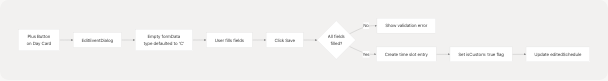
Save Logic
The save operation performs the following steps:
- Validate Required Fields: All fields must be non-empty
- Format Time Slots: Ensures HH:mm format with zero-padding
- Initialize editedSchedule: Creates deep copy if null
- Remove Old Slot: If time changed, delete old time slot
- Add New Slot: Insert event at new time with
isCustom: trueflag - Update Context: Call
setEditedSchedule(updatedSchedule)
Time Slot Formatting:
const formatTime = (time: string) => {
  const [hours, minutes] = time.split(":");
  return `${hours.padStart(2, "0")}:${minutes || "00"}`;
};

const newTimeSlot = `${formatTime(formData.startTime)}-${formatTime(formData.endTime)}`;
Sources: website/components/edit-event-dialog.tsx66-128
Delete Functionality
The delete button appears only when editing an existing event (when currentEvent is defined). It removes the event from editedSchedule:
- Create shallow copy of
editedSchedule - Create shallow copy of the day's schedule
- Delete the time slot from the day
- If day is now empty, remove the day entirely
- Update context with modified schedule
Sources: website/components/edit-event-dialog.tsx130-146
State Management
The editing system relies on React Context to maintain schedule state across components.
Context Structure
State Lifecycle
- Initial State:
editedSchedule = null, display shows originalschedule - First Edit:
EditEventDialogcreates deep copy:JSON.parse(JSON.stringify(schedule)) - Subsequent Edits: Modify the existing
editedScheduleobject - Reset: When user generates new schedule,
ScheduleFormcallssetEditedSchedule(null)
Sources: website/components/edit-event-dialog.tsx44-76 website/components/schedule-form.tsx391
Adding Custom Events
Users can add custom events by clicking the Plus button on any day card. This opens the EditEventDialog with an empty form.
Add Event Flow
Custom Event Flag
Custom events are marked with isCustom: true when added to the schedule. This flag is used by export functions to determine recurrence behavior (custom events are not recurring in Google Calendar).
Sources: website/components/schedule-display.tsx66-75 website/components/edit-event-dialog.tsx116-124
Action Buttons Integration
The ActionButtons component displays export controls below the schedule. It always uses the edited schedule when available for export operations.
Component Structure
Export Operations
All export functions receive displaySchedule which prioritizes edited content:
- PNG/PDF Export: Navigates to
/timeline?download=1and renders the edited schedule - Google Calendar Sync: Sends edited schedule to
createGoogleCalendarEvents() - Share URL: Copies current URL with encoded parameters
Important Note: The component displays a warning that custom events will not be recurring in Google Calendar, as these lack the institutional schedule metadata required for recurrence rules.
Sources: website/components/action-buttons.tsx14-151
Edit Interaction Patterns
The system provides multiple entry points for editing:
Interaction Entry Points
| Trigger | Location | Action | Dialog State |
|---|---|---|---|
| Click event card | Any time slot | Opens edit dialog | Filled with event data |
| Click Edit icon | Hover on event card | Opens edit dialog | Filled with event data |
| Click Plus button | Day card header | Opens edit dialog | Empty, default type = "C" |
Editing UX Flow
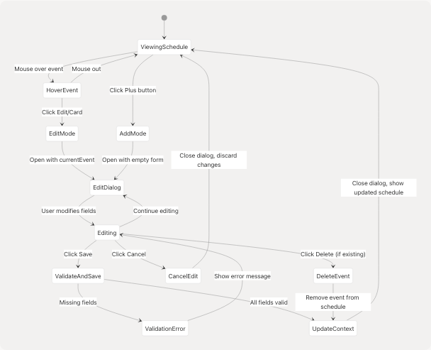
Sources: website/components/schedule-display.tsx66-146 website/components/edit-event-dialog.tsx66-146
Visual Styling Details
The display uses a consistent glassmorphic design system with backdrop blur effects and transparent backgrounds.
Color Palette
| Element | Background | Border | Text |
|---|---|---|---|
| Day card | #131010/50 |
#F0BB78/20 |
slate-100 |
| Event card (L) | #F0BB78/10 |
#F0BB78/20 |
Inherited |
| Event card (T) | #543A14/10 |
#543A14/20 |
Inherited |
| Event card (P) | #FFF0DC/10 |
#FFF0DC/20 |
Inherited |
| Event card (C) | #FF9B50/10 |
#FF9B50/20 |
Inherited |
| Action button panel | #FFF0DC/10 |
#F0BB78/20 |
#F0BB78 |
Motion Effects
All cards use Framer Motion for entrance animations:
- Initial:
opacity: 0, y: 20 - Animate:
opacity: 1, y: 0 - Transition: Index-based stagger effect
Sources: website/components/schedule-display.tsx55-60 website/components/background.tsx1-26
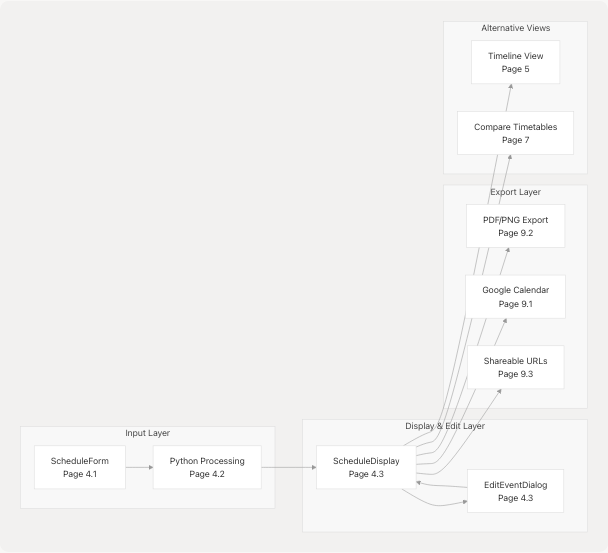
Integration with Other Systems
The Schedule Display & Editing system integrates with several other application components:
Related Systems
Sources: website/components/schedule-display.tsx1-151 website/components/action-buttons.tsx1-152
Code Entity Reference
Key Components
| Component | File | Primary Responsibility |
|---|---|---|
ScheduleDisplay |
components/schedule-display.tsx |
Render timetable grid with color-coded events |
EditEventDialog |
components/edit-event-dialog.tsx |
Modal for editing/adding/deleting events |
ActionButtons |
components/action-buttons.tsx |
Export controls and sharing options |
GoogleCalendarButton |
components/google-calendar-button.tsx |
Google Calendar OAuth and sync |
Key Types
| Type | Definition | Usage |
|---|---|---|
YourTietable |
{ [day: string]: { [time: string]: {...} } } |
Schedule data structure |
ClassType |
`"L" | "T" |
EditEventDialogProps |
Interface for dialog props | Dialog configuration |
Context API
| Context Property | Type | Purpose |
|---|---|---|
schedule |
`YourTietable | null` |
editedSchedule |
`YourTietable | null` |
setEditedSchedule |
Function |
Update edited schedule state |
Sources: website/components/schedule-display.tsx12-14 website/components/edit-event-dialog.tsx15-34 website/types/schedule.ts