Timeline View
Purpose and Scope
The Timeline View provides a calendar-style weekly schedule visualization that displays classes in a time-grid format. This page documents the TimelinePage component, its rendering logic, time-based auto-scrolling, event interaction modal, and download mode support.
For information about the grid-based schedule display with day cards, see Schedule Display & Editing. For exporting schedules as images and PDFs, see PDF & PNG Export.
Sources: src/components/timeline.tsx1-774
Overview
The Timeline View renders a weekly schedule as a vertical timeline grid with columns for each weekday (Monday-Saturday) and rows representing hourly time slots from 8:00 AM to 6:00 PM. Classes appear as positioned blocks within the grid, with visual styling that reflects their type (Lecture, Practical, Tutorial, Custom).
Key Features
| Feature | Description | Lines |
|---|---|---|
| Time Grid Layout | 6 day columns with 11-hour rows (8 AM - 6 PM) | src/components/timeline.tsx444-616 |
| Current Time Indicator | Animated red line showing current time position | src/components/timeline.tsx500-520 |
| Auto-Scroll | Automatically scrolls to current day and time on mount | src/components/timeline.tsx40-90 |
| Event Modal | Click-to-view detailed event information | src/components/timeline.tsx637-771 |
| Download Mode | Special rendering for PNG/PDF export | src/components/timeline.tsx21-25 src/components/timeline.tsx297-299 |
| Statistics Dashboard | Display total classes and breakdown by type | src/components/timeline.tsx266-285 |
Sources: src/components/timeline.tsx13-635
Component Architecture
The Timeline View consists of two main components: the primary TimelinePage component and the EventDetailModal child component.
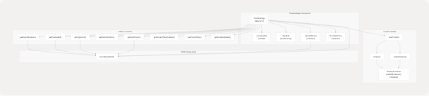
Sources: src/components/timeline.tsx13-635
Data Flow and State Management
The Timeline View consumes schedule data from UserContext and renders it in a time-grid format.
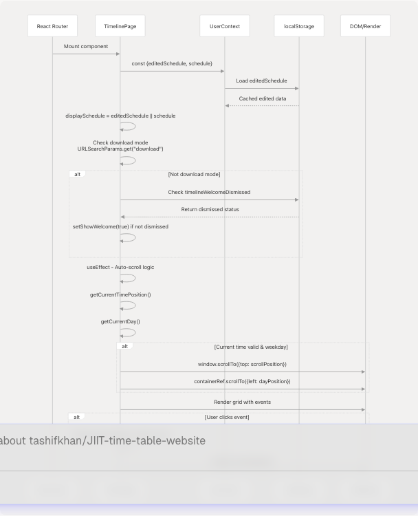
Sources: src/components/timeline.tsx13-25 src/components/timeline.tsx40-90 src/context/userContextProvider.tsx1-52
Layout Structure
The Timeline View uses a CSS Grid layout with a fixed time column and six dynamic day columns.
Grid Configuration
Desktop Layout:
- Grid template:
[110px_repeat(6,1fr)] - Time slot height:
12rem(192px) - Min-width:
1500px
Mobile Layout:
- Grid template:
[70px_repeat(6,1fr)] - Time slot height:
9rem(144px) - Horizontal scrolling enabled
Download Mode:
- Grid template:
[150px_repeat(6,1fr)] - Fixed width:
2550px - Optimized for PDF export
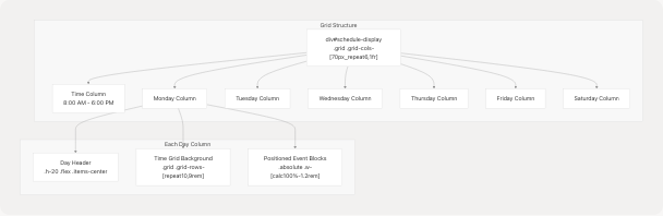
Sources: src/components/timeline.tsx444-616
Event Positioning
Events are positioned absolutely within their day column using calculated top and height styles based on their time slots.
| Function | Purpose | Formula |
|---|---|---|
getEventPosition() |
Calculate top position | (startHour - 8) * slotHeight |
getEventDuration() |
Calculate height | (endHour - startHour) * slotHeight |
Example:
- Event:
09:00-11:00 - Position:
(9 - 8) * 12rem = 12remfrom top - Height:
(11 - 9) * 12rem = 24rem
Sources: src/components/timeline.tsx224-235 src/components/timeline.tsx529-543
Time-Based Features
Current Time Indicator
The Timeline View displays a live red line indicating the current time, visible only on the current weekday during regular hours (8 AM - 6 PM).
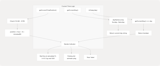
The indicator position is calculated dynamically:
top position = ((currentHour - 8) + currentMinute / 60 - floorHour) * 100%
This results in the red line appearing at the precise fractional hour position within the current time slot row.
Sources: src/components/timeline.tsx237-260 src/components/timeline.tsx500-520
Auto-Scroll on Mount
When a visitor (non-download mode) first loads the Timeline View, the page automatically scrolls to center the current time and day.
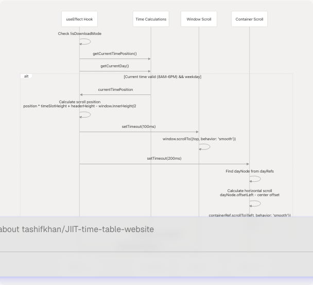
Two-stage scroll timing:
- Vertical scroll (100ms delay): Brings current time to vertical center
- Horizontal scroll (200ms delay): Centers current day horizontally
Sources: src/components/timeline.tsx40-90
Event Styling and Type Colors
Each event block is styled with gradients, borders, and accent colors based on its type.
Color Mapping
The getEventColor() function returns styling objects for each event type:
| Type | Label | Background Gradient | Border | Accent Color |
|---|---|---|---|---|
L |
Lecture | Blue gradient (opacity 0.15-0.25) | Blue border (opacity 0.3) | #3B82F6 |
P |
Practical | Green gradient (opacity 0.15-0.25) | Green border (opacity 0.3) | #10B981 |
T |
Tutorial | Amber gradient (opacity 0.15-0.25) | Amber border (opacity 0.3) | #F59E0B |
C |
Custom | Purple gradient (opacity 0.15-0.25) | Purple border (opacity 0.3) | #8B5CF6 |
Event Block Structure
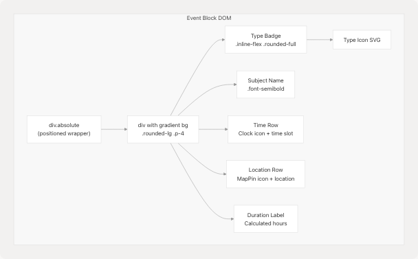
Event styling formula:
background: linear-gradient(135deg, rgba(..., 0.15), rgba(..., 0.25))
backdropFilter: blur(10px)
border: 1px solid rgba(..., 0.3)
borderRadius: 18px
boxShadow: 0 6px 18px rgba(0, 0, 0, 0.1), inset 0 1px 0 rgba(255, 255, 255, 0.1)
Sources: src/components/timeline.tsx101-138 src/components/timeline.tsx204-222 src/components/timeline.tsx529-611
Event Detail Modal
Clicking any event opens the EventDetailModal, a dismissible overlay showing complete event information.
Modal Structure
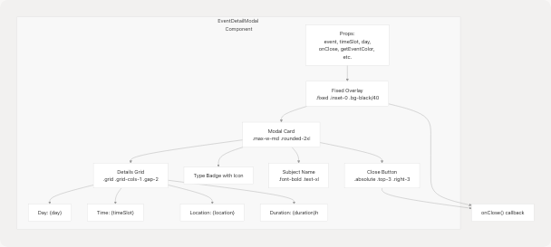
Dismiss Mechanisms
The modal can be closed three ways:
- Click overlay (outside card): src/components/timeline.tsx669
- Click X button: src/components/timeline.tsx682-700
- Press ESC key: src/components/timeline.tsx658-664
The ESC key listener is registered via useEffect:
useEffect(() => {
  function handleKey(e: KeyboardEvent) {
    if (e.key === "Escape") onClose();
  }
  document.addEventListener("keydown", handleKey);
  return () => document.removeEventListener("keydown", handleKey);
}, [onClose]);
Sources: src/components/timeline.tsx637-771
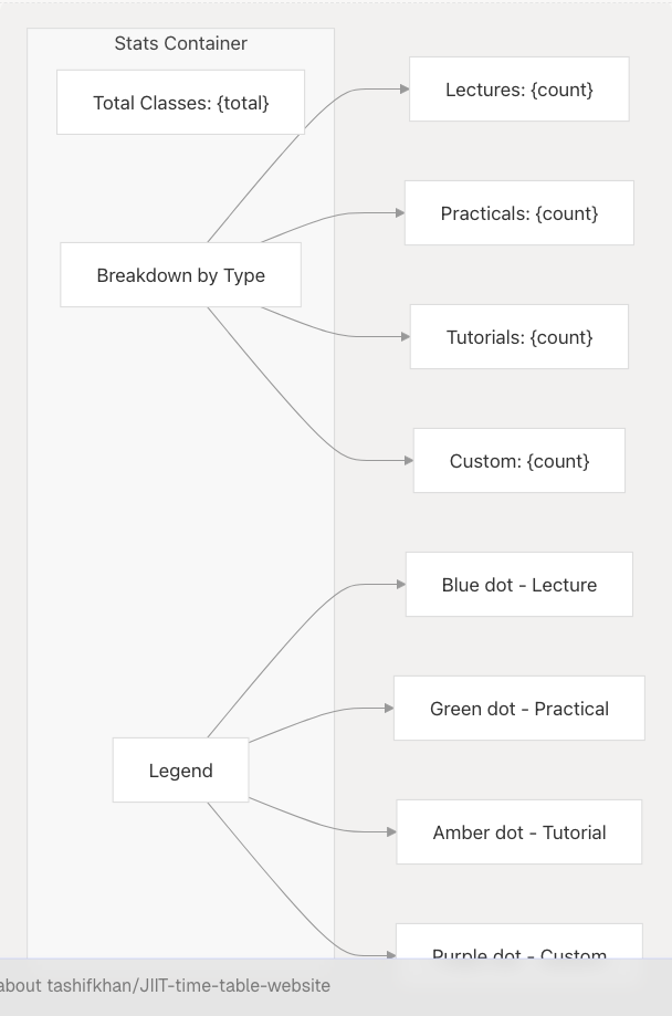
Statistics Dashboard
The Timeline View displays aggregate statistics above the schedule grid, showing total classes and breakdown by type.
Statistics Calculation
The getScheduleStats() function iterates through the schedule to compute:
{
  total: number,              // Total number of classes
  byType: {[key: string]: number},  // Count per type (L, P, T, C)
  todayCount: number          // Classes scheduled for current day
}
Algorithm:
- Iterate through each day in
displaySchedule - Iterate through each time slot in the day
- Increment
totalcounter - Increment
byType[event.type]counter - If day matches current day, increment
todayCount
Display Layout
Sources: src/components/timeline.tsx266-285 src/components/timeline.tsx360-402
Download Mode
The Timeline View supports a special "download mode" optimized for PDF/PNG export, activated via URL query parameter ?download=1.
Download Mode Detection
const isDownloadMode = React.useMemo(() => {
  const params = new URLSearchParams(location.search);
  return params.get("download") === "1";
}, [location.search]);
Rendering Differences
| Feature | Normal Mode | Download Mode |
|---|---|---|
| Minimum width | 1500px |
2550px |
| Container width | Responsive | Fixed 2700px |
| Grid template | [70px_repeat(6,1fr)] md:[110px_repeat(6,1fr)] |
[150px_repeat(6,1fr)] |
| Page title | Outside grid, centered | Inside grid, with stats |
| Welcome banner | Displayed | Hidden |
| Stats dashboard | Outside grid | Hidden |
| Current time indicator | Visible on current day | Hidden |
| Auto-scroll | Enabled | Disabled |
Integration with Download Utilities
The Timeline View is exported as an image or PDF via the download.ts utility functions:
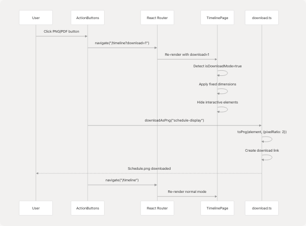
Sources: src/components/timeline.tsx21-25 src/components/timeline.tsx297-299 src/components/timeline.tsx408-439 src/utils/download.ts1-103
Welcome Banner
First-time visitors see a dismissible welcome banner explaining Timeline View features.
Persistence Logic
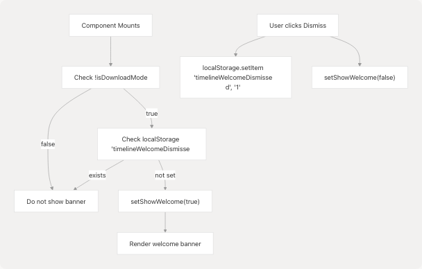
Banner features list:
- View classes color-coded by type
- Hover for details, today is highlighted
- Click events to view full details
- Download as PNG/PDF or sync to Google Calendar
- Navigate to create/edit schedules
Sources: src/components/timeline.tsx27-38 src/components/timeline.tsx325-357
Type Icon Mapping
The Timeline View uses SVG icons to visually represent different class types throughout the interface.
Icon Definitions
| Type | Icon | SVG Path Description |
|---|---|---|
L (Lecture) |
Book | Open book with pages |
P (Practical) |
Flask | Laboratory flask with liquid |
T (Tutorial) |
Pencil | Pencil for writing/editing |
C (Custom) |
Star | Filled star shape |
The getTypeIcon() function returns JSX.Element SVG components:
const getTypeIcon = (type: string) => {
  const iconProps = "w-4 h-4 inline-block";
  switch (type) {
    case "L": return <svg className={iconProps} fill="currentColor" viewBox="0 0 20 20">...</svg>;
    case "P": return <svg className={iconProps} fill="currentColor" viewBox="0 0 20 20">...</svg>;
    case "T": return <svg className={iconProps} fill="currentColor" viewBox="0 0 20 20">...</svg>;
    case "C": return <svg className={iconProps} fill="currentColor" viewBox="0 0 20 20">...</svg>;
    default: return <svg className={iconProps} fill="currentColor" viewBox="0 0 20 20">...</svg>;
  }
};
Icon usage locations:
- Event type badges within event blocks
- Statistics dashboard type breakdown
- Event detail modal type badge
- Legend in stats container
Sources: src/components/timeline.tsx155-202
Responsive Design
The Timeline View adapts to different screen sizes with distinct layouts for mobile and desktop.
Breakpoint Strategy
| Breakpoint | Width | Grid Template | Time Slot Height | Scroll Behavior |
|---|---|---|---|---|
| Mobile | < 768px | [70px_repeat(6,1fr)] |
9rem (144px) |
Horizontal + vertical |
| Desktop | ≥ 768px | [110px_repeat(6,1fr)] |
12rem (192px) |
Vertical only (grid wider than screen) |
Responsive Utilities
Several utility classes toggle based on screen size:
// Time column text
className="text-sm md:text-base"

// Day header text
className="text-sm md:text-base"

// Event subject name
className="text-sm md:text-base"

// Event details
className="text-xs md:text-sm"

// Grid rows
className="grid-rows-[repeat(10,9rem)] md:grid-rows-[repeat(10,12rem)]"
Mobile-Specific Features
- Reduced padding:
p-0 md:p-8on main container - Smaller time column:
70pxvs110px - Compressed event heights:
9remvs12rem - Horizontal scroll: Container
overflow-x-autoenables day swiping - Flexible headers: Title and stats use
flex-col md:flex-row
Sources: src/components/timeline.tsx296-299 src/components/timeline.tsx444-616
Integration with UserContext
The Timeline View consumes schedule data from the global UserContext provider, which manages both base and edited schedules.
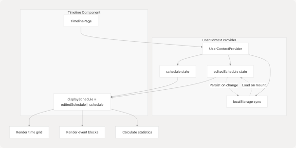
Context Structure
interface UserContextType {
  schedule: {
    [day: string]: {
      [time: string]: {
        subject_name: string;
        type: "L" | "T" | "P" | "C";
        location: string;
      };
    };
  } | null;
  setSchedule: (schedule: ...) => void;
  editedSchedule: {...} | null;
  setEditedSchedule: (schedule: ...) => void;
}
Priority Resolution
The Timeline View prioritizes editedSchedule over schedule:
const displaySchedule = editedSchedule || schedule;
This allows user customizations (created via EditEventDialog in Schedule Display) to override the base generated schedule without modifying the original data.
Sources: src/components/timeline.tsx14-15 src/context/userContextProvider.tsx1-52 src/context/userContext.tsx1-28
Performance Considerations
Refs for DOM Access
The Timeline View uses React refs to efficiently access DOM nodes for scrolling:
const containerRef = useRef<HTMLDivElement>(null);
const dayRefs = useRef<(HTMLDivElement | null)[]>([]);
containerRef: Main schedule container for horizontal scrollingdayRefs: Array of day column elements for calculating scroll offsets
Memoization
The isDownloadMode check is memoized to prevent unnecessary recalculation:
const isDownloadMode = React.useMemo(() => {
  const params = new URLSearchParams(location.search);
  return params.get("download") === "1";
}, [location.search]);
Conditional Rendering
Several features are conditionally rendered based on isDownloadMode to optimize both normal viewing and export performance:
- Welcome banner: Rendered only in normal mode
- Current time indicator: Rendered only in normal mode
- Statistics dashboard: Different positions for each mode
- Auto-scroll effect: Executes only in normal mode
Sources: src/components/timeline.tsx16-25 src/components/timeline.tsx40-90