UI Components
Purpose and Scope
This document provides an overview of JPortal's UI component architecture, including the component hierarchy, styling infrastructure, and integration patterns. For detailed documentation of specific component types, see:
- Custom feature components like
AttendanceCardandCircleProgress→ Custom Feature Components - Navigation and theme-related components → Theme & Navigation Components
- Base Radix UI wrapper components → Base UI Components
- Styling system details → Styling System
Component Architecture Overview
JPortal implements a three-layer component architecture that combines accessibility-focused primitives with custom domain-specific components.
Component Hierarchy Diagram
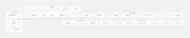
Sources: jportal/src/components/AttendanceCard.jsx1-359 jportal/src/components/CircleProgress.jsx1-53 jportal/src/components/SubjectInfoCard.jsx1-26 jportal/src/components/Profile.jsx1-157 jportal/src/components/ui/tabs.jsx1-42 jportal/package.json15-43
UI Library Stack
Dependency Matrix
| Layer | Library | Version | Purpose | Files |
|---|---|---|---|---|
| Primitives | @radix-ui/react-* |
~1.1-2.1 | Accessible, unstyled UI components | Multiple packages |
| Wrappers | Custom components in ui/ |
N/A | Styled Radix UI wrappers with theme integration | src/components/ui/*.jsx |
| Feature | Custom components | N/A | Domain-specific UI for attendance, grades, etc. | src/components/*.jsx |
| Charts | recharts |
^2.15.4 | Data visualization (line/bar charts) | Used in attendance/grades |
| Calendar | react-day-picker |
^8.10.1 | Calendar date picker component | Used in attendance calendar |
| Styling | tailwindcss |
^4.1.12 | Utility-first CSS framework | Global |
| Variants | class-variance-authority |
^0.7.0 | Component variant management | Wrapper components |
| Utilities | clsx, tailwind-merge |
Latest | Class name manipulation | Utility functions |
Sources: jportal/package.json15-43
Component Import Patterns
The codebase follows consistent import patterns across all feature components:
// Layer 1: Radix UI primitives (used internally by wrapper components)
import * as TabsPrimitive from "@radix-ui/react-tabs"

// Layer 2: Wrapper components from ui/ directory
import { Sheet, SheetContent, SheetHeader, SheetTitle } from "@/components/ui/sheet"
import { Calendar } from "@/components/ui/calendar"
import { Button } from "@/components/ui/button"

// Layer 3: Custom feature components
import CircleProgress from "./CircleProgress"
import AttendanceCard from "./AttendanceCard"

// Visualization libraries
import { LineChart, Line, XAxis, YAxis, CartesianGrid, Tooltip, ResponsiveContainer } from "recharts"

// Utilities
import { cn } from "@/lib/utils"
Sources: jportal/src/components/AttendanceCard.jsx1-5 jportal/src/components/ui/tabs.jsx1-4 jportal/src/components/Profile.jsx1-4
Component Categories
Category Breakdown by Function
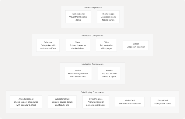
Sources: jportal/src/components/AttendanceCard.jsx7-13 jportal/src/components/SubjectInfoCard.jsx1-26 jportal/src/components/CircleProgress.jsx3 jportal/src/components/Navbar.jsx8-15
Component Prop Patterns
JPortal components follow consistent prop patterns across feature modules:
| Component Type | Common Props | Example |
|---|---|---|
| Feature Cards | subject, selectedSubject, setSelectedSubject, data props |
AttendanceCard receives subject object and selection handlers |
| Display Components | percentage, label, className |
CircleProgress receives numeric data and styling props |
| Page Components | w (WebPortal instance), state, setState |
Profile receives w, profileData, setProfileData |
| Wrapper Components | className, children, Radix-specific props |
All ui/ components accept className for style overrides |
| Navigation Components | Route configuration via constants | Navbar uses local navItems array with paths and icons |
Sources: jportal/src/components/AttendanceCard.jsx7-13 jportal/src/components/CircleProgress.jsx3 jportal/src/components/Profile.jsx6 jportal/src/components/Navbar.jsx9-15
Styling Infrastructure
CSS Architecture Layers
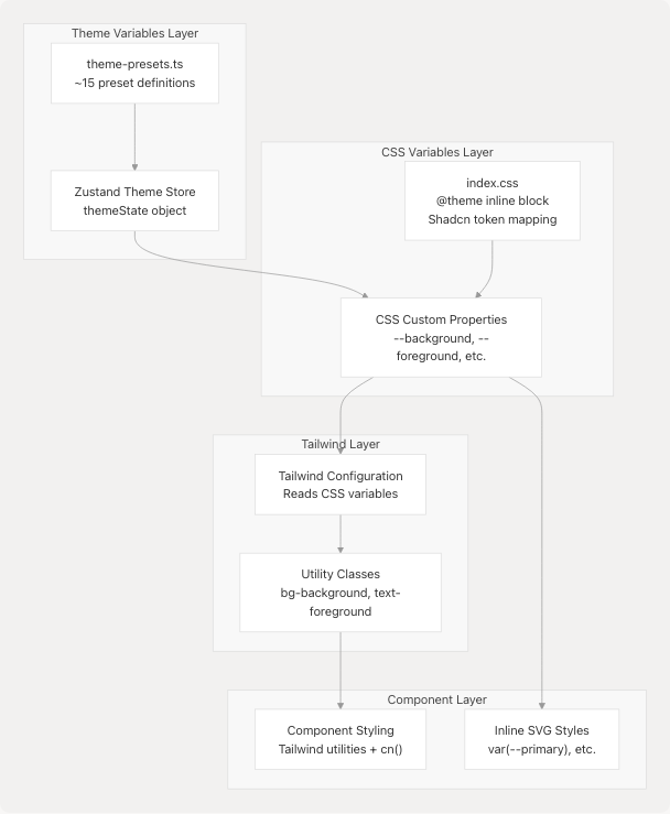
Sources: jportal/src/index.css1-240
Key CSS Variable Groups
The styling system defines several groups of CSS custom properties in jportal/src/index.css7-88:
| Variable Group | Example Variables | Usage Context |
|---|---|---|
| Shadcn Tokens | --color-background, --color-foreground, --color-primary |
Mapped from Shadcn design system to Tailwind |
| Semantic Colors | --background, --foreground, --card, --muted |
Core UI colors for backgrounds and text |
| Interactive | --primary, --secondary, --accent, --destructive |
Button and interactive element colors |
| Chart Colors | --chart-1 through --chart-5 |
Used in Recharts visualizations |
| Custom JPortal | --grade-aa, --marks-outstanding, etc. |
Domain-specific color coding |
| Typography | --font-sans, --font-serif, --font-mono |
Font family definitions |
| Spacing | --radius, --spacing, --shadow-* |
Layout and visual depth |
Sources: jportal/src/index.css7-160
Component Styling Example
The CircleProgress component demonstrates the integration of CSS variables with inline SVG styling:
// CSS variable usage in SVG
<circle
  stroke="var(--primary)"
  strokeWidth={strokeWidth}
  strokeDasharray={circumference}
  strokeDashoffset={offset}
  className="transition-all duration-1000 ease-out"
/>
<text
  className="text-[13px] fill-foreground font-medium group-hover:fill-accent-foreground"
>
  {label ?? percentage}
</text>
Sources: jportal/src/components/CircleProgress.jsx23-48
Key Design Patterns
Pattern 1: Sheet-Based Detail Views
Multiple feature components use the Sheet component (Radix Dialog) for displaying detailed information in a bottom drawer:
Implementation in AttendanceCard:
- Main card is clickable: jportal/src/components/AttendanceCard.jsx104-129
- Sheet opens with
open={selectedSubject?.name === subject.name}: jportal/src/components/AttendanceCard.jsx131-137 - Sheet content uses snap scrolling for calendar and chart sections: jportal/src/components/AttendanceCard.jsx140-351
Pattern 2: Responsive Sizing with Tailwind
Components use Tailwind's responsive breakpoint modifiers extensively:
// From AttendanceCard - responsive text sizing
<h2 className="text-sm font-semibold max-[390px]:text-xs">
  {displayName}
</h2>

// From Navbar - responsive text sizing
<p className="max-[370px]:text-[0.6rem] max-[390px]:text-[0.7rem] text-xs">
  {item.name}
</p>
Sources: jportal/src/components/AttendanceCard.jsx109 jportal/src/components/Navbar.jsx39-41
Pattern 3: Data Visualization Integration
Feature components integrate Recharts with theme variables for consistent styling:
// From AttendanceCard - themed chart configuration
<LineChart data={processAttendanceData()}>
  <CartesianGrid strokeDasharray="3 3" stroke="var(--border)" />
  <XAxis stroke="var(--muted-foreground)" />
  <YAxis stroke="var(--muted-foreground)" />
  <Tooltip
    contentStyle={{
      backgroundColor: "var(--card)",
      border: "1px solid var(--border)",
      color: "var(--card-foreground)",
    }}
  />
  <Line stroke="var(--chart-5)" />
</LineChart>
Sources: jportal/src/components/AttendanceCard.jsx301-347
Pattern 4: State-Driven UI with Loading States
All page-level components implement loading states while fetching data:
// From Profile - loading state pattern
const [loading, setLoading] = useState(true);

if (loading) {
  return (
    <div className="...">
      Loading profile...
    </div>
  );
}

// Render actual content
return <div>...</div>
Sources: jportal/src/components/Profile.jsx7-37
Pattern 5: Utility Function for Class Merging
The cn() utility (from @/lib/utils) is used throughout wrapper components to merge Tailwind classes with Radix UI classes:
// From tabs.jsx - class merging pattern
const TabsList = React.forwardRef(({ className, ...props }, ref) => (
  <TabsPrimitive.List
    ref={ref}
    className={cn(
      "inline-flex h-10 items-center justify-center rounded-md bg-muted p-1",
      className
    )}
    {...props}
  />
))
Sources: jportal/src/components/ui/tabs.jsx8-16
Component Communication Patterns
Props Drilling Architecture
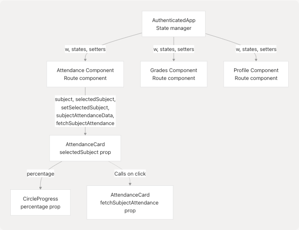
Sources: jportal/src/components/AttendanceCard.jsx7-13 jportal/src/components/CircleProgress.jsx3 jportal/src/components/Profile.jsx6
Event Handler Patterns
Feature components implement consistent event handling patterns:
| Pattern | Example | Location |
|---|---|---|
| Async fetch on interaction | handleClick fetches subject attendance when card clicked |
jportal/src/components/AttendanceCard.jsx22-29 |
| Conditional data loading | Check if data exists before fetching | jportal/src/components/AttendanceCard.jsx24 |
| Loading state management | Set loading before/after async operations | jportal/src/components/AttendanceCard.jsx25-27 |
| State cleanup on close | Reset selected subject when sheet closes | jportal/src/components/AttendanceCard.jsx133-135 |
Component Accessibility Features
All wrapper components in the ui/ directory inherit accessibility features from Radix UI primitives:
- Keyboard Navigation: Full keyboard support for tabs, dialogs, selects
- ARIA Attributes: Proper
aria-*attributes automatically applied - Focus Management: Automatic focus trapping in dialogs and popovers
- Screen Reader Support: Semantic HTML and labels for assistive technologies
The wrapper components preserve these features while adding custom styling via the className prop pattern.
Sources: jportal/src/components/ui/tabs.jsx1-42 jportal/package.json17-19