Theme & Navigation Components
Purpose and Scope
This document covers the navigation and theme-related UI components that provide the application shell and visual customization capabilities in JPortal. The navigation components (Header and Navbar) provide persistent UI for routing and user actions, while the theme components (ThemeSelectorDialog, ThemeToggle) enable visual customization.
For broader UI infrastructure, see UI Components. For the underlying theme system architecture including theme presets and Zustand store, see Theme System. For base Radix UI components, see Base UI Components.
Navigation Component Architecture
Component Hierarchy
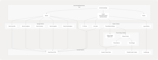
Navigation Component Structure
Header Component
The Header component provides the top navigation bar with branding and global actions.
Component Structure
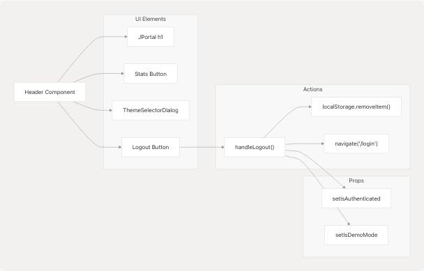
Header Component Flow
Implementation Details
The Header component is defined in jportal/src/components/Header.jsx8-40 It receives two state setters as props:
| Prop | Type | Purpose |
|---|---|---|
setIsAuthenticated |
Function | Sets authentication state to false on logout |
setIsDemoMode |
Function | Optional setter to disable demo mode on logout |
Key Features:
- Branding: Displays "JPortal" title at jportal/src/components/Header.jsx25
- Stats Navigation: Links to
/statsroute for analytics dashboard at jportal/src/components/Header.jsx27-31 - Theme Selection: Renders
ThemeSelectorDialogat jportal/src/components/Header.jsx32 - Logout Functionality: Clears stored credentials and navigates to login at jportal/src/components/Header.jsx11-20
Logout Mechanism
The handleLogout function at jportal/src/components/Header.jsx11-20 performs the following operations:
- Removes
username,password, andattendanceDatafrom localStorage - Calls
setIsAuthenticated(false)to trigger re-render ofAppcomponent - Optionally calls
setIsDemoMode(false)if provided - Navigates to
/loginroute using React Router
Navbar Component
The Navbar component provides bottom navigation with links to the five main feature modules.
Navigation Configuration
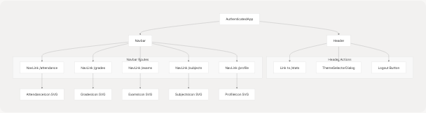
Navbar Route Structure
Implementation Details
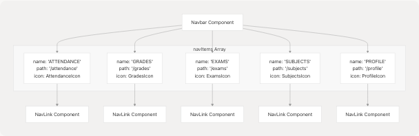
The navigation items are defined as an array at jportal/src/components/Navbar.jsx9-15:
const navItems = [
  { name: "ATTENDANCE", path: "/attendance", IconComponent: AttendanceIcon },
  { name: "  GRADES  ", path: "/grades", IconComponent: GradesIcon },
  { name: "  EXAMS", path: "/exams", IconComponent: ExamsIcon },
  { name: " SUBJECTS ", path: "/subjects", IconComponent: SubjectsIcon },
  { name: " PROFILE ", path: "/profile", IconComponent: ProfileIcon },
];
Icon Integration:
SVG icons are imported as React components using Vite's ?react suffix at jportal/src/components/Navbar.jsx2-6:
AttendanceIconfrom jportal/public/icons/attendance.svgGradesIconfrom jportal/public/icons/grades.svgExamsIconfrom jportal/public/icons/exams.svgSubjectsIconfrom jportal/public/icons/subjects1.svgProfileIconfrom jportal/public/icons/profile.svg
Active State Styling
The NavLink component from React Router provides isActive state at jportal/src/components/Navbar.jsx20-44 Active links receive:
opacity-100(vsopacity-70for inactive)bg-primarybackground on the icon containerfill-primary-foregroundfor the icon fill (vsfill-muted-foreground)
The component uses a fixed position at the bottom of the viewport with fixed bottom-0 left-0 at jportal/src/components/Navbar.jsx18
Theme Selector Dialog
The ThemeSelectorDialog component provides a comprehensive interface for theme customization with advanced interaction patterns.
Component Architecture
ThemeSelectorDialog Data Flow
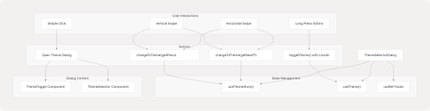
Interaction Patterns
The component implements multiple interaction patterns using refs and event handlers:
| Interaction | Detection | Action | Implementation |
|---|---|---|---|
| Click | Mouse up within 500ms | Open dialog | jportal/src/components/theme-selector-dialog.tsx78-86 |
| Long Press | Hold for 500ms | Toggle light/dark mode | jportal/src/components/theme-selector-dialog.tsx55-62 |
| Swipe Left | deltaX < -50px | Next theme preset | jportal/src/components/theme-selector-dialog.tsx125-128 |
| Swipe Right | deltaX > 50px | Previous theme preset | jportal/src/components/theme-selector-dialog.tsx122-125 |
| Swipe Up | deltaY < -50px | Next theme preset | jportal/src/components/theme-selector-dialog.tsx133-136 |
| Swipe Down | deltaY > 50px | Previous theme preset | jportal/src/components/theme-selector-dialog.tsx136-139 |
Event Handler Implementation
Touch Event Flow:
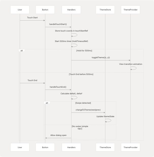
State Management
The component uses multiple useRef hooks at jportal/src/components/theme-selector-dialog.tsx21-24 to track interaction state:
holdTimeoutRef: Timeout ID for long press detectionisHoldingRef: Flag to prevent dialog opening after theme toggletouchStartRef: Initial touch coordinates for swipe detectionhasSwipedRef: Flag to prevent dialog opening after swipe
The changeToTheme function at jportal/src/components/theme-selector-dialog.tsx29-41 updates the Zustand theme store with both light and dark mode styles from the selected preset.
Dialog Content Structure
The dialog renders at jportal/src/components/theme-selector-dialog.tsx173-193 with:
- Header: Title and description (hidden on mobile)
- Mode Toggle Section: Light/dark mode switch using
ThemeTogglecomponent - Preset Selector Section: Grid of theme preset cards using
ThemeSelectorcomponent
The dialog uses Radix UI's Dialog component with responsive sizing: max-w-4xl max-h-[80vh] at jportal/src/components/theme-selector-dialog.tsx173
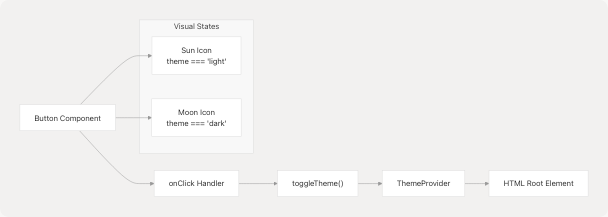
Theme Toggle Component
The ThemeToggle component provides a simple button to switch between light and dark modes with visual feedback.
Component Flow
ThemeToggle Interaction
Implementation
The component at jportal/src/components/theme-toggle.tsx8-31 is a wrapper around the Button component from the UI library. Key features:
- Icon Switching: Renders
SunorMoonicon based on current theme at jportal/src/components/theme-toggle.tsx24-27 - Click Coordinates: Passes click position to
toggleTheme()for view transition animation origin at jportal/src/components/theme-toggle.tsx11-14 - Props Forwarding: Accepts all standard
Buttonprops via spread operator
The component uses CSS transitions defined in the Sun and Moon components:
- Light mode:
rotate-0 scale-100 dark:-rotate-90 dark:scale-0 - Dark mode:
rotate-90 scale-0 dark:rotate-0 dark:scale-100
CSS Variables and Theme Tokens
The styling infrastructure uses CSS custom properties to enable dynamic theme switching.
Variable Mapping Architecture
CSS Variable System
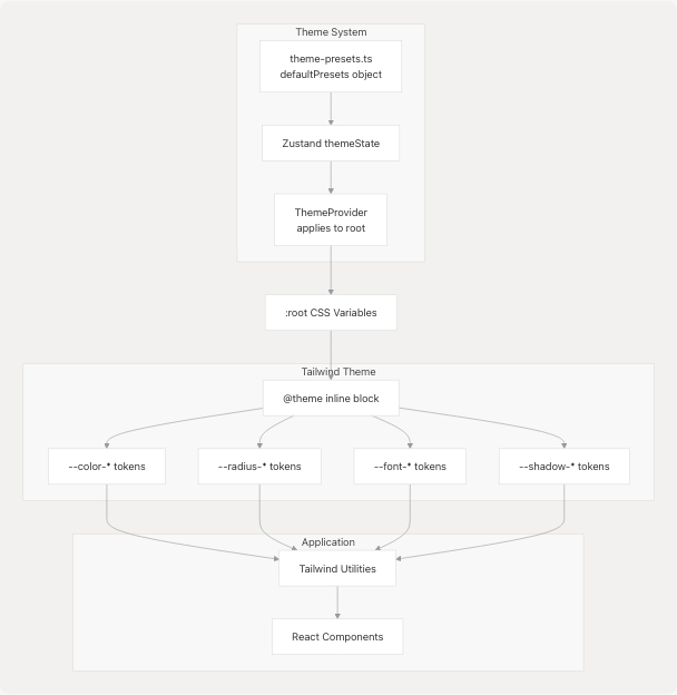
Shadcn Design Token Mapping
The @theme inline block at jportal/src/index.css7-88 maps root CSS variables to Tailwind theme tokens:
Color Tokens:
| Tailwind Token | CSS Variable | Purpose |
|---|---|---|
--color-background |
var(--background) |
Main background color |
--color-foreground |
var(--foreground) |
Main text color |
--color-primary |
var(--primary) |
Primary brand color |
--color-primary-foreground |
var(--primary-foreground) |
Text on primary background |
--color-card |
var(--card) |
Card background |
--color-muted |
var(--muted) |
Muted background |
--color-accent |
var(--accent) |
Accent color |
--color-destructive |
var(--destructive) |
Error/destructive actions |
Radius Tokens:
Defined at jportal/src/index.css60-63:
--radius-sm:calc(var(--radius) - 4px)--radius-md:calc(var(--radius) - 2px)--radius-lg:var(--radius)--radius-xl:calc(var(--radius) + 4px)
Font Tokens:
Defined at jportal/src/index.css56-58:
--font-sans: Sans-serif font stack--font-mono: Monospace font stack--font-serif: Serif font stack
Custom JPortal Color Tokens
Application-specific colors for grades and marks at jportal/src/index.css74-88:
Grade Colors:
| Token | Default HSL | Usage |
|---|---|---|
--color-grade-aa |
hsl(142 76% 36%) |
AA grade display |
--color-grade-a |
hsl(120 60% 50%) |
A grade display |
--color-grade-bb |
hsl(60 90% 60%) |
B+ grade display |
--color-grade-b |
hsl(45 90% 60%) |
B grade display |
--color-grade-f |
hsl(0 84.2% 60.2%) |
F grade display |
Marks Colors:
| Token | Purpose |
|---|---|
--color-marks-outstanding |
Marks >= 90% |
--color-marks-good |
Marks 70-89% |
--color-marks-average |
Marks 50-69% |
--color-marks-poor |
Marks < 50% |
View Transition Animations
The theme system uses the View Transitions API for smooth light/dark mode switching with circular reveal animations.
Animation Implementation
View Transition Flow
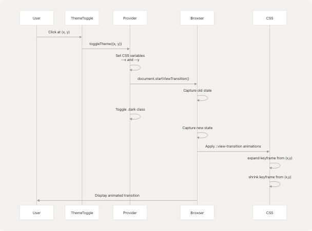
CSS Animation Definition
The animation is defined at jportal/src/index.css163-189 using the @supports feature query:
Keyframes:
-
Expand Animation (new state) at jportal/src/index.css178-182:
- Starts with
clip-path: circle(0 at var(--x, 50%) var(--y, 50%)) - Ends with
clip-path: circle(100vmax at var(--x, 50%) var(--y, 50%))
- Starts with
-
Shrink Animation (old state) at jportal/src/index.css184-188:
- Ends with
clip-path: circle(0 at var(--x, 50%) var(--y, 50%))
- Ends with
The animations run for 1s duration as specified at jportal/src/index.css165-167
Fallback Behavior:
If View Transitions API is not supported, the browser falls back to instant theme switching without animation. The feature detection uses @supports (view-transition-name: none) at jportal/src/index.css163
Global Styling Utilities
Base Layer Styles
Defined at jportal/src/index.css196-204:
Universal Styles:
- All elements receive
border-bordercolor - Ring offset width forced to
0pxto prevent outline spacing issues
Body Styles:
- Background:
bg-backgroundTailwind utility - Text:
text-foregroundTailwind utility
Scrollbar Hiding
The application hides scrollbars globally at jportal/src/index.css206-239 while maintaining scroll functionality:
Implementation:
- Chrome/Safari/Opera:
::-webkit-scrollbar { display: none; } - Firefox:
scrollbar-width: none; - IE/Edge:
-ms-overflow-style: none;
Applied to:
- All elements (utility layer) at jportal/src/index.css207-214
.overflow-y-autoclass at jportal/src/index.css231-239
Snap Scrolling Utilities
Custom utilities for smooth scroll snapping at jportal/src/index.css217-228:
| Class | CSS Property | Value |
|---|---|---|
.snap-y |
scroll-behavior |
smooth |
.snap-mandatory |
scroll-snap-type |
y mandatory |
.snap-start |
scroll-snap-align |
start |
Component Integration Summary
Navigation and Theme Component Relationships