Styling System
Purpose and Scope
This document describes the styling architecture in JPortal, including the Tailwind CSS v4 configuration, CSS variables system, theme token mapping, color semantics, and component styling patterns. For information about theme presets and dynamic theme switching, see Theme System. For base UI component implementation details, see Base UI Components.
Architecture Overview
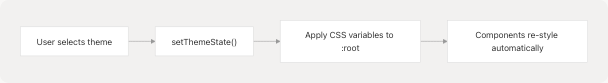
The styling system in JPortal uses a layered architecture where theme values flow from TypeScript preset definitions through CSS custom properties to Tailwind utility classes, which are then consumed by React components.
Styling Architecture Flow
Sources: jportal/src/index.css1-240 jportal/src/utils/theme-presets.ts1-1644
Tailwind CSS v4 Setup
JPortal uses Tailwind CSS v4 with the new @import syntax and inline configuration. The setup is minimal and declarative.
Core Configuration
The entire Tailwind configuration is defined in index.css:
@import "tailwindcss";
@plugin 'tailwindcss-animate';
@custom-variant dark (&:is(.dark *));
Key Features:
- Single import: jportal/src/index.css1 imports the entire Tailwind framework
- Animation plugin: jportal/src/index.css3 enables
tailwindcss-animatefor transitions - Dark mode variant: jportal/src/index.css5 defines custom dark mode selector
No tailwind.config.js file exists — all configuration is CSS-native.
Sources: jportal/src/index.css1-5
CSS Variables & Theme Tokens
@theme inline Block
The @theme inline block maps Shadcn design tokens to CSS custom properties, creating a bridge between theme values and Tailwind utilities:
@theme inline {
  /* shadcn design tokens */
  --radius-lg: var(--radius);
  --radius-md: calc(var(--radius) - 2px);
  --radius-sm: calc(var(--radius) - 4px);

  --color-background: var(--background);
  --color-foreground: var(--foreground);
  --color-primary: var(--primary);
  --color-primary-foreground: var(--primary-foreground);
  ...
}
This enables Tailwind classes like bg-background to reference var(--color-background), which in turn references var(--background).
Sources: jportal/src/index.css7-88
Root CSS Variables
All theme values are defined as CSS custom properties on :root:
| Category | Variables | Example Value |
|---|---|---|
| Colors | --background, --foreground, --card, --card-foreground |
hsl(232, 34%, 17%) |
| Semantic | --primary, --secondary, --muted, --accent, --destructive |
hsl(210, 50%, 55%) |
| Border/Input | --border, --input, --ring |
hsl(217.2 32.6% 17.5%) |
| Charts | --chart-1 through --chart-5 |
hsl(312, 64%, 42%) |
| Sidebar | --sidebar, --sidebar-foreground, --sidebar-border |
hsl(217.2 32.6% 17.5%) |
| Typography | --font-sans, --font-serif, --font-mono |
ui-sans-serif, system-ui, ... |
| Spacing | --radius, --spacing |
0.5rem, 0.25rem |
| Shadows | --shadow-color, --shadow-opacity, --shadow-blur |
hsl(0 0% 0%), 0.1, 3px |
Sources: jportal/src/index.css91-160
Dynamic Theme Application
The theme system dynamically updates these CSS variables when users switch themes:
Example: When switching from "Default" to "Violet Bloom", the theme store updates:
--background: #fdfdfd(light mode)--primary: #7033ff--radius: 1.4rem--font-sans: Plus Jakarta Sans, sans-serif
All components using bg-background, bg-primary, rounded-lg, or font-sans instantly reflect the new theme.
Sources: jportal/src/utils/theme-presets.ts164-260
Color System
Semantic Color Tokens
JPortal uses a semantic naming system for colors, ensuring consistent meaning across themes:
| Token | Purpose | Usage Examples |
|---|---|---|
background / foreground |
Page background and primary text | bg-background text-foreground |
card / card-foreground |
Card containers and their text | bg-card text-card-foreground |
primary / primary-foreground |
Primary actions and their contrast text | bg-primary text-primary-foreground |
secondary / secondary-foreground |
Secondary actions | bg-secondary text-secondary-foreground |
muted / muted-foreground |
Subdued UI elements | bg-muted text-muted-foreground |
accent / accent-foreground |
Highlighted content | bg-accent text-accent-foreground |
destructive / destructive-foreground |
Destructive actions | bg-destructive text-destructive-foreground |
border |
Borders and dividers | border-border |
input |
Form input backgrounds | bg-input |
ring |
Focus rings | ring-ring |
Sources: jportal/src/index.css13-39
Chart Color Tokens
Five chart colors are defined for data visualization:
--color-chart-1: var(--chart-1);
--color-chart-2: var(--chart-2);
--color-chart-3: var(--chart-3);
--color-chart-4: var(--chart-4);
--color-chart-5: var(--chart-5);
Usage in AttendanceCard:
var(--chart-3)for "Present" indicators (jportal/src/components/AttendanceCard.jsx194)var(--chart-5)for "Absent" indicators (jportal/src/components/AttendanceCard.jsx199)bg-chart-3/30for present class cards (jportal/src/components/AttendanceCard.jsx282)bg-chart-5/30for absent class cards (jportal/src/components/AttendanceCard.jsx282)
Sources: jportal/src/index.css41-45 jportal/src/components/AttendanceCard.jsx192-347
Custom JPortal Colors
Additional domain-specific colors for grades and marks:
/* Grade colors */
--grade-aa: hsl(142 76% 36%);  /* Excellent */
--grade-a: hsl(120 60% 50%);   /* Very Good */
--grade-bb: hsl(60 90% 60%);   /* Good */
--grade-b: hsl(45 90% 60%);    /* Above Average */
--grade-cc: hsl(35 90% 60%);   /* Average */
--grade-c: hsl(25 90% 60%);    /* Below Average */
--grade-d: hsl(15 90% 60%);    /* Poor */
--grade-f: hsl(0 84.2% 60.2%); /* Fail */

/* Marks colors */
--marks-outstanding: hsl(142 76% 36%);
--marks-good: hsl(45 90% 60%);
--marks-average: hsl(25 90% 60%);
--marks-poor: hsl(0 84.2% 60.2%);
These are mapped to Tailwind classes via the @theme inline block and used in the Grades module.
Sources: jportal/src/index.css74-88 jportal/src/index.css144-160
Color-Mix Function Usage
Modern CSS color-mix() is used for transparency effects:
backgroundColor: "color-mix(in srgb, var(--chart-3) 30%, transparent)"
This creates a 30% opacity version of chart-3 color, used extensively in the attendance calendar modifiers.
Sources: jportal/src/components/AttendanceCard.jsx194-246
Typography System
Font Family Variables
Three font stacks are defined and dynamically loadable:
--font-sans: ui-sans-serif, system-ui, -apple-system, ...
--font-serif: ui-serif, Georgia, Cambria, "Times New Roman", ...
--font-mono: ui-monospace, SFMono-Regular, Menlo, Monaco, ...
These map to Tailwind utilities:
font-sans→ usesvar(--font-sans)font-serif→ usesvar(--font-serif)font-mono→ usesvar(--font-mono)
Theme-Specific Fonts: Different themes specify different fonts:
- Default: System fonts
- Violet Bloom:
Plus Jakarta Sans, sans-serif - Twitter:
Open Sans, sans-serif - Notebook:
Architects Daughter, sans-serif(handwriting style)
The DynamicFontLoader component (see Theme System) loads these via Google Fonts when a theme is selected.
Sources: jportal/src/index.css56-58 jportal/src/index.css120-123 jportal/src/utils/theme-presets.ts201-203
Letter Spacing & Line Height
Some themes define custom letter spacing:
--letter-spacing: -0.025em;  /* Violet Bloom */
--letter-spacing: 0.5px;     /* Notebook */
This value can be referenced in custom CSS but is not currently mapped to Tailwind utilities.
Sources: jportal/src/index.css131 jportal/src/utils/theme-presets.ts211
Shadow & Radius System
Border Radius Tokens
Radius values are calculated from a base --radius value:
--radius-sm: calc(var(--radius) - 4px);
--radius-md: calc(var(--radius) - 2px);
--radius-lg: var(--radius);
--radius-xl: calc(var(--radius) + 4px);
Tailwind Classes:
rounded-sm→ uses--radius-smrounded-md→ uses--radius-mdrounded-lg→ uses--radius-lgrounded-xl→ uses--radius-xl
Theme Variations:
- Default:
0.375rem(6px) - Violet Bloom:
1.4rem(22.4px) — very rounded - Twitter:
1.3rem(20.8px) - Doom 64:
0px— sharp corners
Sources: jportal/src/index.css9-11 jportal/src/index.css60-63
Shadow System
Sophisticated shadow system with customizable parameters:
--shadow-2xs: var(--shadow-offset-x, 0) var(--shadow-offset-y, 1px)
              var(--shadow-blur, 2px) var(--shadow-spread, 0)
              color-mix(in srgb, var(--shadow-color, #000000)
              calc(var(--shadow-opacity, 0.05) * 100%), transparent);
Shadow Variables:
| Variable | Default | Purpose |
|---|---|---|
--shadow-color |
hsl(0 0% 0%) |
Base shadow color |
--shadow-opacity |
0.1 |
Shadow transparency |
--shadow-blur |
3px |
Blur radius |
--shadow-spread |
0px |
Spread radius |
--shadow-offset-x |
0 |
Horizontal offset |
--shadow-offset-y |
1px |
Vertical offset |
Seven shadow sizes available: shadow-2xs, shadow-xs, shadow-sm, shadow, shadow-md, shadow-lg, shadow-xl, shadow-2xl
Theme-Specific Shadows:
- Violet Bloom:
opacity: 0.16,blur: 3px,offset-y: 2px - Bubblegum:
opacity: 1.0, uses colored shadowhsl(325.78 58.18% 56.86% / 0.5) - Doom 64:
opacity: 0.4, strong shadows for retro feel
Sources: jportal/src/index.css65-72 jportal/src/index.css125-130
Responsive Design Patterns
Breakpoint System
JPortal uses Tailwind's default breakpoints:
| Breakpoint | Min Width | Usage Pattern |
|---|---|---|
sm |
640px | Small tablets |
md |
768px | Tablets |
lg |
1024px | Laptops |
xl |
1280px | Desktops |
2xl |
1536px | Large screens |
Mobile-First Patterns
Components use mobile-first responsive design:
AttendanceCard Text Sizing:
className="text-sm font-semibold max-[390px]:text-xs"
- Default:
text-sm(14px) - Below 390px:
text-xs(12px)
Navbar Icon Sizing:
className="max-[370px]:text-[0.6rem] max-[390px]:text-[0.7rem] text-xs"
- Default:
text-xs - Below 390px:
0.7rem - Below 370px:
0.6rem
Sources: jportal/src/components/AttendanceCard.jsx109 jportal/src/components/Navbar.jsx39
Grid Layouts
Responsive grid patterns using Tailwind grid classes:
ThemeSelector:
className="grid grid-cols-2 gap-3 sm:grid-cols-3 md:grid-cols-4"
- Mobile: 2 columns
- Small screens: 3 columns
- Medium+: 4 columns
Profile InfoRow:
className="flex flex-col sm:flex-row sm:justify-between py-1"
- Mobile: Stacked vertically
- Small screens+: Horizontal with space-between
Sources: jportal/src/components/theme-selector.tsx28 jportal/src/components/Profile.jsx152
Custom Breakpoints
Custom max-width breakpoints for fine-grained control:
max-[370px]:  /* Very small phones */
max-[375px]:  /* iPhone SE */
max-[390px]:  /* Standard small phones */
These are used throughout for text sizing and spacing adjustments on compact screens.
Sources: jportal/src/components/AttendanceCard.jsx266 jportal/src/components/CircleProgress.jsx44
Component Styling Patterns
Pattern 1: Semantic Color Classes
Components use semantic tokens rather than hardcoded colors:
<div className="bg-card text-card-foreground">
  <p className="text-muted-foreground">Label:</p>
  <button className="bg-primary text-primary-foreground">Action</button>
</div>
This ensures components adapt to all themes automatically.
Sources: jportal/src/components/Profile.jsx45
Pattern 2: State-Based Styling
Dynamic classes based on state:
<div className={`
  hover:bg-accent hover:text-accent-foreground
  ${isActive ? "bg-primary" : ""}
`}>
NavLink Example:
<NavLink className={({ isActive }) => `
  flex-1 text-md text-muted-foreground
  ${isActive ? "opacity-100" : "opacity-70"}
`}>
Sources: jportal/src/components/Navbar.jsx23-26 jportal/src/components/AttendanceCard.jsx105-106
Pattern 3: Direct CSS Variable Usage
Some components bypass Tailwind and use CSS variables directly for dynamic styling:
Calendar Modifiers:
modifiersStyles={{
  presentSingle: {
    backgroundColor: "color-mix(in srgb, var(--chart-3) 30%, transparent)",
    borderRadius: "50%",
  },
}}
CircleProgress SVG:
<circle stroke="var(--primary)" />
<text className="fill-foreground group-hover:fill-accent-foreground" />
This is necessary when Tailwind classes are insufficient for complex styling requirements.
Sources: jportal/src/components/AttendanceCard.jsx193-246 jportal/src/components/CircleProgress.jsx31-44
Pattern 4: Conditional Backgrounds
Component-specific color logic:
<div className={`p-2 rounded ${
  classData.present === "Present"
    ? "bg-chart-3/30"
    : "bg-chart-5/30"
}`}>
The /30 suffix creates 30% opacity versions of the colors.
Sources: jportal/src/components/AttendanceCard.jsx280-283
Pattern 5: Group Hover Effects
Nested hover states using Tailwind's group utilities:
<div className="group hover:bg-accent">
  <div className="group-hover:bg-accent-foreground" />
  <text className="group-hover:fill-accent-foreground" />
</div>
Sources: jportal/src/components/AttendanceCard.jsx105 jportal/src/components/CircleProgress.jsx44
View Transitions
Theme Switch Animation
The styling system includes CSS View Transitions for smooth theme switching:
@supports (view-transition-name: none) {
  ::view-transition-old(root),
  ::view-transition-new(root) {
    animation-duration: 1s;
  }

  ::view-transition-new(root) {
    clip-path: circle(0 at var(--x, 50%) var(--y, 50%));
    animation-name: expand;
  }

  @keyframes expand {
    to {
      clip-path: circle(100vmax at var(--x, 50%) var(--y, 50%));
    }
  }
}
This creates a circular expand/shrink effect emanating from the clicked position when switching themes. The --x and --y variables are set dynamically by the ThemeProvider.
Sources: jportal/src/index.css162-189
Dark Mode Class
The .dark class enables dark mode styling:
.dark {
  color-scheme: dark;
}
This is applied to the root element when dark mode is active, triggering all dark variant styles.
Sources: jportal/src/index.css192-194
Utility Layers
Base Layer
Global styles applied to all elements:
@layer base {
  * {
    @apply border-border;
    --tw-ring-offset-width: 0px !important;
  }
  body {
    @apply bg-background text-foreground;
  }
}
This ensures:
- All borders use the theme's
bordercolor - Ring offsets are disabled (set to 0)
- Body always has theme background and foreground colors
Sources: jportal/src/index.css196-204
Utilities Layer
Custom utility classes:
@layer utilities {
  * {
    -ms-overflow-style: none; /* IE and Edge */
    scrollbar-width: none; /* Firefox */
  }

  ::-webkit-scrollbar {
    display: none; /* Chrome, Safari and Opera */
  }
}
This globally hides scrollbars while maintaining scroll functionality, creating a cleaner UI.
Additional scroll utilities:
.snap-y {
  scroll-behavior: smooth;
}

.snap-mandatory {
  scroll-snap-type: y mandatory;
}

.snap-start {
  scroll-snap-align: start;
}
These enable smooth scroll snapping in the AttendanceCard sheet.
Sources: jportal/src/index.css206-228 jportal/src/index.css230-239
Component-Specific Styling Examples
AttendanceCard Calendar Styling
The attendance calendar uses complex custom styling with multiple modifier states:
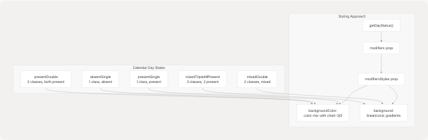
Gradient Examples:
mixedDouble: {
  background: "linear-gradient(90deg,
    color-mix(in srgb, var(--chart-3) 30%, transparent) 50%,
    color-mix(in srgb, var(--chart-5) 30%, transparent) 50%)"
}

mixedTripleAllPresent: {
  background: "conic-gradient(
    color-mix(in srgb, var(--chart-3) 30%, transparent) 0deg 240deg,
    color-mix(in srgb, var(--chart-5) 30%, transparent) 240deg 360deg)"
}
Sources: jportal/src/components/AttendanceCard.jsx146-246
Navbar Active State
The navbar uses NavLink's isActive state for conditional styling:
<NavLink className={({ isActive }) => `
  flex-1 text-md text-muted-foreground
  ${isActive ? "opacity-100" : "opacity-70"}
`}>
  {({ isActive }) => (
    <div className={`rounded-xl p-1 ${
      isActive ? "bg-primary" : ""
    }`}>
      <Icon className={
        isActive ? "fill-primary-foreground" : "fill-muted-foreground"
      } />
    </div>
  )}
</NavLink>
This creates a three-tier visual hierarchy:
- Active route: Full opacity, primary background, primary-foreground icon
- Inactive routes: 70% opacity, no background, muted-foreground icon
- Hover state: Primary background applied
Sources: jportal/src/components/Navbar.jsx20-44
CircleProgress Animation
The circular progress indicator uses SVG with CSS transitions:
<circle
  stroke="var(--primary)"
  strokeDasharray={circumference}
  strokeDashoffset={offset}
  className="transition-all duration-1000 ease-out"
/>
The strokeDashoffset animates from full circumference (empty circle) to the calculated offset based on percentage, creating a smooth fill animation over 1 second.
Sources: jportal/src/components/CircleProgress.jsx26-37
Summary Table
| Aspect | Implementation | Key Files |
|---|---|---|
| CSS Framework | Tailwind CSS v4 with @import | index.css:1-5 |
| Theme Tokens | CSS variables + @theme inline | index.css:7-88 |
| Color System | Semantic tokens + chart colors + grade colors | index.css:13-160 |
| Typography | Dynamic font stacks with Google Fonts | index.css:56-58, 120-123 |
| Shadows | Parameterized shadow system (7 sizes) | index.css:65-72 |
| Radius | Calculated from base --radius | index.css:9-11, 60-63 |
| Responsive | Mobile-first with custom breakpoints | Components |
| Animations | View Transitions API for theme switching | index.css:162-189 |
| Utilities | Scrollbar hiding, scroll snapping | index.css:206-239 |
Sources: jportal/src/index.css1-240 jportal/src/utils/theme-presets.ts1-1644