Custom Feature Components
This document covers the custom UI components built specifically for JPortal's feature modules. These components provide domain-specific visualizations and interactions for attendance tracking, grades display, and subject information. For base UI components from Radix UI (Dialog, Sheet, Select, etc.), see Base UI Components. For navigation and theme components, see Theme & Navigation Components.
Overview
JPortal implements four primary custom feature components that encapsulate complex domain logic and visualizations:
| Component | Purpose | Used In | Key Features |
|---|---|---|---|
AttendanceCard |
Display subject attendance with drill-down | Attendance Module | Calendar view, line chart, class-by-class details |
CircleProgress |
Circular percentage indicator | Attendance Module | Animated SVG ring with configurable radius |
MarksCard |
Display course marks breakdown | Grades Module | Progress bars with color-coded performance |
SubjectInfoCard |
Display subject details | Subjects Module | Course info, credits, faculty listing |
These components are stateful, managing local UI state (e.g., selected dates, loading indicators) while receiving data through props from parent feature modules. They integrate with base UI primitives from src/components/ui/ and data visualization libraries (Recharts).
Sources: jportal/src/components/AttendanceCard.jsx1-359 jportal/src/components/CircleProgress.jsx1-53 jportal/src/components/MarksCard.jsx1-42 jportal/src/components/SubjectInfoCard.jsx1-26
Component Architecture
Component Hierarchy
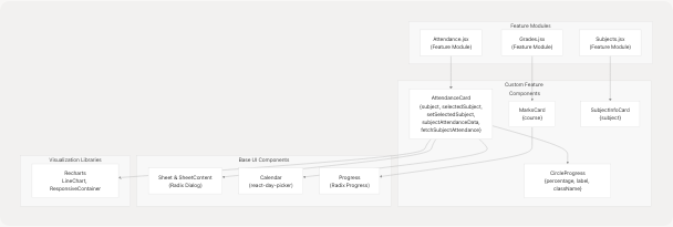
Component Hierarchy Diagram
This diagram shows how custom feature components integrate with their parent modules and depend on base UI primitives. AttendanceCard is the most complex, combining multiple base components and a visualization library.
Sources: jportal/src/components/AttendanceCard.jsx1-13 jportal/src/components/CircleProgress.jsx3 jportal/src/components/MarksCard.jsx4 jportal/src/components/SubjectInfoCard.jsx1
Data Flow Pattern
Data Flow in AttendanceCard
This diagram illustrates the dual-state architecture: parent module state is passed via props, while local UI state (like selectedDate) is managed internally. User interactions trigger callbacks that update parent state via the fetchSubjectAttendance prop.
Sources: jportal/src/components/AttendanceCard.jsx7-13 jportal/src/components/AttendanceCard.jsx19-20 jportal/src/components/AttendanceCard.jsx22-29 jportal/src/components/AttendanceCard.jsx249
AttendanceCard Component
AttendanceCard is the most sophisticated custom component, providing a multi-view interface for subject attendance tracking.
Component Structure
The component is defined in jportal/src/components/AttendanceCard.jsx7-356 and accepts five props:
| Prop | Type | Purpose |
|---|---|---|
subject |
Object | Subject data containing name, attendance stats, class counts |
selectedSubject |
Object | null |
setSelectedSubject |
Function | Setter to update selected subject in parent |
subjectAttendanceData |
Object | Map of subject names to array of class records |
fetchSubjectAttendance |
Function | Async function to fetch detailed attendance for a subject |
Visual Components
The component renders two distinct views:
1. Card View (Collapsed)
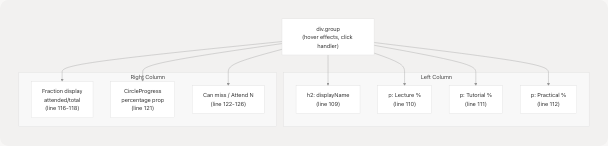
AttendanceCard Collapsed View Structure
The collapsed card displays summary statistics with a CircleProgress component showing overall attendance percentage. The displayName strips parenthetical content from subject names using regex jportal/src/components/AttendanceCard.jsx17
Sources: jportal/src/components/AttendanceCard.jsx104-129 jportal/src/components/AttendanceCard.jsx14-17
2. Detail View (Sheet)
When clicked, the card opens a bottom sheet (jportal/src/components/AttendanceCard.jsx131-353) containing two scrollable sections:
Calendar Section (jportal/src/components/AttendanceCard.jsx142-295):
- Uses
react-day-pickerCalendar component with custom modifiers - Implements 10 distinct modifiers for attendance visualization:
presentSingle,absentSingle: Single class days (lines 147-154)presentDouble,absentDouble,mixedDouble: Days with 2 classes (lines 155-166)presentTriple,absentTriple: Days with 3 classes, all same status (lines 167-174)mixedTripleAllPresent,mixedTripleAllAbsent,mixedTripleEqual: Days with 3 classes, mixed attendance (lines 175-189)
- Applies gradient backgrounds via
modifiersStyles(lines 192-246) - Selected date shows class-by-class breakdown (lines 277-293)
Chart Section (jportal/src/components/AttendanceCard.jsx298-350):
- Recharts
LineChartshowing cumulative attendance percentage over time processAttendanceData()function (lines 69-100) computes running percentage from individual class records
Key Algorithms
Date Matching Logic
The getDayStatus() function jportal/src/components/AttendanceCard.jsx32-45 matches calendar dates to attendance records:
1. Convert Date object to "DD/MM/YYYY" format
2. Filter subjectAttendanceData for matching date prefix
3. Return array of boolean statuses (true = Present, false = Absent)
4. Array length indicates number of classes that day
This powers the calendar modifiers, which use array length and composition to determine visual styling.
Cumulative Attendance Calculation
The processAttendanceData() function jportal/src/components/AttendanceCard.jsx69-100 transforms flat class records into time-series data:
1. Sort all class records by date (oldest first)
2. Iterate chronologically, maintaining running counters:
   - cumulativePresent: total attended classes
   - cumulativeTotal: total classes
3. For each unique date, store percentage = (present/total) * 100
4. Deduplicate by date to get one data point per day
This produces a monotonically changing line chart showing attendance trends.
Sources: jportal/src/components/AttendanceCard.jsx32-100 jportal/src/components/AttendanceCard.jsx131-353
CircleProgress Component
CircleProgress renders an animated circular progress indicator using SVG.
Component API
Defined in jportal/src/components/CircleProgress.jsx3-50:
| Prop | Type | Default | Purpose |
|---|---|---|---|
percentage |
Number | - | Value from 0-100 to display |
label |
String | undefined | Override text display (defaults to percentage) |
className |
String | "" | Additional CSS classes |
SVG Implementation
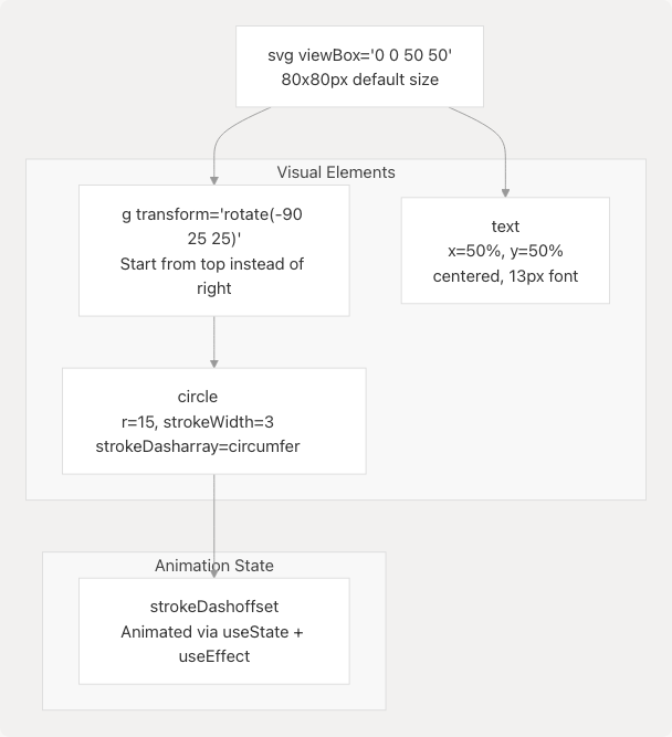
CircleProgress SVG Structure
The component uses the stroke-dashoffset technique for circular progress animation:
- Initial State: Circle outline has
circumference = 2πr = 94.25units - Offset Calculation:
offset = circumference - (percentage/100) * circumference - Animation:
useEffectupdates offset from 100% (empty) to actual percentage over 1000ms jportal/src/components/CircleProgress.jsx11-21
The rotation transform jportal/src/components/CircleProgress.jsx25 ensures the progress starts at 12 o'clock position instead of 3 o'clock (SVG default).
Styling Integration
The component uses CSS custom properties for theming:
stroke="var(--primary)"for the circle outline jportal/src/components/CircleProgress.jsx31fill-foregroundandgroup-hover:fill-accent-foregroundfor text color jportal/src/components/CircleProgress.jsx44
This allows the component to adapt to theme changes without prop updates.
Sources: jportal/src/components/CircleProgress.jsx1-53
MarksCard Component
MarksCard displays exam marks for a single course with visual progress indicators.
Component Structure
Defined in jportal/src/components/MarksCard.jsx4-41 accepts a single course prop with structure:
{
  name: string,
  code: string,
  exams: {
    [examName]: { OM: number, FM: number }
  }
}
Visual Layout
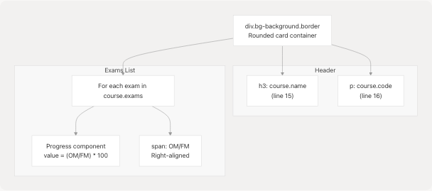
MarksCard Layout Structure
Each exam entry jportal/src/components/MarksCard.jsx20-38 consists of a horizontal progress bar with marks displayed on the right.
Dynamic Color Coding
The getProgressColor() function jportal/src/components/MarksCard.jsx5-10 assigns semantic colors based on performance:
| Percentage Range | Color Class | Meaning |
|---|---|---|
| ≥ 80% | bg-marks-outstanding |
Excellent performance |
| 60-79% | bg-marks-good |
Good performance |
| 40-59% | bg-marks-average |
Average performance |
| < 40% | bg-marks-poor |
Poor performance |
These color classes are defined in the theme system (see Theme System) and adapt to light/dark modes.
Sources: jportal/src/components/MarksCard.jsx1-42
SubjectInfoCard Component
SubjectInfoCard provides a condensed view of subject registration details.
Component API
Defined in jportal/src/components/SubjectInfoCard.jsx1-24 accepts a subject prop:
{
  name: string,
  code: string,
  credits: number,
  isAudit: boolean,
  components: [
    { type: 'L'|'T'|'P', teacher: string }
  ]
}
Layout Implementation
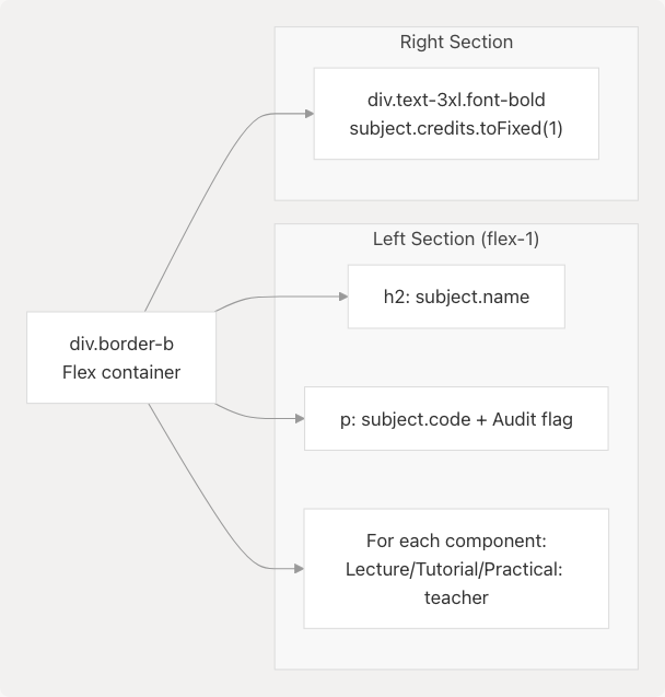
SubjectInfoCard Layout
The component uses a simple two-column flex layout with subject details on the left and prominent credit display on the right jportal/src/components/SubjectInfoCard.jsx3-22
Component Type Mapping
The component maps component types to readable labels jportal/src/components/SubjectInfoCard.jsx10-17:
'L'→ "Lecture"'T'→ "Tutorial"'P'→ "Practical"
Each component shows the assigned teacher name.
Sources: jportal/src/components/SubjectInfoCard.jsx1-26
Component Integration Patterns
Props Drilling Pattern
Custom feature components receive data through extensive props drilling from parent feature modules:
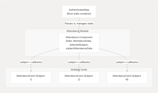
Props Drilling in Attendance Module
Each AttendanceCard receives:
- Data props:
subject,subjectAttendanceData(read-only) - State props:
selectedSubject(shared across all cards) - Callback props:
setSelectedSubject,fetchSubjectAttendance(to modify parent state)
This pattern enables coordinated behavior (e.g., only one card can be expanded at a time) but creates tight coupling between parent and child components.
Sources: jportal/src/components/AttendanceCard.jsx7-13
Lazy Data Loading
AttendanceCard implements lazy loading for detailed attendance data jportal/src/components/AttendanceCard.jsx22-29:
handleClick():
  1. Set selectedSubject to open sheet
  2. Check if subjectAttendanceData[subject.name] exists
  3. If not, set isLoading = true
  4. Call fetchSubjectAttendance(subject)
  5. Parent module fetches from API and updates state
  6. Set isLoading = false
This avoids fetching granular attendance data for all subjects on page load, reducing initial load time.
Responsive Design Strategy
All custom components implement responsive sizing using Tailwind breakpoint classes:
| Breakpoint | AttendanceCard | CircleProgress | MarksCard | SubjectInfoCard |
|---|---|---|---|---|
| Default | text-sm |
w-[80px] h-[80px] |
p-3 |
text-sm |
| ≤390px | max-[390px]:text-xs |
text-[12px] |
N/A | max-[390px]:text-xs |
| ≤375px | N/A | max-[375px]:text-[12px] |
N/A | N/A |
| ≥640px (sm) | N/A | N/A | sm:p-4, sm:text-base |
N/A |
| ≥1024px (lg) | lg:text-base |
N/A | N/A | lg:text-base |
This ensures readability across mobile devices (down to 320px width) and desktop screens.
Sources: jportal/src/components/AttendanceCard.jsx109-112 jportal/src/components/CircleProgress.jsx24 jportal/src/components/MarksCard.jsx13-16 jportal/src/components/SubjectInfoCard.jsx5-12
Accessibility Considerations
Custom components inherit accessibility features from their base UI dependencies:
- AttendanceCard: Uses Radix
Sheetwith proper ARIA attributes and focus management - MarksCard: Radix
Progresscomponent includesrole="progressbar"andaria-valuenow - Calendar: react-day-picker implements full keyboard navigation and screen reader support
All interactive elements use semantic HTML (button, div[role="button"]) and maintain accessible contrast ratios through the theme system.
Sources: jportal/src/components/AttendanceCard.jsx131-137 jportal/src/components/ui/progress.jsx1-25