Attendance Module
Purpose and Scope
The Attendance Module provides students with a comprehensive view of their class attendance across all registered subjects. This module displays attendance statistics, calculates how many classes a student can miss or must attend to maintain a target percentage, and offers detailed day-by-day attendance tracking with historical trends.
This document covers the implementation of attendance tracking and visualization. For information about overall application architecture and state management patterns, see Architecture Overview. For details on the data layer and API integration, see Data Layer & API Integration.
Component Architecture
The Attendance Module consists of three primary React components that work together to provide attendance tracking functionality:
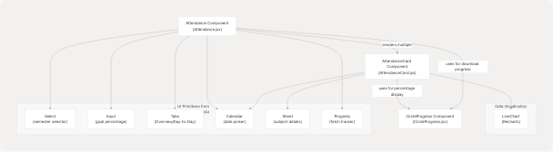
Sources: jportal/src/components/Attendance.jsx1-477 jportal/src/components/AttendanceCard.jsx1-359 jportal/src/components/CircleProgress.jsx1-53
State Management and Props Interface
The Attendance component receives an extensive set of state variables and setters via props drilling from AuthenticatedApp. This design allows the parent to persist attendance data across navigation.
Props Structure
| Prop Name | Type | Purpose |
|---|---|---|
w |
`WebPortal | MockWebPortal` |
attendanceData |
Object |
Cached attendance data keyed by registration_id |
semestersData |
Object |
Available semesters metadata |
selectedSem |
Object |
Currently selected semester object |
attendanceGoal |
Number |
Target attendance percentage (0-100) |
subjectAttendanceData |
Object |
Daily attendance records per subject |
selectedSubject |
Object |
Subject selected in detail view |
activeTab |
String |
Active tab: "overview" or "daily" |
dailyDate |
Date |
Selected date in Day-to-Day view |
calendarOpen |
Boolean |
Calendar visibility state |
isTrackerOpen |
Boolean |
Fetch progress sheet visibility |
subjectCacheStatus |
Object |
Per-subject fetch status tracking |
Each state variable has a corresponding setter function passed as a prop (e.g., setAttendanceData, setSelectedSem).
Sources: jportal/src/components/Attendance.jsx12-40
Data Flow and Fetching Strategy
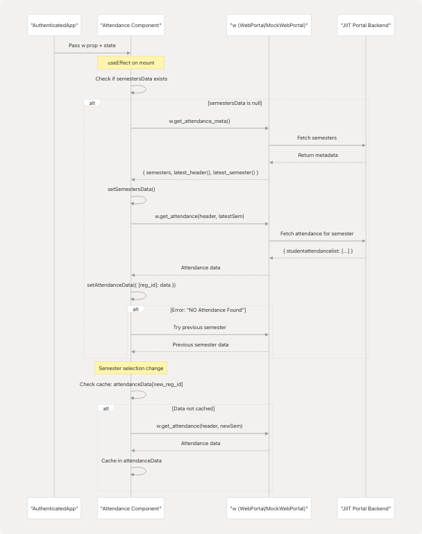
Sources: jportal/src/components/Attendance.jsx41-98 jportal/src/components/Attendance.jsx100-132
Initial Data Fetch
On component mount, the Attendance component executes a multi-step data fetching process jportal/src/components/Attendance.jsx41-98:
- Fetch Semester Metadata: Calls
w.get_attendance_meta()to retrieve available semesters - Extract Latest Semester: Uses
meta.latest_semester()to identify the current semester - Fetch Attendance Data: Calls
w.get_attendance(header, latestSem)for the selected semester - Error Handling: If latest semester returns "NO Attendance Found", falls back to previous semester jportal/src/components/Attendance.jsx73-87
Semester Change Handling
When a user selects a different semester jportal/src/components/Attendance.jsx100-132:
- Immediate UI Update: Selected semester updates immediately for responsive UX
- Cache Check: Verifies if
attendanceData[registration_id]exists - Conditional Fetch: Only fetches from API if data is not cached
- Error State: Stores error message in cache if attendance is unavailable
Sources: jportal/src/components/Attendance.jsx41-132
Subject Data Processing
The component transforms raw API response data into a structured format for display jportal/src/components/Attendance.jsx141-185:
// Extracted subject processing logic
const subjects = attendanceData[selectedSem.registration_id]?.studentattendancelist?.map((item) => {
  const { attended, total } = {
    attended: (Ltotalpres || 0) + (Ttotalpres || 0) + (Ptotalpres || 0),
    total: (Ltotalclass || 0) + (Ttotalclass || 0) + (Ptotalclass || 0),
  };

  return {
    name: subjectcode,
    attendance: { attended, total },
    combined: LTpercantage,
    lecture: Lpercentage,
    tutorial: Tpercentage,
    practical: Ppercentage,
    classesNeeded: Math.ceil((goal * total - 100 * attended) / (100 - goal)),
    classesCanMiss: Math.floor((100 * attended - goal * total) / goal),
  };
});
API Response Structure
The studentattendancelist array contains objects with the following structure:
| Field | Type | Description |
|---|---|---|
subjectcode |
String | Subject name/code |
Ltotalclass, Ltotalpres |
Number | Lecture total and present count |
Ttotalclass, Ttotalpres |
Number | Tutorial total and present count |
Ptotalclass, Ptotalpres |
Number | Practical total and present count |
LTpercantage |
Number | Combined attendance percentage |
Lpercentage, Tpercentage, Ppercentage |
Number | Component-wise percentages |
subjectid, individualsubjectcode |
String | Identifiers for detailed fetch |
Sources: jportal/src/components/Attendance.jsx141-185 jportal/src/assets/fakedata.json22-183
Attendance Goal Calculation
The module calculates actionable metrics based on the user-defined attendanceGoal:
Classes Needed Formula
classesNeeded = ceil((goal × total - 100 × attended) / (100 - goal))
This formula determines how many consecutive classes a student must attend to reach their goal percentage.
Classes Can Miss Formula
classesCanMiss = floor((100 × attended - goal × total) / goal)
This formula determines how many consecutive classes a student can miss while maintaining their goal percentage.
Goal Input Validation
The goal input field accepts values between 1 and 100, with special handling jportal/src/components/Attendance.jsx134-139:
const handleGoalChange = (e) => {
  const value = e.target.value === "" ? "" : parseInt(e.target.value);
  if (value === "" || (!isNaN(value) && value > 0 && value <= 100)) {
    setAttendanceGoal(value);
  }
};
Sources: jportal/src/components/Attendance.jsx134-139 jportal/src/components/Attendance.jsx164-169
Feature: Overview Tab
The Overview tab displays a summary card for each subject showing attendance statistics and goal-based recommendations.
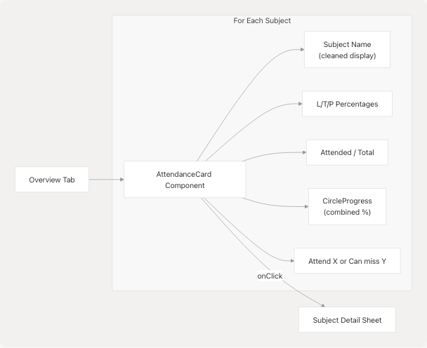
AttendanceCard Component
Each subject is rendered using AttendanceCard jportal/src/components/AttendanceCard.jsx102-129 Key features include:
- Subject Name Cleaning: Removes trailing parenthetical content using regex
name.replace(/\s*\([^)]*\)\s*$/, "")jportal/src/components/AttendanceCard.jsx17 - Component Breakdown: Displays Lecture, Tutorial, and Practical percentages if non-zero
- Circular Progress: Shows combined percentage using
CircleProgresscomponent - Actionable Metric: Displays either "Attend X" or "Can miss Y" based on goal calculation
Click Interaction
Clicking an AttendanceCard opens a Sheet component with detailed attendance history jportal/src/components/AttendanceCard.jsx22-29:
- Sets
selectedSubjectto trigger sheet open state - Checks if detailed data exists in
subjectAttendanceData[subject.name] - If not cached, calls
fetchSubjectAttendance(subject)to load daily records
Sources: jportal/src/components/Attendance.jsx295-311 jportal/src/components/AttendanceCard.jsx1-129
Feature: Day-to-Day Tab
The Day-to-Day tab provides a calendar-based view of all classes for all subjects, with automatic prefetching of daily attendance data.
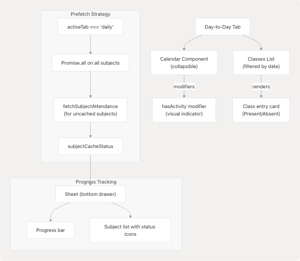
Prefetching Implementation
When the user switches to the Day-to-Day tab, the component automatically fetches daily attendance for all subjects jportal/src/components/Attendance.jsx214-231:
useEffect(() => {
  if (activeTab !== "daily") return;

  const loadAllSubjects = async () => {
    await Promise.all(
      subjects.map(async (subj) => {
        if (subjectAttendanceData[subj.name]) {
          setSubjectCacheStatus((p) => ({ ...p, [subj.name]: "cached" }));
          return;
        }
        setSubjectCacheStatus((p) => ({ ...p, [subj.name]: "fetching" }));
        await fetchSubjectAttendance(subj);
        setSubjectCacheStatus((p) => ({ ...p, [subj.name]: "cached" }));
      })
    );
  };
  loadAllSubjects();
}, [activeTab]);
Cache Status Tracking
The subjectCacheStatus object tracks three states per subject:
"idle": Not yet fetched"fetching": Currently fetching"cached": Data available locally
Progress Sheet
A floating button displays fetch progress jportal/src/components/Attendance.jsx407-468 The button shows a CircleProgress indicator with a fraction label (e.g., "8/10"). Clicking it opens a bottom sheet with:
- Progress bar: Visual representation of overall completion
- Subject list: Individual subject status with icons:
Checkicon (from lucide-react) for cachedLoader2icon (animated spinner) for fetchingAlertCircleicon for idle
Calendar Display
The calendar uses the react-day-picker library (via shadcn/ui Calendar component) with custom modifiers jportal/src/components/Attendance.jsx333-341:
modifiers={{
  hasActivity: (date) => subjects.some((s) => getClassesFor(s.name, date).length > 0),
}}
modifiersStyles={{
  hasActivity: {
    boxShadow: "inset 0 -2px 0 0 var(--color-primary)",
    borderRadius: "3px",
  },
}}
The hasActivity modifier adds a bottom border to dates that have classes scheduled.
Class List Display
For the selected date, classes are grouped by subject jportal/src/components/Attendance.jsx374-396 Each class entry shows:
- Subject name
- Class type (Lecture/Tutorial/Practical)
- Present/Absent status (color-coded:
text-chart-1for present,text-chart-2for absent) - Date and time
Sources: jportal/src/components/Attendance.jsx214-404 jportal/src/components/Attendance.jsx233-242
Feature: Subject Detail Sheet
Clicking an AttendanceCard in the Overview tab opens a bottom sheet with two scrollable sections:
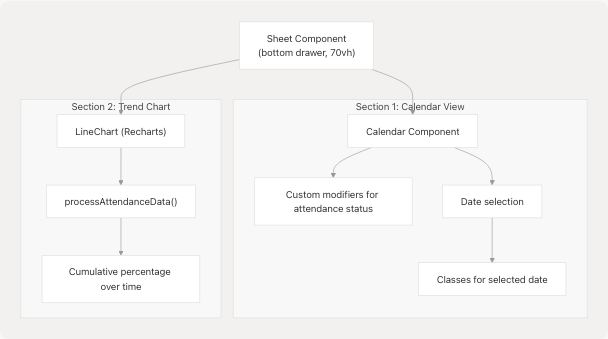
Calendar Modifiers for Attendance Status
The detail calendar uses sophisticated modifiers to visually represent attendance patterns jportal/src/components/AttendanceCard.jsx145-191 The getDayStatus function returns an array of boolean values (true = Present, false = Absent) for each class on a given date.
Modifier Categories
| Modifier Name | Condition | Visual Style |
|---|---|---|
presentSingle |
1 class, Present | Green circle background |
absentSingle |
1 class, Absent | Red circle background |
presentDouble |
2 classes, both Present | Green circle background |
absentDouble |
2 classes, both Absent | Red circle background |
mixedDouble |
2 classes, 1 Present, 1 Absent | Linear gradient (90deg, green/red split) |
presentTriple |
3 classes, all Present | Green circle background |
absentTriple |
3 classes, all Absent | Red circle background |
mixedTripleAllPresent |
3 classes, 2 Present | Conic gradient (240° green, 120° red) |
mixedTripleAllAbsent |
3 classes, 2 Absent | Conic gradient (240° red, 120° green) |
mixedTripleEqual |
3 classes, mixed equally | Conic gradient (alternating) |
The visual styles use CSS color-mix() function with CSS variables jportal/src/components/AttendanceCard.jsx193-246:
presentSingle: {
  backgroundColor: "color-mix(in srgb, var(--chart-3) 30%, transparent)",
  borderRadius: "50%",
}
Selected Date Display
When a user clicks a date with classes, the component displays detailed information for each class jportal/src/components/AttendanceCard.jsx277-293:
{selectedDate && (
  <div className="mt-4 space-y-2 w-full pb-4">
    {getClassesForDate(selectedDate).map((classData, index) => (
      <div key={index} className={`p-2 rounded ${
        classData.present === "Present" ? "bg-chart-3/30" : "bg-chart-5/30"
      }`}>
        <p className="text-sm">{classData.attendanceby}</p>
        <p className="text-xs">{classData.classtype} - {classData.present}</p>
        <p className="text-xs">{classData.datetime}</p>
      </div>
    ))}
  </div>
)}
Attendance Trend Chart
The second section of the sheet displays a cumulative attendance trend jportal/src/components/AttendanceCard.jsx298-350 The processAttendanceData function jportal/src/components/AttendanceCard.jsx68-100:
- Sorts all attendance records chronologically
- Calculates cumulative present/total counts
- Computes percentage after each class
- Groups by date to avoid duplicate points
The resulting LineChart shows how attendance percentage evolved over time:
<LineChart data={processAttendanceData()}>
  <XAxis dataKey="date" tickFormatter={(value) => {
    const [day, month] = value.split("/");
    return `${day}/${month}`;
  }} />
  <YAxis domain={[0, 100]} tickFormatter={(value) => `${value}%`} />
  <Line type="monotone" dataKey="percentage" stroke="var(--chart-5)" />
</LineChart>
Sources: jportal/src/components/AttendanceCard.jsx131-353
Data Fetching Methods
Fetching Subject Daily Attendance
The fetchSubjectAttendance function retrieves day-by-day attendance records for a specific subject jportal/src/components/Attendance.jsx187-212:
const fetchSubjectAttendance = async (subject) => {
  const attendance = attendanceData[selectedSem.registration_id];
  const subjectData = attendance.studentattendancelist.find(
    (s) => s.subjectcode === subject.name
  );

  const subjectcomponentids = ["Lsubjectcomponentid", "Psubjectcomponentid", "Tsubjectcomponentid"]
    .filter((id) => subjectData[id])
    .map((id) => subjectData[id]);

  const data = await w.get_subject_daily_attendance(
    selectedSem,
    subjectData.subjectid,
    subjectData.individualsubjectcode,
    subjectcomponentids
  );

  setSubjectAttendanceData((prev) => ({
    ...prev,
    [subject.name]: data.studentAttdsummarylist,
  }));
};
API Method Signature
The get_subject_daily_attendance method is implemented in both WebPortal (real mode) and MockWebPortal (demo mode) jportal/src/components/MockWebPortal.js53-57:
Parameters:
semester: Semester object withregistration_idandregistration_codesubjectid: Unique subject identifierindividualsubjectcode: Subject code for lookupsubjectcomponentids: Array of component IDs (Lecture, Tutorial, Practical)
Returns:
{
  studentAttdsummarylist: [
    {
      datetime: "01/01/2025 (10:00:AM - 10:50:AM)",
      classtype: "Lecture",
      present: "Present",
      attendanceby: "FACULTY NAME"
    },
    // ... more entries
  ]
}
Sources: jportal/src/components/Attendance.jsx187-212 jportal/src/components/MockWebPortal.js53-57 jportal/src/assets/fakedata.json287-504
UI Components Used
The Attendance Module leverages components from the application's UI library (shadcn/ui + Radix UI primitives) and Recharts for visualization.
Component Import Map
| Component | Source | Usage in Attendance Module |
|---|---|---|
Select, SelectContent, SelectItem, SelectTrigger, SelectValue |
@/components/ui/select |
Semester selection dropdown |
Input |
@/components/ui/input |
Attendance goal percentage input |
Calendar |
@/components/ui/calendar |
Date picker for Day-to-Day tab and subject details |
Tabs, TabsList, TabsTrigger, TabsContent |
@/components/ui/tabs |
Overview/Day-to-Day tab switching |
Sheet, SheetTrigger, SheetContent, SheetHeader, SheetTitle |
@/components/ui/sheet |
Subject detail drawer and progress tracker |
Progress |
@/components/ui/progress |
Fetch progress indicator |
LineChart, Line, XAxis, YAxis, CartesianGrid, Tooltip, ResponsiveContainer |
recharts |
Attendance trend visualization |
Icon Components
Lucide React icons are used for visual feedback jportal/src/components/Attendance.jsx10:
Check: Indicates cached dataLoader2: Animated spinner for fetching stateAlertCircle: Indicates idle/pending stateChevronDown,ChevronUp: Calendar toggle indicators
Sources: jportal/src/components/Attendance.jsx1-11 jportal/src/components/AttendanceCard.jsx1-6
Styling and Responsiveness
Sticky Header
The semester selector and goal input are positioned in a sticky header jportal/src/components/Attendance.jsx246-272:
<div className="sticky top-14 bg-background z-20">
  <div className="flex gap-2 py-2 px-3">
    <Select>{/* Semester selector */}</Select>
    <Input type="number" className="w-32" placeholder="Goal %" />
  </div>
</div>
The top-14 offset accounts for the application's main header height.
Responsive Design
The module uses responsive Tailwind classes extensively:
- CircleProgress sizing:
w-[80px] h-[80px]with font sizetext-[13px] max-[390px]:text-[12px]jportal/src/components/CircleProgress.jsx24-46 - Subject cards: Font sizes adjust at 390px breakpoint:
text-sm max-[390px]:text-xsjportal/src/components/AttendanceCard.jsx109-112 - Calendar: Cell sizing adapts with
max-[390px]:h-6 max-[390px]:w-6 max-[390px]:text-xsjportal/src/components/Attendance.jsx359
Theme Integration
All components use CSS custom properties for theming:
- Colors:
var(--foreground),var(--background),var(--chart-1), etc. - Interactive states:
hover:bg-accent hover:text-accent-foreground - Chart colors:
stroke="var(--chart-5)"for Recharts compatibility
Sources: jportal/src/components/Attendance.jsx246-272 jportal/src/components/CircleProgress.jsx24-46 jportal/src/components/AttendanceCard.jsx105-129
Demo Mode Data Structure
For development and demonstration purposes, the MockWebPortal class provides fake attendance data from fakedata.json.
Semester Ordering Logic
The mock implementation intelligently reorders semesters based on the current date jportal/src/components/MockWebPortal.js13-45:
const currentMonth = new Date().getMonth() + 1; // 1-12
const isEvenSemesterPeriod = currentMonth >= 1 && currentMonth <= 7;

orderedSemesters.sort((a, b) => {
  const aIsEven = a.registration_code.includes("EVESEM");
  const bIsEven = b.registration_code.includes("EVESEM");

  if (isEvenSemesterPeriod) {
    // EVESEM first during Jan-July
    if (aIsEven && !bIsEven) return -1;
  } else {
    // ODDSEM first during Aug-Dec
    if (!aIsEven && bIsEven) return -1;
  }
  return 0;
});
This ensures the demo displays the currently active academic semester by default.
Mock Data Structure
The fake data is organized hierarchically in fakedata.json jportal/src/assets/fakedata.json2-285:
{
  "attendance": {
    "semestersData": {
      "semesters": [ /* semester objects */ ],
      "latest_header": "header2025EVESEM",
      "latest_semester": { /* semester object */ }
    },
    "attendanceData": {
      "2025EVESEM": {
        "studentattendancelist": [ /* subject attendance objects */ ]
      },
      "2025ODDSEM": { /* ... */ }
    },
    "subjectAttendanceData": {
      "15B11EC611": [ /* daily attendance records */ ],
      "15B17EC671": [ /* ... */ ]
    }
  }
}
Sources: jportal/src/components/MockWebPortal.js12-57 jportal/src/assets/fakedata.json1-578
Error Handling
The module implements several error handling strategies:
Missing Attendance Data
If the latest semester has no attendance data, the component falls back to the previous semester jportal/src/components/Attendance.jsx73-88:
catch (error) {
  if (error.message.includes("NO Attendance Found")) {
    const previousSem = meta.semesters[1];
    if (previousSem) {
      const data = await w.get_attendance(header, previousSem);
      setAttendanceData((prev) => ({ ...prev, [previousSem.registration_id]: data }));
      setSelectedSem(previousSem);
    }
  } else {
    throw error;
  }
}
Error State Display
When semester-specific data is unavailable, an error message is cached and displayed jportal/src/components/Attendance.jsx120-127:
catch (error) {
  if (error.message.includes("NO Attendance Found")) {
    setAttendanceData((prev) => ({
      ...prev,
      [value]: { error: "Attendance not available for this semester" },
    }));
  }
}
The UI checks for this error state and displays it jportal/src/components/Attendance.jsx296-300:
{selectedSem && attendanceData[selectedSem.registration_id]?.error ? (
  <div className="flex items-center justify-center py-4">
    {attendanceData[selectedSem.registration_id].error}
  </div>
) : /* render subject cards */}
Sources: jportal/src/components/Attendance.jsx73-88 jportal/src/components/Attendance.jsx120-127 jportal/src/components/Attendance.jsx296-311
Performance Optimizations
Caching Strategy
The module implements multi-level caching:
- Semester-level cache:
attendanceDataobject keyed byregistration_idstores fetched attendance data - Subject-level cache:
subjectAttendanceDataobject keyed by subject name stores daily attendance - Cache status tracking:
subjectCacheStatusprevents redundant fetches
Conditional Rendering
Loading states are managed efficiently jportal/src/components/Attendance.jsx274-278:
{isAttendanceMetaLoading || isAttendanceDataLoading ? (
  <div className="flex items-center justify-center py-4">
    Loading attendance...
  </div>
) : /* render tabs */}
Lazy Loading
Subject detail data is only fetched when:
- User clicks an
AttendanceCardin Overview tab - User switches to Day-to-Day tab (batch fetch)
This approach minimizes initial load time and API calls.
Sources: jportal/src/components/Attendance.jsx100-132 jportal/src/components/Attendance.jsx214-231 jportal/src/components/AttendanceCard.jsx22-29
Integration Points
Parent Component (AuthenticatedApp)
The Attendance Module is instantiated within AuthenticatedApp as a route component. All state is managed at the parent level and passed via props, enabling:
- State persistence across navigation
- Shared state with other modules (e.g.,
attendanceGoalpersisted in localStorage) - Centralized loading states coordinated with app-level loading indicators
For details on how AuthenticatedApp coordinates state, see State Management Strategy.
Data Layer
The module interfaces with the data layer exclusively through the w prop, which implements the portal API abstraction. This allows seamless switching between:
- Production mode:
WebPortalinstance (from jsjiit library) communicating with JIIT backend - Demo mode:
MockWebPortalinstance reading fromfakedata.json
For details on the data layer architecture, see Data Layer & API Integration.
UI Component Library
The module depends on base UI components documented in Base UI Components and custom components documented in Custom Feature Components.