Base UI Components
Purpose and Scope
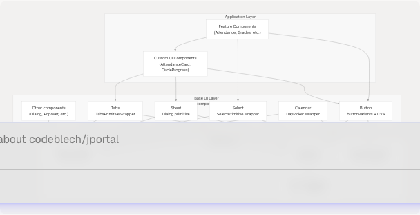
This document covers the foundational UI components in JPortal that are built as thin wrappers around Radix UI primitives. These components provide accessible, themeable, and reusable building blocks for the entire application. They are located in src/components/ui/ and serve as the base layer upon which custom feature components are constructed.
For custom components built for specific features (e.g., AttendanceCard, MarksCard), see Custom Feature Components. For navigation and theme-related components (e.g., Header, Navbar, ThemeSelector), see Theme & Navigation Components. For information about the styling system, CSS variables, and Tailwind configuration, see Styling System.
Architecture Overview
The base UI components follow a consistent architecture pattern where Radix UI unstyled primitives are wrapped with Tailwind CSS utilities and Class Variance Authority (CVA) for variant management. This approach provides:
- Accessibility: Radix UI handles ARIA attributes, keyboard navigation, and focus management
- Flexibility: Components accept
classNameprops for customization - Consistency: All components integrate with the theme system via CSS custom properties
- Type Safety: TypeScript definitions with proper prop forwarding
Component Layer Architecture
Common Component Patterns
All base UI components in src/components/ui/ follow consistent patterns:
Forwarded Refs Pattern
Every component uses React.forwardRef to properly forward refs to the underlying DOM element or Radix primitive:
const Component = React.forwardRef(({ className, ...props }, ref) => (
  <RadixPrimitive.Component ref={ref} {...props} />
))
Component.displayName = RadixPrimitive.Component.displayName
This pattern is used in:
- src/components/ui/calendar.jsx8-59
- src/components/ui/select.jsx13-28
- src/components/ui/sheet.jsx16-24
- src/components/ui/tabs.jsx8-16
className Merging with cn() Utility
All components accept a className prop that is merged with default styles using the cn() utility from src/lib/utils:
| Component | Base Classes | Merge Location |
|---|---|---|
SelectTrigger |
flex h-10 w-full items-center... |
src/components/ui/select.jsx16-18 |
SheetOverlay |
fixed inset-0 z-50 bg-black/80... |
src/components/ui/sheet.jsx18-20 |
TabsList |
inline-flex h-10 items-center... |
src/components/ui/tabs.jsx11-13 |
Calendar |
p-3 |
src/components/ui/calendar.jsx17 |
Theme Integration via CSS Variables
All components reference CSS custom properties defined in src/index.css7-88 These variables are dynamically set by the theme system:
--color-background, --color-foreground
--color-primary, --color-primary-foreground
--color-muted, --color-muted-foreground
--color-accent, --color-accent-foreground
--color-border, --color-input, --color-ring
--radius-sm, --radius-md, --radius-lg
Components reference these via Tailwind utilities like bg-background, text-foreground, border-input, etc.
Component Catalog
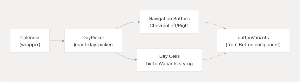
Calendar Component
The Calendar component wraps the react-day-picker library with custom Radix-styled navigation and day cells.
Component Structure
Key Features
| Feature | Implementation | Location |
|---|---|---|
| Navigation Icons | lucide-react ChevronLeft/ChevronRight |
src/components/ui/calendar.jsx53-54 |
| Button Styling | Reuses buttonVariants from Button component |
src/components/ui/calendar.jsx25 |
| Selected Day | bg-primary text-primary-foreground |
src/components/ui/calendar.jsx41-42 |
| Today Indicator | bg-accent text-accent-foreground |
src/components/ui/calendar.jsx43 |
| Outside Days | Configurable via showOutsideDays prop |
src/components/ui/calendar.jsx11 |
Styling Classes
The Calendar component defines extensive classNames for different parts of the day picker:
- Layout:
months,month,caption,nav,table,head_row,row,cell - Interactive elements:
nav_button,nav_button_previous,nav_button_next,day - States:
day_selected,day_today,day_outside,day_disabled,day_range_middle
All classes are defined in src/components/ui/calendar.jsx18-51
Select Component
The Select component provides a dropdown selection interface with search and keyboard navigation support. It exports multiple sub-components that compose the complete select experience.
Component Composition
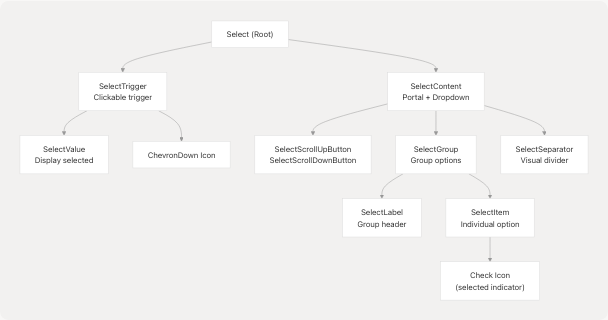
Exported Components
| Component | Radix Primitive | Purpose | Location |
|---|---|---|---|
Select |
SelectPrimitive.Root |
Root container | src/components/ui/select.jsx7 |
SelectGroup |
SelectPrimitive.Group |
Group related items | src/components/ui/select.jsx9 |
SelectValue |
SelectPrimitive.Value |
Display selected value | src/components/ui/select.jsx11 |
SelectTrigger |
SelectPrimitive.Trigger |
Clickable trigger button | src/components/ui/select.jsx13-28 |
SelectContent |
SelectPrimitive.Content |
Dropdown content portal | src/components/ui/select.jsx52-78 |
SelectLabel |
SelectPrimitive.Label |
Group label text | src/components/ui/select.jsx80-83 |
SelectItem |
SelectPrimitive.Item |
Individual selectable item | src/components/ui/select.jsx85-103 |
SelectSeparator |
SelectPrimitive.Separator |
Visual divider | src/components/ui/select.jsx105-108 |
SelectScrollUpButton |
SelectPrimitive.ScrollUpButton |
Scroll up indicator | src/components/ui/select.jsx30-39 |
SelectScrollDownButton |
SelectPrimitive.ScrollDownButton |
Scroll down indicator | src/components/ui/select.jsx41-50 |
Key Features
Trigger Styling src/components/ui/select.jsx16-18:
- Full-width flex container with space-between justification
- Includes focus ring with
focus:ring-2 focus:ring-ring - ChevronDown icon that cannot shrink (
shrink-0 ml-2) - Text truncation and line-clamping for selected value
Content Positioning src/components/ui/select.jsx52-63:
- Uses
SelectPrimitive.Portalfor proper z-index layering - Supports
position="popper"for positioning relative to trigger - Maximum height of
max-h-96with scroll - Responsive width:
max-w-[var(--radix-select-trigger-width)]
Item Selection Indicator src/components/ui/select.jsx94-98:
- Check icon positioned absolutely at left
- Only visible when item is selected via
SelectPrimitive.ItemIndicator - Item text uses
truncateto handle overflow
Usage in JPortal
The Select component is used extensively throughout JPortal for:
- Semester selection in Attendance, Grades, Exams, and Subjects modules
- Event type selection in Exams module
- Theme preset selection in ThemeSelector
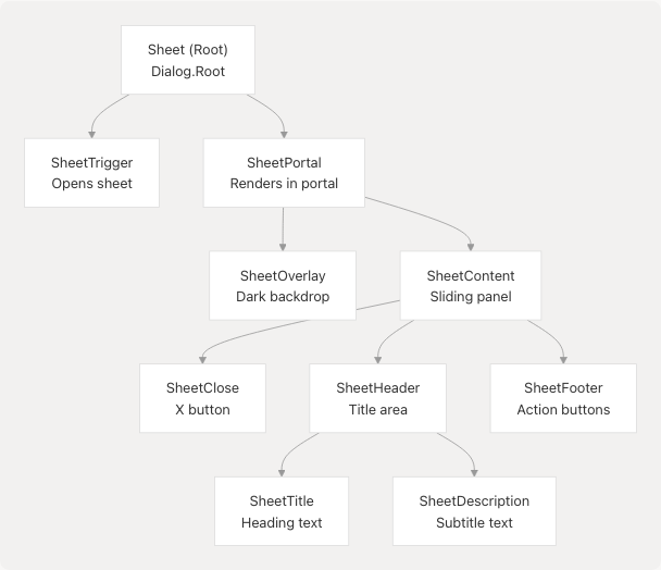
Sheet Component
The Sheet component provides a slide-in panel (also known as drawer or sidebar) built on top of @radix-ui/react-dialog. It supports four directional slides and includes overlay, header, and footer compositions.
Component Architecture
Side Variants with CVA
The SheetContent uses Class Variance Authority (CVA) to define four directional variants src/components/ui/sheet.jsx27-44:
| Side | Position | Slide Animation | Width/Height | Border |
|---|---|---|---|---|
top |
inset-x-0 top-0 |
slide-out-to-top / slide-in-from-top |
Full width | border-b |
bottom |
inset-x-0 bottom-0 |
slide-out-to-bottom / slide-in-from-bottom |
Full width | border-t |
left |
inset-y-0 left-0 |
slide-out-to-left / slide-in-from-left |
w-3/4 sm:max-w-sm |
border-r |
right (default) |
inset-y-0 right-0 |
slide-out-to-right / slide-in-from-right |
w-3/4 sm:max-w-sm |
border-l |
Animation and Transitions
The sheet uses data-state attributes for animations:
data-[state=open]:animate-inwith fade and slide effectsdata-[state=closed]:animate-outwith reversed animations- Duration: 300ms close, 500ms open src/components/ui/sheet.jsx28
Overlay Styling
The overlay src/components/ui/sheet.jsx16-24 provides:
- Fixed fullscreen positioning:
fixed inset-0 z-50 - Semi-transparent black backdrop:
bg-black/80 - Fade animations on open/close
- Z-index of 50 to appear above most content
Close Button Integration
The SheetContent automatically includes a close button src/components/ui/sheet.jsx51-55:
- Positioned absolutely at
right-4 top-4 - Uses
lucide-reactX icon - Includes screen reader text "Close"
- Styled with opacity changes on hover and ring on focus
Tabs Component
The Tabs component provides a tabbed interface for organizing content into sections. It wraps @radix-ui/react-tabs with consistent styling.
Component Composition
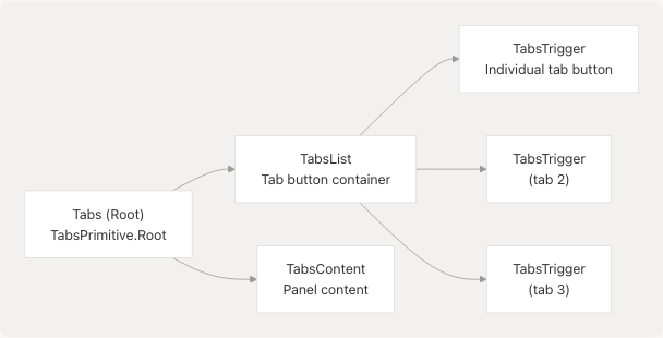
Component Details
| Component | Styling | Active State | Location |
|---|---|---|---|
TabsList |
inline-flex h-10 items-center justify-center rounded-md bg-muted p-1 |
N/A | src/components/ui/tabs.jsx8-16 |
TabsTrigger |
inline-flex items-center justify-center whitespace-nowrap rounded-sm px-3 py-1.5 |
data-[state=active]:bg-background data-[state=active]:text-foreground data-[state=active]:shadow-xs |
src/components/ui/tabs.jsx19-27 |
TabsContent |
mt-2 ring-offset-background |
N/A | src/components/ui/tabs.jsx30-38 |
Active Tab Styling
When a tab is active (data-[state=active]):
- Background changes from
mutedtobackground - Text color changes to
foreground - Shadow appears:
shadow-xs(defined in src/index.css66)
This creates a visual effect where the active tab appears to "pop out" from the muted tab list background.
Accessibility Features
Built-in from Radix UI:
- Automatic ARIA attributes (
role="tablist",aria-selected, etc.) - Keyboard navigation (arrow keys to switch tabs)
- Focus management with visible focus ring:
focus-visible:ring-2 focus-visible:ring-ring
Usage in JPortal
The Tabs component is used in the Attendance module to switch between:
- "Overview" tab: Shows overall attendance with semester selection
- "Daily" tab: Shows daily attendance records
See Attendance Module for implementation details.
Button Component Reference
While not included in the provided files, the Button component is referenced by other base components and is a critical part of the UI system. It is located at src/components/ui/button.jsx and exports:
Button: The main button componentbuttonVariants: CVA-based variant function used by Calendar and other components
The buttonVariants function is referenced in:
- src/components/ui/calendar.jsx6 - Import statement
- src/components/ui/calendar.jsx25 - Used for navigation buttons
- src/components/ui/calendar.jsx37 - Used for day cells
This demonstrates the composability of base components, where variant definitions are shared across components.
Styling Integration
Tailwind CSS Utilities
All base UI components use Tailwind CSS utility classes extensively. The Tailwind configuration reads CSS custom properties defined in src/index.css7-88:
@theme inline {
  --color-background: var(--background);
  --color-foreground: var(--foreground);
  --color-primary: var(--primary);
  /* ... etc */
}
This allows components to use utilities like:
bg-background,text-foregroundbg-primary,text-primary-foregroundborder-input,ring-ringbg-muted,text-muted-foreground
Which automatically respond to theme changes without component code modifications.
Animation Classes
Components use Tailwind animation utilities from the tailwindcss-animate plugin src/index.css3:
| Animation | Usage | Example |
|---|---|---|
animate-in / animate-out |
Entry/exit animations | Sheet, Select content |
fade-in-0 / fade-out-0 |
Opacity transitions | Overlays |
zoom-in-95 / zoom-out-95 |
Scale transitions | Select dropdown |
slide-in-from-* / slide-out-to-* |
Directional slides | Sheet panels |
These are applied using Radix UI's data-state attributes, e.g., data-[state=open]:animate-in.
Responsive Design
Base components implement responsive behavior using Tailwind breakpoints:
| Component | Responsive Feature | Implementation |
|---|---|---|
Sheet |
Width constraint on desktop | sm:max-w-sm (src/components/ui/sheet.jsx35) |
Calendar |
Flexible month layout | flex-col sm:flex-row (src/components/ui/calendar.jsx19) |
SheetHeader |
Text alignment | text-center sm:text-left (src/components/ui/sheet.jsx66) |
SheetFooter |
Flex direction | flex-col-reverse sm:flex-row (src/components/ui/sheet.jsx76) |
Other Base Components
While this document focuses on the provided component files, the src/components/ui/ directory contains additional base components following the same patterns:
- Dialog: Modal overlays (used by Sheet internally via
@radix-ui/react-dialog) - Popover: Floating content containers
- Dropdown Menu: Context menus and dropdowns
- Tooltip: Hover information displays
- Input: Text input fields
- Textarea: Multi-line text inputs
- Checkbox: Toggle inputs
- Radio Group: Single-choice selection
- Switch: Toggle switches
- Slider: Range inputs
- Card: Content containers
- Badge: Status indicators
- Avatar: User image displays
- Separator: Horizontal/vertical dividers
- Skeleton: Loading placeholders
All follow the same architectural patterns described in [Common Component Patterns](https://github.com/codeblech/jportal/blob/4df0fde4/Common Component Patterns)
Integration with Feature Modules
Base UI components are consumed throughout JPortal's feature modules:
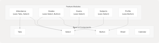
Example: Profile Module Button Usage
The Profile module imports and uses the Button component src/components/Profile.jsx3:
import { Button } from "@/components/ui/button";
This demonstrates how feature modules depend on base UI components for consistent interaction patterns.
Example: Navbar Component Integration
While Navbar is covered in Theme & Navigation Components, it demonstrates composition patterns by using navigation features that could leverage Sheet for mobile menus or Popover for dropdowns.