Adding New Features
Purpose and Scope
This document provides a step-by-step guide for developers adding new feature modules to JPortal. It covers the architectural patterns used across existing features and the specific code changes required to integrate a new feature module into the application.
For information about the overall architecture patterns, see Architecture Overview. For details about the mock data system used during development, see Mock Data System. For information about specific UI components that can be reused, see UI Components.
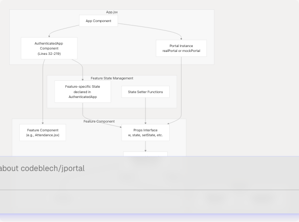
Feature Module Architecture
All feature modules in JPortal follow a consistent architectural pattern. Understanding this pattern is essential before adding new features.
Core Pattern
Key Characteristics
| Aspect | Implementation |
|---|---|
| State Location | All feature state is declared in AuthenticatedApp component (App.jsx32-101) |
| Props Pattern | Extensive props drilling - state and setters passed down to feature components |
| Data Access | Via w prop (WebPortal or MockWebPortal instance) |
| Caching Strategy | Features cache data in component state, keyed by semester/registration ID |
| Loading States | Each feature manages its own loading states for meta and data |
| Semester Selection | Most features include semester dropdown for historical data access |
Step-by-Step Implementation Guide
Step 1: Create the Feature Component
Create a new component file in src/components/ following the naming convention FeatureName.jsx.
Component Structure Template
// src/components/NewFeature.jsx
import React, { useState, useEffect } from "react";
import { Select, SelectContent, SelectItem, SelectTrigger, SelectValue } from "@/components/ui/select";

export default function NewFeature({
  w,                        // Portal instance (required)
  featureData,              // Main data state
  setFeatureData,           // Data setter
  semestersData,            // Semester metadata
  setSemestersData,         // Semester metadata setter
  selectedSem,              // Currently selected semester
  setSelectedSem,           // Semester selection setter
  // Add other feature-specific state props as needed
}) {
  // Local loading states
  const [loading, setLoading] = useState(true);

  // Initial data fetch
  useEffect(() => {
    const fetchData = async () => {
      // Check if data already exists
      if (featureData && semestersData) {
        setLoading(false);
        return;
      }

      try {
        // Fetch metadata (e.g., available semesters)
        const meta = await w.get_feature_meta();
        setSemestersData(meta);

        // Fetch initial data
        const data = await w.get_feature_data(meta.latest_semester);
        setFeatureData(prev => ({
          ...prev,
          [meta.latest_semester.registration_id]: data
        }));
        setSelectedSem(meta.latest_semester);
      } catch (error) {
        console.error("Failed to fetch feature data:", error);
      } finally {
        setLoading(false);
      }
    };

    fetchData();
  }, [w, featureData, setFeatureData, semestersData, setSemestersData]);

  // Semester change handler
  const handleSemesterChange = async (value) => {
    const semester = semestersData.semesters.find(s => s.registration_id === value);
    setSelectedSem(semester);

    // Check cache
    if (featureData[value]) {
      return;
    }

    // Fetch new data
    setLoading(true);
    try {
      const data = await w.get_feature_data(semester);
      setFeatureData(prev => ({
        ...prev,
        [value]: data
      }));
    } catch (error) {
      console.error("Failed to fetch data for semester:", error);
    } finally {
      setLoading(false);
    }
  };

  // Render logic
  return (
    <div className="text-foreground font-sans">
      {/* Sticky header with semester selector */}
      <div className="sticky top-14 bg-background z-20">
        <div className="py-2 px-3">
          <Select onValueChange={handleSemesterChange} value={selectedSem?.registration_id}>
            <SelectTrigger className="bg-background text-foreground border-foreground cursor-pointer hover:bg-accent hover:text-accent-foreground">
              <SelectValue placeholder="Select semester">
                {selectedSem?.registration_code}
              </SelectValue>
            </SelectTrigger>
            <SelectContent className="bg-background text-foreground border-foreground">
              {semestersData?.semesters?.map((sem) => (
                <SelectItem key={sem.registration_id} value={sem.registration_id}>
                  {sem.registration_code}
                </SelectItem>
              ))}
            </SelectContent>
          </Select>
        </div>
      </div>

      {/* Content area */}
      <div className="px-3 pb-4">
        {loading ? (
          <div className="flex items-center justify-center py-4">
            Loading...
          </div>
        ) : (
          // Render feature content
          <div>Feature content here</div>
        )}
      </div>
    </div>
  );
}
Key Implementation Details
- Sticky Header Pattern: Use
sticky top-14for semester selector to keep it visible during scroll (Attendance.jsx246-272) - Loading States: Maintain separate loading states for metadata and data (Attendance.jsx99-101)
- Caching Strategy: Store data keyed by
registration_idto avoid redundant API calls (Attendance.jsx107-118) - Error Handling: Wrap API calls in try-catch blocks and log errors appropriately
Step 2: Define State in AuthenticatedApp
Add state declarations for your new feature in the AuthenticatedApp component.
State Declaration Pattern
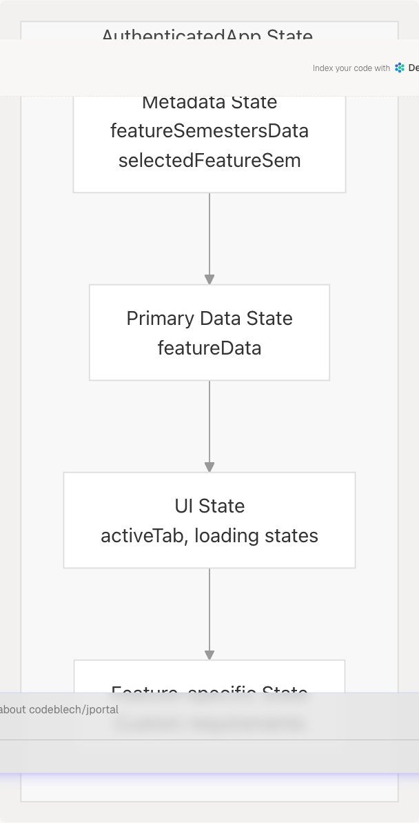
Location: jportal/src/App.jsx32-101
Add state variables following this pattern:
// In AuthenticatedApp component
function AuthenticatedApp({ w, setIsAuthenticated, setIsDemoMode }) {
  // Add your feature states here

  // Main data state - keyed by registration_id for caching
  const [featureData, setFeatureData] = useState({});

  // Semester metadata state
  const [featureSemestersData, setFeatureSemestersData] = useState(null);

  // Currently selected semester
  const [selectedFeatureSem, setSelectedFeatureSem] = useState(null);

  // Loading states
  const [featureMetaLoading, setFeatureMetaLoading] = useState(true);
  const [featureDataLoading, setFeatureDataLoading] = useState(true);

  // Additional feature-specific states
  const [activeFeatureTab, setActiveFeatureTab] = useState("overview");

  // ... existing state declarations
}
State Naming Conventions
| State Type | Pattern | Example |
|---|---|---|
| Main Data | {feature}Data |
attendanceData, gradesData |
| Semester Metadata | {feature}SemestersData |
attendanceSemestersData, subjectSemestersData |
| Selected Semester | selected{Feature}Sem |
selectedAttendanceSem, selectedGradesSem |
| Loading States | {feature}Loading or is{Feature}Loading |
gradesLoading, isAttendanceMetaLoading |
| Tab States | active{Feature}Tab |
activeGradesTab, activeAttendanceTab |
Step 3: Add Route Configuration
Add the new feature route in the AuthenticatedApp routes section.
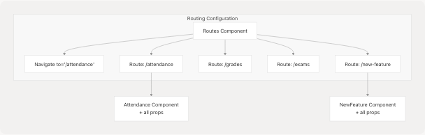
Location: jportal/src/App.jsx107-216
Add the route in the Routes component within AuthenticatedApp:
// In AuthenticatedApp's return statement
<Routes>
  <Route path="/" element={<Navigate to="/attendance" />} />
  <Route path="/login" element={<Navigate to="/attendance" />} />

  {/* Existing routes */}
  <Route path="/attendance" element={<Attendance {...attendanceProps} />} />
  <Route path="/grades" element={<Grades {...gradesProps} />} />

  {/* Add your new feature route */}
  <Route
    path="/new-feature"
    element={
      <NewFeature
        w={w}
        featureData={featureData}
        setFeatureData={setFeatureData}
        semestersData={featureSemestersData}
        setSemestersData={setFeatureSemestersData}
        selectedSem={selectedFeatureSem}
        setSelectedSem={setSelectedFeatureSem}
        featureMetaLoading={featureMetaLoading}
        setFeatureMetaLoading={setFeatureMetaLoading}
        featureDataLoading={featureDataLoading}
        setFeatureDataLoading={setFeatureDataLoading}
        // Pass any additional props needed
      />
    }
  />
</Routes>
Route Path Conventions
- Use lowercase kebab-case for route paths
- Keep paths simple and descriptive (e.g.,
/attendance,/grades,/exams) - The path becomes part of the URL:
https://example.com/#/new-feature
Step 4: Update Navigation Component
Add navigation link in the Navbar component to make the feature accessible.
File: src/components/Navbar.jsx
// Add import for any new icons
import { IconName } from "lucide-react";

// In the Navbar component's render
<nav className="...">
  {/* Existing nav items */}
  <NavLink to="/attendance">
    <CalendarCheck className="h-5 w-5" />
    <span className="text-xs">Attendance</span>
  </NavLink>

  {/* Add your new feature link */}
  <NavLink to="/new-feature">
    <IconName className="h-5 w-5" />
    <span className="text-xs">Feature Name</span>
  </NavLink>
</nav>
Navigation Best Practices
| Aspect | Guideline |
|---|---|
| Icon Selection | Use icons from lucide-react library for consistency |
| Label Length | Keep navigation labels short (1-2 words) |
| Order | Place new features logically based on user workflow |
| Active State | NavLink automatically handles active state styling |
Step 5: Implement Mock Data Support
Extend the MockWebPortal class to support your new feature in demo mode.
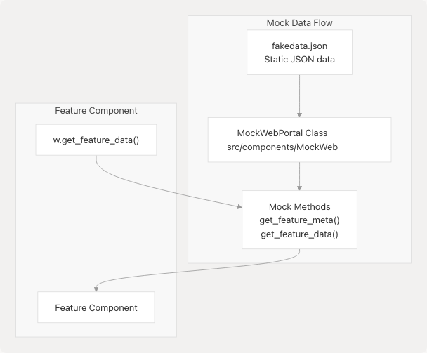
Add Data to fakedata.json
File: public/fakedata.json
{
  "attendance": { /* existing */ },
  "grades": { /* existing */ },
  "newfeature": {
    "semesters": [
      {
        "registration_id": "202301",
        "registration_code": "2023-24 ODD SEM"
      }
    ],
    "data": {
      "202301": {
        // Feature-specific data structure
      }
    }
  }
}
Extend MockWebPortal Class
File: src/components/MockWebPortal.jsx
class MockWebPortal {
  constructor() {
    this.fakeData = null;
  }

  async init() {
    if (!this.fakeData) {
      const response = await fetch('/fakedata.json');
      this.fakeData = await response.json();
    }
  }

  // Add methods for your feature
  async get_feature_meta() {
    await this.init();
    return {
      semesters: this.fakeData.newfeature.semesters,
      latest_semester: this.fakeData.newfeature.semesters[0]
    };
  }

  async get_feature_data(semester) {
    await this.init();
    return this.fakeData.newfeature.data[semester.registration_id];
  }
}
Method Naming Conventions
Match the real WebPortal API methods from the jsjiit library:
- Use snake_case for method names (e.g.,
get_feature_data, notgetFeatureData) - Accept the same parameters as the real API
- Return data in the same structure as the real API
Step 6: Add WebPortal API Methods (Real Mode)
For real mode functionality, the feature must call methods available in the jsjiit library's WebPortal class.
API Method Pattern
// In your feature component
const fetchData = async () => {
  try {
    // Call WebPortal API method
    const data = await w.get_feature_specific_method(params);
    setFeatureData(data);
  } catch (error) {
    console.error("API call failed:", error);
  }
};
Common WebPortal Methods
| Method | Purpose | Used By |
|---|---|---|
get_attendance_meta() |
Fetch available semesters for attendance | Attendance |
get_attendance(header, semester) |
Fetch attendance data | Attendance |
get_sgpa_cgpa() |
Fetch grade overview | Grades |
get_grade_card(semester) |
Fetch semester grade card | Grades |
get_registered_semesters() |
Fetch registered semesters | Subjects |
get_registered_subjects_and_faculties(semester) |
Fetch subject details | Subjects |
get_semesters_for_exam_events() |
Fetch exam semesters | Exams |
get_exam_schedule(event) |
Fetch exam schedule | Exams |
Note: If the required API method doesn't exist in jsjiit, you'll need to contribute to that library first or work with mock data only.
Advanced Patterns
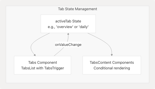
Multi-Tab Features
Some features like Attendance and Grades use tabbed interfaces for different views.
Implementation
// In AuthenticatedApp state
const [activeFeatureTab, setActiveFeatureTab] = useState("overview");

// Pass to component
<NewFeature
  activeTab={activeFeatureTab}
  setActiveTab={setActiveFeatureTab}
  // other props
/>

// In feature component
<Tabs value={activeTab} onValueChange={setActiveTab}>
  <TabsList className="grid grid-cols-2 bg-background gap-3">
    <TabsTrigger value="overview">Overview</TabsTrigger>
    <TabsTrigger value="details">Details</TabsTrigger>
  </TabsList>

  <TabsContent value="overview">
    {/* Overview content */}
  </TabsContent>

  <TabsContent value="details">
    {/* Details content */}
  </TabsContent>
</Tabs>
Nested Data Structures
Features like Attendance that fetch additional detail data for selected items.
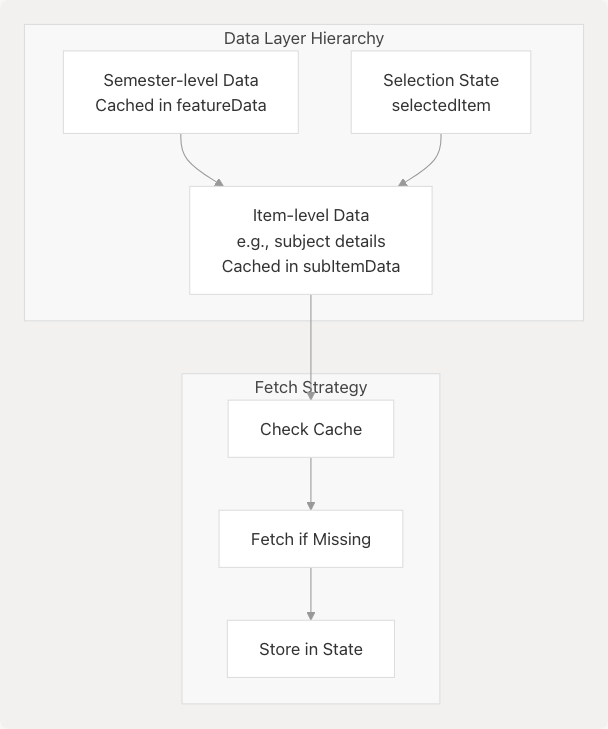
Example: Attendance feature has subjectAttendanceData for detailed per-subject data (App.jsx76-77)
// State in AuthenticatedApp
const [featureData, setFeatureData] = useState({});
const [subItemData, setSubItemData] = useState({});
const [selectedItem, setSelectedItem] = useState(null);

// Pass to component
<NewFeature
  featureData={featureData}
  setFeatureData={setFeatureData}
  subItemData={subItemData}
  setSubItemData={setSubItemData}
  selectedItem={selectedItem}
  setSelectedItem={setSelectedItem}
/>

// In feature component - fetch sub-item data
const fetchSubItemData = async (item) => {
  if (subItemData[item.id]) {
    return; // Already cached
  }

  const data = await w.get_sub_item_data(item);
  setSubItemData(prev => ({
    ...prev,
    [item.id]: data
  }));
};
Loading State Patterns
Different loading states for different data layers improve UX.
| Loading State Type | Usage | Example |
|---|---|---|
| Meta Loading | While fetching metadata (semesters, etc.) | isAttendanceMetaLoading |
| Data Loading | While fetching primary data | isAttendanceDataLoading |
| Action Loading | During user-initiated actions | gradeCardLoading |
// In AuthenticatedApp
const [featureMetaLoading, setFeatureMetaLoading] = useState(true);
const [featureDataLoading, setFeatureDataLoading] = useState(true);

// Conditional rendering in feature component
{featureMetaLoading || featureDataLoading ? (
  <div className="flex items-center justify-center py-4">
    Loading...
  </div>
) : (
  // Render content
)}
Feature Integration Checklist
Use this checklist when adding a new feature:
Code Changes
- Create feature component in
src/components/FeatureName.jsx - Add state declarations in
AuthenticatedApp(App.jsx32-101) - Add route configuration (App.jsx107-216)
- Update
Navbarcomponent with navigation link - Import feature component in
App.jsx(App.jsx6-11)
Data Layer
- Add mock data to
public/fakedata.json - Extend
MockWebPortalclass with new methods - Verify
jsjiitlibrary supports required API methods - Test data fetching with both real and mock portals
UI & Styling
- Use Radix UI components for consistency (#5.3)
- Follow theme system for colors and styling (#3.4)
- Implement responsive design
- Test with different theme presets
Testing
- Test demo mode functionality
- Test semester selection and caching
- Test loading states
- Test error handling
- Verify browser back/forward navigation
- Test PWA offline functionality if applicable
Common Patterns Reference
Data Caching by Registration ID
// Check cache before fetching
if (featureData[semester.registration_id]) {
  // Use cached data
  return;
}

// Fetch and store
const data = await w.get_feature_data(semester);
setFeatureData(prev => ({
  ...prev,
  [semester.registration_id]: data
}));
Semester Selector UI
<Select onValueChange={handleSemesterChange} value={selectedSem?.registration_id}>
  <SelectTrigger className="bg-background text-foreground border-foreground cursor-pointer hover:bg-accent hover:text-accent-foreground">
    <SelectValue placeholder="Select semester">
      {selectedSem?.registration_code}
    </SelectValue>
  </SelectTrigger>
  <SelectContent className="bg-background text-foreground border-foreground">
    {semestersData?.semesters?.map((sem) => (
      <SelectItem key={sem.registration_id} value={sem.registration_id}>
        {sem.registration_code}
      </SelectItem>
    ))}
  </SelectContent>
</Select>
Error Handling
try {
  const data = await w.get_feature_data(params);
  setFeatureData(data);
} catch (error) {
  console.error("Failed to fetch feature data:", error);
  // Optionally set error state for user feedback
  setError("Unable to load data. Please try again.");
}
Notes and Limitations
Current Limitations
- Props Drilling: The current architecture uses extensive props drilling. Future refactoring may introduce context or global state management to reduce this.
- State Centralization: All state is in
AuthenticatedApp, making the component large (220+ lines). Consider this when adding complex features. - No State Persistence: Most feature state is lost on page refresh (except
attendanceGoal). Consider localStorage for critical state. - jsjiit Dependency: Features requiring new API methods depend on updates to the external
jsjiitlibrary.
Performance Considerations
- Features cache data by semester to minimize API calls
- Use React's
useEffectcleanup for async operations - Consider lazy loading for features with heavy data processing (e.g., Grades with Pyodide)