Development Guide
This guide provides information for developers contributing to JPortal. It covers code organization patterns, architectural decisions, development workflow, and best practices used throughout the codebase. For information about building and deploying the application, see Build & Deployment. For details about the mock data system used in demo mode, see Mock Data System. For step-by-step instructions on adding new features, see Adding New Features.
Project Setup
Prerequisites
JPortal requires Node.js and npm to run. The project uses modern JavaScript/TypeScript tooling with Vite as the build system.
Installation
Clone the repository and install dependencies:
git clone https://github.com/codeblech/jportal
cd jportal
npm install
Development Commands
| Command | Purpose |
|---|---|
npm run dev |
Start Vite development server with hot reload |
npm run build |
Build production bundle to dist/ |
npm run preview |
Preview production build locally |
npm run lint |
Run ESLint on codebase |
npm run deploy |
Deploy to GitHub Pages (runs predeploy build) |
Sources: package.json7-13
Technology Stack
Core Dependencies
| Library | Version | Purpose |
|---|---|---|
| React | ^18.3.1 | UI framework |
| React Router DOM | ^6.27.0 | Client-side routing |
| Vite | ^5.4.10 | Build tool and dev server |
| Tailwind CSS | ^4.1.12 | Utility-first CSS framework |
| TypeScript | ^5.9.2 | Type checking (dev) |
Key Libraries
| Library | Purpose |
|---|---|
| Radix UI | Accessible component primitives (Dialog, Select, Tabs, etc.) |
| React Hook Form | Form state management |
| Zod | Schema validation |
| Zustand | Global state management (theme) |
| TanStack Query | Server state management |
| Recharts | Data visualization |
| Sonner | Toast notifications |
| jsjiit | JIIT portal API integration (loaded via CDN) |
| Pyodide | Python runtime in browser (for PDF parsing) |
Sources: package.json15-43
Code Organization
Directory Structure
jportal/
├── src/
│   ├── components/
│   │   ├── Attendance.jsx          # Feature module
│   │   ├── Grades.jsx              # Feature module
│   │   ├── Exams.jsx               # Feature module
│   │   ├── Subjects.jsx            # Feature module
│   │   ├── Profile.jsx             # Feature module
│   │   ├── Cloudflare.jsx          # Analytics dashboard
│   │   ├── Login.jsx               # Authentication
│   │   ├── Header.jsx              # Top navigation
│   │   ├── Navbar.jsx              # Bottom navigation
│   │   ├── MockWebPortal.jsx       # Demo mode API
│   │   ├── theme-*.jsx             # Theme system
│   │   └── ui/                     # Base UI components
│   ├── lib/
│   │   ├── theme-presets.ts        # Theme definitions
│   │   ├── theme-store.ts          # Zustand store
│   │   └── utils.ts                # Utility functions
│   ├── data/
│   │   └── fakedata.json           # Mock data for demo mode
│   ├── App.jsx                     # Root component
│   ├── main.jsx                    # Application entry
│   └── index.css                   # Global styles
├── public/
│   └── j-yuvraj.svg                # PWA icon
└── index.html                      # HTML shell
Sources: App.jsx1-16
Application Entry Point and Routing
Main Entry Flow
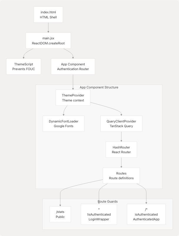
The application uses HashRouter for GitHub Pages compatibility. The App component implements authentication-based routing: unauthenticated users see Login, while authenticated users access AuthenticatedApp. The /stats route is publicly accessible.
Sources: App.jsx243-376
Authentication System
Portal Instance Pattern
JPortal uses a dual-mode architecture with two portal instances created at module level:
const realPortal = new WebPortal();    // jsjiit library
const mockPortal = new MockWebPortal(); // Local mock implementation

// Select active portal based on authentication mode
const activePortal = isDemoMode ? mockPortal : realPortal;
Both portals implement the same interface (methods like get_attendance(), get_grades(), etc.), allowing seamless mode switching.
Sources: App.jsx18-250
Authentication State Flow
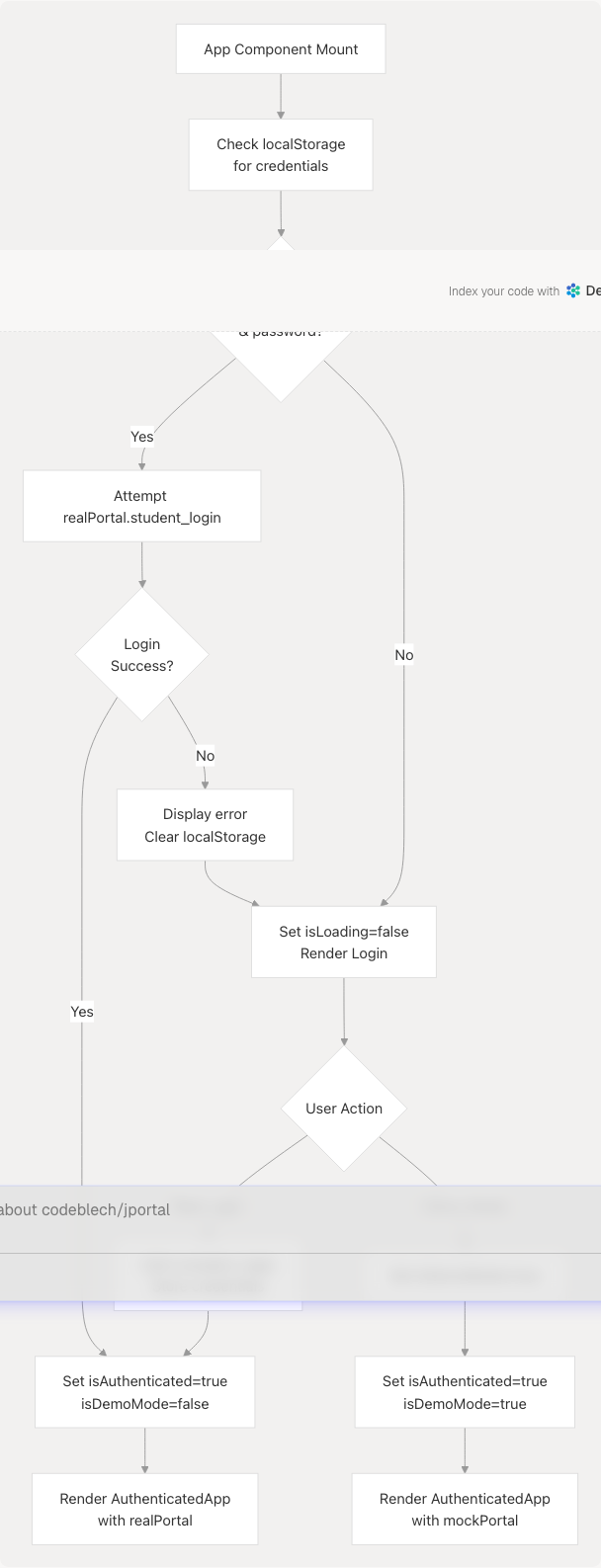
The authentication flow automatically attempts login on mount if credentials exist in localStorage. Manual login stores credentials for future auto-login. Demo mode bypasses authentication and uses MockWebPortal.
Sources: App.jsx252-298 Login.jsx24-95
State Management Architecture
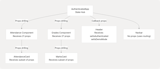
Multi-Layer State Pattern
JPortal uses a centralized state hub pattern where AuthenticatedApp maintains state for all feature modules and passes it down via props.
State Layers Diagram
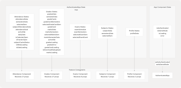
This pattern involves extensive props drilling where state and setter functions are passed through component hierarchies. All feature components receive the w prop (portal instance) as their primary data source.
Sources: App.jsx32-101
State Initialization Patterns
Feature modules follow a consistent pattern for state initialization:
- Metadata Loading: Fetch available semesters/options on mount
- Default Selection: Auto-select most recent semester
- Data Loading: Fetch data for selected semester
- Caching: Store fetched data in state to avoid re-fetching
Example state management in AuthenticatedApp for Attendance:
const [attendanceData, setAttendanceData] = useState({});
const [attendanceSemestersData, setAttendanceSemestersData] = useState(null);
const [selectedAttendanceSem, setSelectedAttendanceSem] = useState(null);
const [attendanceGoal, setAttendanceGoal] = useState(() => {
  const savedGoal = localStorage.getItem("attendanceGoal");
  return savedGoal ? parseInt(savedGoal) : 75;
});
Sources: App.jsx33-56
Feature Module Patterns
Standard Feature Module Structure
All feature modules follow a similar structure:
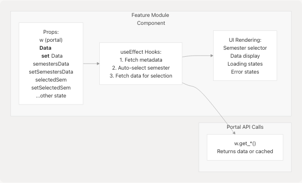
Common Props Pattern
Every feature module receives:
| Prop Category | Examples | Purpose |
|---|---|---|
| Portal | w |
API access (WebPortal or MockWebPortal) |
| Data State | attendanceData, gradesData |
Stores fetched data |
| Data Setters | setAttendanceData, setGradesData |
Update data state |
| Metadata | semestersData, examSemesters |
Available options |
| Selection | selectedSem, selectedExamSem |
Current selection |
| UI State | activeTab, isLoading, isOpen |
Component-specific UI state |
Sources: App.jsx110-214
Portal API Integration Pattern
The w Prop
All feature components receive a w prop which is either realPortal or mockPortal. This abstraction allows identical code to work in both real and demo modes.
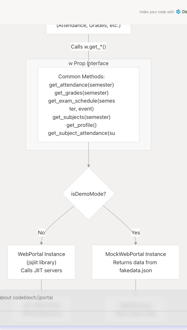
API Call Pattern
Feature modules typically follow this pattern when fetching data:
useEffect(() => {
  const fetchData = async () => {
    try {
      setLoading(true);
      const data = await w.get_something(selectedOption);
      setData(data);
    } catch (error) {
      console.error("Error:", error);
      setError(error.message);
    } finally {
      setLoading(false);
    }
  };

  if (selectedOption) {
    fetchData();
  }
}, [selectedOption, w]);
Sources: App.jsx250
Component Communication Patterns
Props Drilling
JPortal uses props drilling for component communication. State is maintained in AuthenticatedApp and passed down to feature components and their children.
Alternative: Global State (Theme)
The theme system uses Zustand for global state, avoiding props drilling:
// lib/theme-store.ts
export const useThemeStore = create((set) => ({
  themeState: getInitialTheme(),
  setThemeState: (theme) => set({ themeState: theme }),
}));

// Any component can access theme
const { themeState, setThemeState } = useThemeStore();
This demonstrates that JPortal uses different patterns for different concerns: props drilling for feature state, Zustand for theme, and potential for TanStack Query for server state.
Sources: App.jsx102-218
Local Storage Usage
Persisted Data
| Key | Type | Purpose | Managed By |
|---|---|---|---|
username |
string | User enrollment number | Login flow |
password |
string | User password | Login flow |
attendanceGoal |
string (number) | Target attendance percentage | Attendance module |
| Theme data | object | Current theme preset and mode | Theme system |
Credential Storage Pattern
// Store on successful login
localStorage.setItem("username", enrollmentNumber);
localStorage.setItem("password", password);

// Retrieve on app mount for auto-login
const username = localStorage.getItem("username");
const password = localStorage.getItem("password");

// Clear on logout or login error
localStorage.removeItem("username");
localStorage.removeItem("password");
Sources: Login.jsx54-55 App.jsx253-280
Error Handling Patterns
Login Error Handling
The application uses custom error types from the jsjiit library:
try {
  await w.student_login(username, password);
} catch (error) {
  if (error instanceof LoginError &&
      error.message.includes("JIIT Web Portal server is temporarily unavailable")) {
    toast.error("JIIT Web Portal server is temporarily unavailable. Please try again later.");
  } else if (error instanceof LoginError &&
             error.message.includes("Failed to fetch")) {
    toast.error("Please check your internet connection. If connected, JIIT Web Portal server is unavailable.");
  } else {
    toast.error("Login failed. Please check your credentials.");
  }
}
User Feedback
JPortal uses Sonner for toast notifications with custom styling:
<Toaster
  richColors
  icons={{
    error: <TriangleAlert className="h-4 w-4" />,
  }}
  toastOptions={{
    style: {
      background: "var(--popover)",
      color: "var(--popover-foreground)",
      border: "1px solid var(--border)",
      boxShadow: "var(--shadow-lg)",
    },
  }}
/>
Sources: Login.jsx64-76 App.jsx320-333
Development Best Practices
Code Style Conventions
- Component Files: Use
.jsxextension for React components - Utility Files: Use
.tsextension for TypeScript utilities - State Naming: Follow
[noun]Datapattern (e.g.,attendanceData,gradesData) - Setter Naming: Follow
set[Noun]Datapattern (e.g.,setAttendanceData) - Loading States: Use
is[Feature]Loadingpattern (e.g.,isAttendanceMetaLoading) - Boolean Props: Use
is*orhas*prefixes (e.g.,isOpen,hasError)
Component Structure
Follow this pattern for feature components:
export default function FeatureName({
  w,
  data,
  setData,
  // ... other props
}) {
  // 1. Local state (if needed)
  const [localState, setLocalState] = useState(null);

  // 2. useEffect hooks for data fetching
  useEffect(() => {
    // Fetch metadata
  }, [w]);

  useEffect(() => {
    // Fetch data based on selection
  }, [selection, w]);

  // 3. Event handlers
  const handleSomething = () => {
    // ...
  };

  // 4. Render
  return (
    <div>
      {/* UI */}
    </div>
  );
}
Prop Passing
When passing many props to a component, use object destructuring and group related props:
<Attendance
  // Portal
  w={w}

  // Data
  attendanceData={attendanceData}
  setAttendanceData={setAttendanceData}

  // Metadata
  semestersData={attendanceSemestersData}
  setSemestersData={setAttendanceSemestersData}

  // Selection
  selectedSem={selectedAttendanceSem}
  setSelectedSem={setSelectedAttendanceSem}

  // ... grouped props
/>
Sources: App.jsx110-141
Routing and Navigation
Route Structure
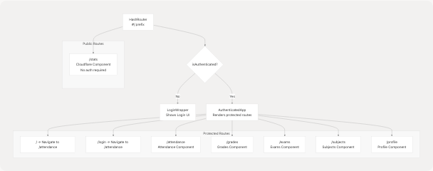
Navigation Components
- Header: Fixed at top, contains theme selector and logout button
- Navbar: Fixed at bottom, contains navigation links to 5 main routes
Both use hash-based routing (#/attendance, #/grades, etc.) for GitHub Pages compatibility.
Sources: App.jsx107-369
Linting and Code Quality
ESLint Configuration
The project uses ESLint with React-specific plugins:
@eslint/js: Base JavaScript ruleseslint-plugin-react: React-specific ruleseslint-plugin-react-hooks: Enforce Rules of Hookseslint-plugin-react-refresh: Fast Refresh compatibility@tanstack/eslint-plugin-query: TanStack Query best practices
Run linting with:
npm run lint
Sources: package.json45-51
Development Workflow
Local Development
- Start dev server:
npm run dev - Open browser: Navigate to
http://localhost:5173(or shown port) - Make changes: Hot reload updates automatically
- Test in demo mode: Use "Try Demo" button on login
- Test real mode: Use actual JIIT credentials (if available)
Testing Both Modes
To verify feature compatibility with both portal implementations:
- Implement feature using
w.get_*()methods - Test with demo mode first (instant, no network)
- Test with real mode (requires JIIT credentials)
- Ensure identical behavior in both modes
Pre-Deployment Checklist
- Run
npm run lint- No linting errors - Test all features in demo mode
- Test all features in real mode (if credentials available)
- Verify theme switching works
- Test PWA installation
- Check responsive design on mobile
- Build succeeds:
npm run build - Preview build:
npm run preview
Sources: package.json8-13
Common Development Tasks
Adding a New UI Component
- Create component in
src/components/ui/ - Use Radix UI primitives if applicable
- Style with Tailwind CSS
- Use CSS variables for theme compatibility
- Export from component file
Modifying Theme
- Edit presets in
src/lib/theme-presets.ts - Add new CSS variables in
src/index.css - Use variables via Tailwind:
bg-background,text-foreground
Adding a New Route
- Add state to
AuthenticatedAppcomponent - Create component in
src/components/ - Add
<Route>inAuthenticatedAppRoutes - Add navigation link to
Navbar.jsx(if needed) - Pass necessary props including
w
Working with Portal API
When adding new data fetching:
// In feature component
useEffect(() => {
  const fetchData = async () => {
    try {
      const data = await w.get_new_data(params);
      setData(data);
    } catch (error) {
      console.error(error);
    }
  };
  fetchData();
}, [params, w]);
Ensure MockWebPortal implements the same method for demo mode.
Sources: App.jsx32-219
Debugging Tips
Check Portal Mode
Add console logs to verify which portal is active:
console.log('Portal mode:', isDemoMode ? 'Demo' : 'Real');
console.log('Portal instance:', w);
Inspect State
Use React DevTools to inspect AuthenticatedApp state:
- All feature states are visible in one component
- Check state values before and after API calls
- Verify prop propagation
Network Requests
- Real mode: Check Network tab for JIIT portal requests
- Demo mode: No network requests, data from
fakedata.json
LocalStorage
Check Application > Local Storage in DevTools:
- Verify credentials are stored correctly
- Check
attendanceGoalvalue - Inspect theme data
Common Issues
| Issue | Likely Cause | Solution |
|---|---|---|
| "Auto-login failed" | Invalid stored credentials | Clear localStorage, login again |
| Data not loading | Missing semester selection | Check if selectedSem is set |
| Props undefined | Missing prop in component | Check prop drilling chain |
| Theme not applying | CSS variables not defined | Check index.css for variables |
Sources: App.jsx252-288