Navigation System
Purpose and Scope
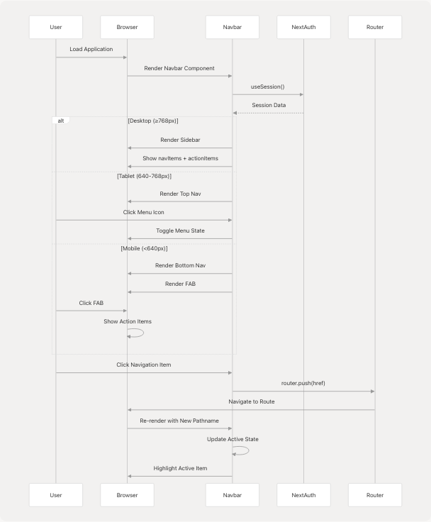
This document describes the responsive navigation system in TalentSync's frontend application. The system provides three distinct navigation interfaces optimized for different screen sizes: a collapsible sidebar for desktop, a top navigation bar for tablets, and a bottom navigation bar with floating action button (FAB) for mobile devices. The system integrates with NextAuth for session management and displays role-appropriate navigation options.
For authentication-related routing and middleware protection, see Middleware & Route Protection. For information about dashboard layout and page organization, see Dashboard Pages.
Navigation Architecture Overview
The navigation system consists of four primary components that work together to provide a seamless experience across device sizes:
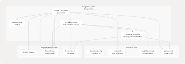
Sources: frontend/components/navbar.tsx1-397 frontend/components/mobile-bottom-nav.tsx1-209 frontend/components/floating-action-button.tsx1-109 frontend/lib/navigation.ts1-109
Responsive Breakpoint Strategy
The navigation system adapts to three distinct viewport ranges using Tailwind CSS breakpoints:
| Device Type | Screen Size | Navigation Mode | Component Visibility |
|---|---|---|---|
| Mobile | < 640px (sm) | Bottom Navigation + FAB | MobileBottomNav visible, sidebar/top nav hidden |
| Tablet | 640px - 768px (sm to md) | Top Navigation Bar | Top nav visible, sidebar/bottom nav hidden |
| Desktop | ≥ 768px (md+) | Collapsible Sidebar | Sidebar visible, tablet/mobile nav hidden |
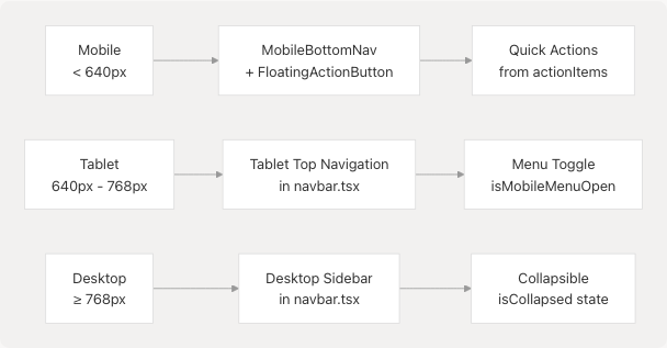
Sources: frontend/components/navbar.tsx40-47 frontend/components/navbar.tsx238-242 frontend/components/mobile-bottom-nav.tsx55-63
Desktop Sidebar Navigation
Component Structure
The desktop sidebar is implemented in the Navbar component and is visible on screens ≥768px. It uses the useSidebar() hook from SidebarProvider to manage collapse state.
Sources: frontend/components/navbar.tsx40-236 frontend/components/navbar.tsx77-143 frontend/components/navbar.tsx145-234
Collapse Functionality
The sidebar can be collapsed to a minimal 64px width, showing only icons:
| State | Width | Content Display |
|---|---|---|
Expanded (isCollapsed = false) |
288px (w-72) |
Icons + labels + descriptions |
Collapsed (isCollapsed = true) |
64px (w-16) |
Icons only with tooltips |
The collapse state is managed by the SidebarProvider context and toggled via the ChevronLeft/ChevronRight button:
frontend/components/navbar.tsx62-74
Active Route Highlighting
Active routes are determined by comparing pathname from usePathname() with each navigation item's href:
frontend/components/navbar.tsx81-98
Active items receive the class text-[#76ABAE] bg-[#76ABAE]/10 while inactive items use text-[#EEEEEE]/80.
Sources: frontend/components/navbar.tsx41-47 frontend/components/navbar.tsx51-74 frontend/components/navbar.tsx77-100
Tablet Navigation
The tablet navigation displays a fixed top bar with a hamburger menu for screens between 640px and 768px:
Menu Structure
The expandable menu contains:
- Main Navigation Items - Mapped from
navItemsarray - Quick Actions Section - Displayed only for authenticated users from
actionItems - User Section - Profile info, Dashboard link, and Sign Out button (authenticated) or Sign In/Get Started buttons (unauthenticated)
frontend/components/navbar.tsx264-388
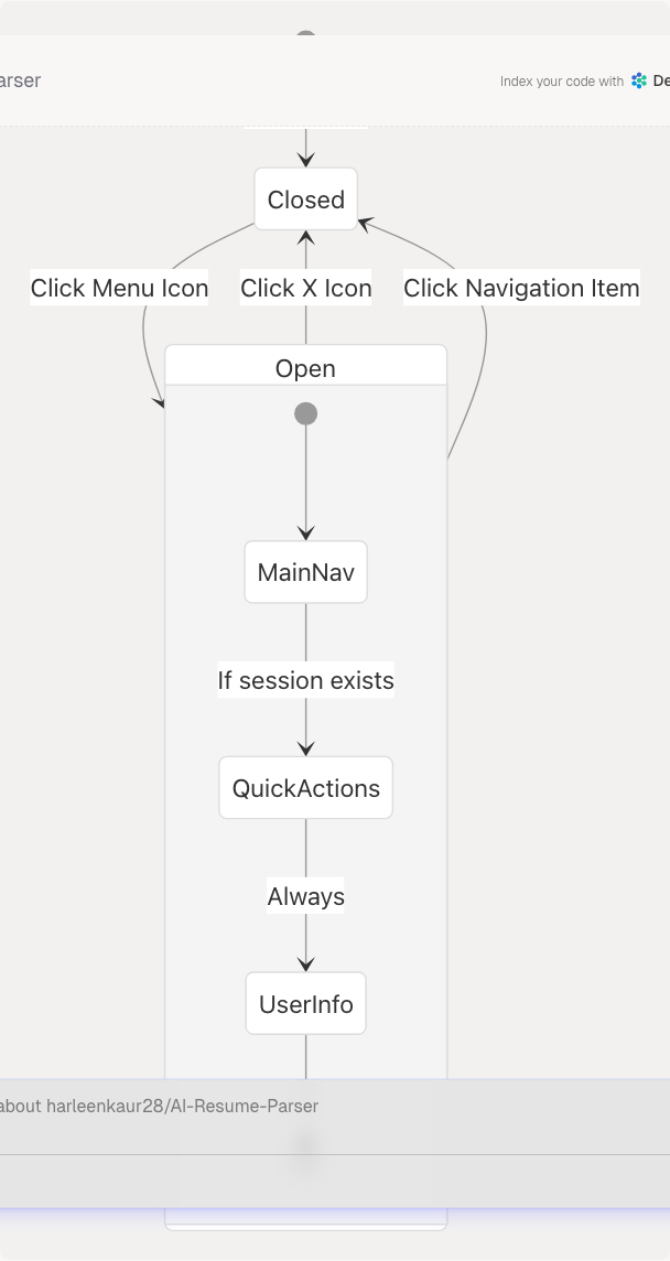
Toggle State Management
The menu toggle state is managed by local component state:
frontend/components/navbar.tsx30 frontend/components/navbar.tsx251-260
Sources: frontend/components/navbar.tsx238-391 frontend/components/navbar.tsx264-330
Mobile Bottom Navigation
Architecture
The mobile bottom navigation consists of two integrated components:
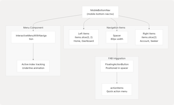
Sources: frontend/components/mobile-bottom-nav.tsx1-209 frontend/components/floating-action-button.tsx1-109
Mobile Navigation Items
Mobile navigation uses a separate configuration optimized for mobile UX:
frontend/lib/navigation.ts48-69
The items are split to accommodate the centered FAB:
- Left side: Home, Dashboard
- Spacer: 80px for FAB
- Right side: Account, Seeker
frontend/components/mobile-bottom-nav.tsx139-176
Active Route Detection
The mobile navigation determines the active item by matching the current pathname:
frontend/components/mobile-bottom-nav.tsx31-38
Sources: frontend/components/mobile-bottom-nav.tsx23-63 frontend/components/mobile-bottom-nav.tsx139-206
Floating Action Button (FAB)
Component Behavior
The FAB provides quick access to primary actions through an expandable radial menu:
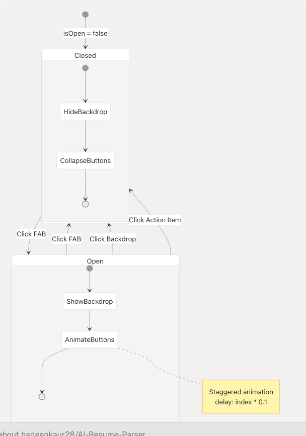
Action Items Display
When opened, the FAB displays all items from actionItems in a vertical stack:
frontend/components/floating-action-button.tsx32-76
Each action button includes:
- Label: Displayed to the left in a tooltip-style bubble
- Icon: Rendered in a circular button with
#76ABAEbackground - Animation: Staggered scale and fade-in animation
Navigation Integration
On action selection, the FAB closes and navigates to the target route:
frontend/components/floating-action-button.tsx21-24
Sources: frontend/components/floating-action-button.tsx1-109 frontend/components/floating-action-button.tsx32-91
Navigation Configuration
Data Structure
All navigation items are defined in a centralized configuration file:
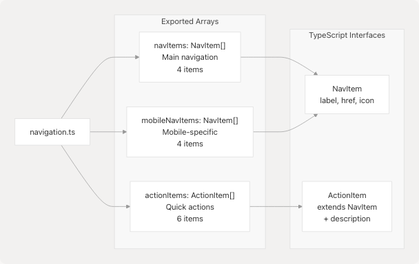
NavItem Interface
frontend/lib/navigation.ts15-19
ActionItem Interface
frontend/lib/navigation.ts21-23
Main Navigation Items
frontend/lib/navigation.ts25-46
These items appear in the desktop sidebar and tablet navigation.
Action Items
frontend/lib/navigation.ts71-108
Action items appear in:
- Desktop sidebar "Quick Actions" section (when authenticated)
- Tablet navigation menu (when authenticated)
- Mobile FAB menu
- Desktop FAB menu (if implemented)
Sources: frontend/lib/navigation.ts1-109 frontend/lib/navigation.ts15-23 frontend/lib/navigation.ts25-108
Session-Based Navigation
Authentication State Detection
All navigation components use NextAuth's useSession() hook to determine authentication state:
frontend/components/navbar.tsx32
Conditional Rendering
The navigation system adapts based on authentication status:
| Section | Authenticated | Unauthenticated |
|---|---|---|
| Quick Actions | Visible | Hidden |
| User Profile | Visible with Avatar, Name, Role | Hidden |
| Dashboard Link | Visible | Hidden |
| Sign Out Button | Visible | Hidden |
| Sign In Button | Hidden | Visible |
| Get Started Button | Hidden | Visible |
Role-Based Display
User roles are displayed in the sidebar user section:
frontend/components/navbar.tsx172-175
The role mapping converts "Admin" to "Recruiter" for display purposes.
Sources: frontend/components/navbar.tsx32-36 frontend/components/navbar.tsx103-142 frontend/components/navbar.tsx147-234
Component Integration Pattern
Import and Usage
The navigation system is integrated into the application layout through the Navbar component:
import { Navbar } from "@/components/navbar";

export default function Layout({ children }) {
  return (
    <>
      <Navbar />
      <main>{children}</main>
    </>
  );
}
The Navbar component internally manages all navigation modes:
frontend/components/navbar.tsx38-396
Sidebar Provider Context
The desktop sidebar uses a context provider for collapse state management:
frontend/components/navbar.tsx23 frontend/components/navbar.tsx31
This allows the collapse state to be shared across components if needed.
Animation System
All navigation components use Framer Motion for smooth transitions:
frontend/components/navbar.tsx5 frontend/components/navbar.tsx41-47 frontend/components/navbar.tsx239-242
Sources: frontend/components/navbar.tsx1-28 frontend/components/navbar.tsx28-397 frontend/components/sidebar-provider.tsx (referenced but not provided)
Styling and Theming
Color Scheme
The navigation system uses a consistent color palette:
| Element | Color | Usage |
|---|---|---|
| Primary Accent | #76ABAE |
Active states, hover effects, FAB background |
| Background | black/20 with backdrop-blur-xl |
Glassmorphic effect |
| Text Primary | #EEEEEE |
Main text color |
| Text Secondary | #EEEEEE/70 or #EEEEEE/80 |
Inactive items |
| Border | white/10 |
Dividers and borders |
CSS Modules
The mobile menu uses a dedicated CSS file for advanced animations:
frontend/components/ui/modern-mobile-menu.css1-163
Key animations include:
- Active item elevation:
translateY(-4px) - Ripple effect on tap
- Slide-up animation on mount
- Text underline with dynamic width
Sources: frontend/components/navbar.tsx44-49 frontend/components/ui/modern-mobile-menu.css1-163 frontend/components/floating-action-button.tsx67
Navigation Flow Diagram
Sources: frontend/components/navbar.tsx28-397 frontend/components/mobile-bottom-nav.tsx23-63 frontend/components/floating-action-button.tsx11-106