Landing & Public Pages
This document covers the public-facing, unauthenticated pages of the TalentSync platform, specifically the landing page (/) and about page (/about). These pages serve as the primary entry points for new users and provide comprehensive information about the platform before authentication.
For information about the authentication system and protected routes, see Authentication System. For the dashboard system that users access after login, see Dashboard Pages.
Overview
The public pages consist of two main routes that do not require authentication:
| Route | Component | Purpose |
|---|---|---|
/ |
frontend/app/page.tsx |
Main landing page with hero, value propositions, and feature highlights |
/about |
frontend/app/about/page.tsx |
Comprehensive platform overview with market analysis, architecture, and technical details |
Both pages are built as Next.js client components using Framer Motion for animations and follow a consistent dark theme design system with the primary color #76ABAE (teal) and background #1d2228.
Sources: frontend/app/page.tsx1-60 frontend/app/about/page.tsx1-63
Page Routing Architecture
Sources: frontend/app/page.tsx1-60 frontend/app/about/page.tsx1-63
Landing Page (/)
Component Structure
The main landing page component is exported as the default Home() function in frontend/app/page.tsx43-60 It renders a full-page layout with ambient background effects and a series of stacked sections.
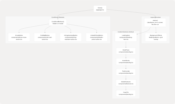
The background effects use a layered approach with pointer-events-none to ensure no interference with user interaction frontend/app/page.tsx46-50:
- Radial gradient circles at 20% and 80% positions
- Grid overlay with 60px spacing and overlay blend mode
- 15% opacity on gradients
Sources: frontend/app/page.tsx43-60
LandingHero Component
The LandingHero component frontend/components/landing-hero.tsx21-245 is the primary hero section with dual-mode presentation for seekers and recruiters.
Component State
const [isMobile, setIsMobile] = useState(calMobile());
const [mode, setMode] = useState<"seeker" | "recruiter">("seeker");
The component tracks:
- isMobile: Window width < 640px, checked via
calMobile()utility frontend/components/landing-hero.tsx16-19 - mode: Toggle between seeker and recruiter presentation
Layout Grid
The hero uses a responsive grid layout frontend/components/landing-hero.tsx47:
- Desktop:
lg:grid-cols-12split into 7 columns (copy) + 5 columns (preview) - Mobile: Single column stack
Key Elements
| Element | Lines | Purpose |
|---|---|---|
| Badge | frontend/components/landing-hero.tsx55-58 | "AI talent intelligence" label with Sparkles icon |
| Heading | frontend/components/landing-hero.tsx59-66 | Gradient text "Turn Resumes Into Decisions" |
| Mode Toggle | frontend/components/landing-hero.tsx72-86 | Switch between seeker/recruiter views |
| CTA Buttons | frontend/components/landing-hero.tsx87-117 | Primary (Get Started/Recruiter Console) + Demo button |
| Metrics Cards | frontend/components/landing-hero.tsx119-137 | 12K+ resumes, 6h/wk saved, 30K+ assets |
| Preview Card | frontend/components/landing-hero.tsx141-182 | JSON output sample with mode-specific highlights |
Mode-Specific Content
const highlight =
    mode === "seeker"
        ? ["Gap analysis", "Tailored resume variants", "Interview prep questions"]
        : ["Bulk parsing", "Candidate signal ranking", "Cold outreach drafts"];
The preview card displays different AI insights based on the selected mode frontend/components/landing-hero.tsx33-36
Navigation Links
The CTA buttons link to different routes based on mode frontend/components/landing-hero.tsx88-106:
- Seeker mode:
/dashboard/seeker - Recruiter mode:
/dashboard/recruiter - Demo button:
/dashboard/seeker(for both modes)
Sources: frontend/components/landing-hero.tsx21-245
Responsive Mobile Features
The MobileFeatures component frontend/components/features.tsx64-75 is conditionally rendered only on mobile devices (< 640px width). It displays a grid of four feature cards:
| Icon | Title | Description |
|---|---|---|
| FileSearch | Smart Resume Parsing | Upload resume in any format for instant insights |
| Brain | AI-Powered Matching | Match with roles fitting skills and experience |
| Zap | Instant Analysis | Detailed breakdown of skills and experience |
| Users | Recruiter Tools | Powerful HR tools for finding candidates |
Each card uses frontend/components/features.tsx41-56:
- Glass-morphism effect:
backdrop-blur-lg bg-white/5 - Border:
border-white/10 - Hover state:
hover:bg-white/10 - Icon container:
bg-[#76ABAE]/20with 12x12 rounded corners
Sources: frontend/components/features.tsx1-78
About Page (/about)
Page Metadata
The about page defines SEO metadata frontend/app/about/page.tsx21-25:
export const metadata = {
    title: "About TalentSync | AI-Powered Hiring Intelligence",
    description: "Comprehensive overview of TalentSync: market problem, workflow, architecture, features for seekers & employers, competitive edge, and data design.",
};
Section Structure
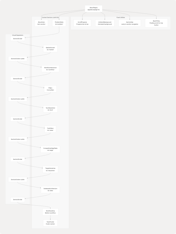
Sources: frontend/app/about/page.tsx27-62
Key About Page Sections
ProblemStats Component
Located at #problem section frontend/components/about/problem-stats.tsx24-80 this component displays two key market statistics:
const stats = [
    {
        value: "286%",
        label: "YoY Application Surge",
        description: "Avg 48.7 applications per posting, overwhelming manual review.",
        color: "from-rose-500 to-pink-600",
        icon: TrendingUp,
    },
    {
        value: "93%",
        label: "Employers Use ATS",
        description: "Formatting + keyword bias silently filter strong candidates.",
        color: "from-amber-500 to-orange-600",
        icon: Building,
    },
];
Each stat card renders with:
- Gradient top border using specified colors
- 6xl font size for the value with gradient text
- Icon at 12x12 size in teal color
- Glass-morphism card background
Sources: frontend/components/about/problem-stats.tsx1-80
MarketGrowth Component
The #market section frontend/components/about/market-growth.tsx7-115 presents two market projections:
-
AI in HR Market (2024→2029)
- CAGR: 19.1%
- Values: $6.05B (2024) → $10.08B (2027) → $14.08B (2029)
- Badge color: rose-500/20
-
Resume Parsing Market
- Growth: 114%
- Values: $20.19B (2024) → $43.20B (2029)
- Badge color: sky-500/20
Both cards use a 2-column grid layout on large screens and include radial gradient overlays at 10% opacity.
Sources: frontend/components/about/market-growth.tsx1-115
DualValue Component
The #value section frontend/components/about/dual-value.tsx24-101 presents a two-column comparison of value propositions:
Seeker Features:
const seeker = [
    { title: "Detailed Resume Analysis", desc: "Actionable ATS-aligned recommendations." },
    { title: "AI Job Field Prediction", desc: "Mapped trajectory + domain fit." },
    { title: "Unlimited Free Access", desc: "Remove friction early in journey." },
];
Employer Features:
const employer = [
    { title: "Curated Candidate Dashboard", desc: "Structured profiles & rankings." },
    { title: "Bulk ZIP Processing", desc: "Parallel ingest + extraction." },
    { title: "Reduced Time-To-Hire", desc: "Prioritized signal + automation." },
];
Each feature is rendered with a CheckCircle icon in teal color frontend/components/about/dual-value.tsx54-66
Sources: frontend/components/about/dual-value.tsx1-101
CompetitiveEdgeTable Component
The #edge section frontend/components/about/competitive-edge-table.tsx23-83 displays a comparison table with four features:
| Feature | Our Platform | B2B Parsers | B2C Builders |
|---|---|---|---|
| Detailed Seeker Analysis | ✓ | ✗ | ✓ |
| Employer Hiring Dashboard | ✓ | ✓ | ✗ |
| Bulk ZIP Uploads | ✓ | △ (limited) | ✗ |
| Unlimited Free Seeker Access | ✓ | ✗ | △ (limited) |
The table uses a custom cell() function frontend/components/about/competitive-edge-table.tsx17-21 to render:
true→ Green checkmark (text-green-400)false→ Red X (text-red-400)- String "limited" → Yellow triangle (text-yellow-400)
Sources: frontend/components/about/competitive-edge-table.tsx1-84
DatabaseArchitecture Component
The #data section frontend/components/about/database-architecture.tsx8-89 displays two database diagrams in a 2-column grid:
-
Logical Architecture (left card)
- Image:
/database-archetecture.png(600×420) - Icon: Database (Lucide)
- Description: Resume entity extraction, scoring artifacts, user roles, pipeline logging
- Image:
-
Entity Relationships (right card)
- Image:
/database-relationships.png(600×420) - Icon: Server (Lucide)
- Description: Relational mapping with referential integrity
- Image:
Both images include:
- Hover scale effect:
group-hover:scale-[1.02] - Gradient overlay on hover
- Rounded borders with
border-white/15
Sources: frontend/components/about/database-architecture.tsx1-89
Visual Design System
Color Palette
The public pages use a consistent color scheme:
| Usage | Color Code | Description |
|---|---|---|
| Primary (Teal) | #76ABAE |
Buttons, accents, icons, highlights |
| Background | #1d2228 |
Main background color |
| Card Background | #101518 (landing) #12181b (about) |
Component containers |
| Text Primary | #EEEEEE |
Main text content |
| Text Secondary | #EEEEEE/70 or #EEEEEE/60 |
Descriptions, labels |
| Text Muted | #EEEEEE/50 |
Timestamps, metadata |
Glass-Morphism Pattern
Both pages extensively use glass-morphism effects with:
backdrop-blur-lgorbackdrop-blur-xlbg-white/5orbg-white/10border-white/10ring-1 ring-white/10
Example from landing hero preview card frontend/components/landing-hero.tsx149:
className="relative rounded-2xl bg-[#101518]/90 ring-1 ring-white/10 backdrop-blur-xl p-6"
Sources: frontend/app/page.tsx46-50 frontend/app/about/page.tsx29-34
User Flow to Authentication
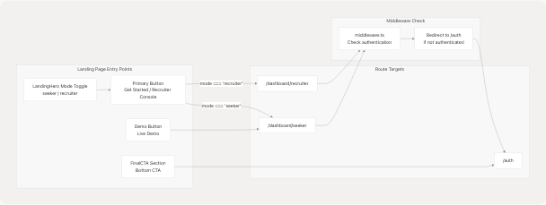
The landing page CTA buttons link directly to dashboard routes frontend/components/landing-hero.tsx88-106 but the middleware (see Middleware & Route Protection) intercepts these requests and redirects unauthenticated users to /auth.
Sources: frontend/components/landing-hero.tsx88-117
Shared Utility Components
AmbientBackground
The AmbientBackground component frontend/components/about/ambient-bg.tsx5-28 creates a parallax effect using Framer Motion:
const { scrollYProgress } = useScroll({
    target: ref,
    offset: ["start start", "end end"],
});
const opacity = useTransform(scrollYProgress, [0, 1], [0.4, 0.7]);
const rotate = useTransform(scrollYProgress, [0, 1], [0, 25]);
The component renders:
- A massive rotating conic gradient (160vmax diameter)
- Grid overlay with 80px spacing
- Dual radial gradients at 20% and 80% positions
- All with
pointer-events-noneand fixed positioning
Sources: frontend/components/about/ambient-bg.tsx1-28
BackToTop Button
The BackToTop component frontend/components/about/back-to-top.tsx6-31 appears after scrolling 900px:
const [visible, setVisible] = useState(false);
useEffect(() => {
    const onScroll = () => setVisible(window.scrollY > 900);
    window.addEventListener("scroll", onScroll, { passive: true });
    return () => window.removeEventListener("scroll", onScroll);
}, []);
Button features:
- Fixed positioning at
bottom-6 right-6 - Fade in/out with AnimatePresence
- Scale hover effect:
whileHover={{ scale: 1.07 }} - Smooth scroll to top on click
Sources: frontend/components/about/back-to-top.tsx1-31
Responsive Behavior
Mobile Breakpoints
The public pages use Tailwind's default breakpoints:
| Breakpoint | Width | Usage |
|---|---|---|
sm: |
≥640px | Toggle scroll indicator, adjust font sizes |
md: |
≥768px | Enable 2-column grids, show desktop nav |
lg: |
≥1024px | Full 12-column grid layouts, side-by-side sections |
xl: |
≥1280px | Increase hero heading to 7xl |
Mobile-Specific Elements
-
Scroll Indicator frontend/components/landing-hero.tsx201-241
- Only shown when
isMobile === true - Animated mouse icon with bouncing circle
- "Scroll down" label
- Only shown when
-
MobileFeatures Component frontend/components/features.tsx64-75
- Only rendered on screens < 640px
- Hidden on desktop with
hidden md:blockwrapper
-
Conditional Buttons frontend/app/page.tsx30-41
- Floating action buttons hidden on mobile
- Commented out in production frontend/app/page.tsx57
Sources: frontend/components/landing-hero.tsx22-28 frontend/components/features.tsx65-73 frontend/app/page.tsx30-41
Animation Strategy
All page animations use Framer Motion with a consistent pattern:
Initial Load Animations
initial={{ opacity: 0, y: 24 }}
animate={{ opacity: 1, y: 0 }}
transition={{ duration: 0.7 }}
Common in frontend/components/landing-hero.tsx50-53 and throughout about sections.
Scroll-Triggered Animations
initial={{ opacity: 0, y: 24 }}
whileInView={{ opacity: 1, y: 0 }}
viewport={{ once: true }}
transition={{ duration: 0.6 }}
Used in all about page sections like frontend/components/about/problem-stats.tsx28-32
Staggered Delays
Multiple cards in a row use incremental delays:
transition={{ duration: 0.55, delay: i * 0.08 }}
Seen in frontend/components/about/problem-stats.tsx52
Sources: frontend/components/landing-hero.tsx50-53 frontend/components/about/problem-stats.tsx28-52
Summary
The landing and about pages serve as the unauthenticated entry points to TalentSync, providing:
- Landing Page (
/): Mode-switchable hero with seeker/recruiter targeting, metrics showcase, and direct CTAs to dashboard routes - About Page (
/about): Multi-section comprehensive platform overview with market data, competitive analysis, architecture diagrams, and technical details - Shared Design System: Consistent dark theme with teal accents, glass-morphism effects, and responsive breakpoints
- Animation Layer: Framer Motion-powered entrance and scroll animations for progressive disclosure
- Navigation Flow: Strategic CTA placement linking to authentication-protected dashboard routes, with middleware handling redirects
All public pages are client-side rendered components using Next.js 14+ app directory structure.