LinkedIn Post Generator
- frontend/app/dashboard/analysis/[id]/page.tsx
- frontend/app/dashboard/linkedin-posts/page.tsx
- frontend/components/linkedin-posts-button.tsx
- frontend/lib/markdown-renderer.tsx
Purpose and Scope
The LinkedIn Post Generator is a frontend interface that enables users to create AI-generated LinkedIn posts based on configurable parameters. This page documents the user interface, form handling, API integration, and post display features implemented in the /dashboard/linkedin-posts route.
For information about the backend service that powers this feature, including the LangChain integration and research agents, see LinkedIn Services. For the main dashboard that provides navigation to this feature, see Main Dashboard.
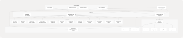
Component Architecture
The LinkedIn Post Generator is implemented as a client-side React component at frontend/app/dashboard/linkedin-posts/page.tsx It follows a two-column layout pattern with a configuration form on the left and generated posts displayed on the right.
Component Structure Diagram
Form State and Parameters
The component maintains a comprehensive form state object with 12 configurable parameters that control post generation behavior.
Form State Structure
| Parameter | Type | Default | Description |
|---|---|---|---|
topic |
string |
"" |
Main topic for the post (required) |
tone |
string |
"Professional" |
Writing tone: Professional, Conversational, Inspirational, Analytical, Friendly |
audience |
string |
"" |
Target audience, comma-separated (e.g., "Developers, Engineering Managers") |
length |
string |
"Medium" |
Post length: Short, Medium, Long, Any |
hashtags_option |
string |
"suggest" |
Hashtag generation: "suggest" or "none" |
cta_text |
string |
"" |
Optional call-to-action text |
mimic_examples |
string |
"" |
Example posts to mimic writing style |
language |
string |
"" |
Post language (auto-detected if empty) |
post_count |
number |
3 |
Number of posts to generate (1-5) |
emoji_level |
number |
1 |
Emoji usage level (0-3) |
github_project_url |
string |
"" |
Optional GitHub project URL for context |
enable_research |
boolean |
true |
Enable web research for enhanced content |
Parameter Update Pattern
The component uses a unified state update function for all form fields:
const update = (k: string, v: any) => setForm((f) => ({ ...f, [k]: v }));
This function is called by all input handlers to update specific fields while preserving the rest of the state.
Post Generation Flow
Generation Sequence Diagram
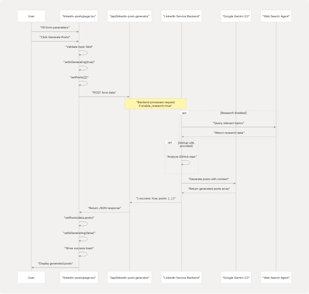
Generation Function
The generate() function orchestrates the post creation process:
// Key steps:
// 1. Validate topic field is not empty
// 2. Set loading state and clear previous posts
// 3. POST form data to API endpoint
// 4. Handle response and update posts state
// 5. Display success/error toast notifications
Validation: The topic field is required. If empty, the function displays a destructive toast and returns early frontend/app/dashboard/linkedin-posts/page.tsx65-72
API Call: The function POSTs the entire form state as JSON to /api/linkedin-post-generator frontend/app/dashboard/linkedin-posts/page.tsx76-80
Error Handling: Network errors and non-success responses are caught and displayed via toast notifications frontend/app/dashboard/linkedin-posts/page.tsx90-96
Generated Post Data Model
Each generated post follows the GeneratedPost interface:
interface GeneratedPost {
    text: string;                              // Main post content
    hashtags?: string[];                       // Suggested hashtags
    cta_suggestion?: string;                   // Call-to-action text
    sources?: { title: string; link: string }[]; // Research sources
    github_project_name?: string;              // Detected project name
}
Post Processing and Display
Post Content Processing
The processPostContent() function performs intelligent post-processing to clean up the generated content:
Hashtag Extraction: The function identifies hashtags in the last paragraph of the post text and moves them to the hashtags array frontend/app/dashboard/linkedin-posts/page.tsx101-140
Algorithm:
- Split post text into paragraphs
- Extract hashtags from the last paragraph using regex
/#[a-zA-Z0-9_]+/g - Remove hashtags from the text
- Clean up whitespace
- Merge extracted hashtags with existing hashtags array
- Remove duplicates using
Set
This ensures hashtags are consistently displayed in the dedicated hashtag section rather than inline in the text.
Post Card Components
Each generated post is rendered in a card with multiple sections:
Post Card Structure
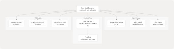
Card Styling: Each post card uses glassmorphism effects with backdrop-blur-sm, hover animations, and border transitions frontend/app/dashboard/linkedin-posts/page.tsx599-690
Animation: Posts animate in sequentially with a staggered delay using framer-motion:
initial={{ opacity: 0, y: 12 }}
animate={{ opacity: 1, y: 0 }}
transition={{ duration: 0.4, delay: i * 0.1 }}
User Interactions
Copy to Clipboard
The copyPost() function formats and copies a single post to the clipboard:
Format:
{post_text}

#{hashtag1} #{hashtag2} #{hashtag3}

CTA: {cta_suggestion}
Implementation: Uses the Web Clipboard API (navigator.clipboard.writeText()) with error handling frontend/app/dashboard/linkedin-posts/page.tsx142-152
Download All Posts
The downloadAll() function exports all generated posts as a markdown file:
Filename: linkedin-posts.md
Format: Posts are separated by horizontal rules with numbered headings:
Post 1:
{text}
Hashtags: #{tag1} #{tag2}
CTA: {cta}

-------------------------
Post 2:
...
Implementation: Creates a Blob object and triggers a download using a temporary anchor element frontend/app/dashboard/linkedin-posts/page.tsx154-175
UI Components and Styling
Responsive Design
The page implements a mobile-first responsive layout:
| Breakpoint | Layout | Key Changes |
|---|---|---|
| Mobile (< 640px) | Single column | Stacked form and results, smaller text, compact buttons |
| Tablet (640-1280px) | Single column | Larger text, more padding |
| Desktop (> 1280px) | Two columns | Side-by-side form and results (xl:grid-cols-2) |
Container Classes: The main container uses responsive padding:
className="container mx-auto px-4 sm:px-6 lg:px-8 py-4 sm:py-8"
Form Section Layout
The form is organized into bordered sections with consistent spacing:
-
Core Topic & Audience frontend/app/dashboard/linkedin-posts/page.tsx247-352
- Topic input (required)
- Tone selector
- Audience input
- Length and hashtag options grid
-
CTA Configuration frontend/app/dashboard/linkedin-posts/page.tsx354-364
- Optional CTA text input
-
Style Customization frontend/app/dashboard/linkedin-posts/page.tsx365-388
- Mimic examples textarea
- Language input
-
Advanced Settings frontend/app/dashboard/linkedin-posts/page.tsx389-451
- GitHub project URL
- Post count slider (1-5)
- Emoji level slider (0-3)
- Enable research toggle
Each section uses border-t border-[#76ABAE]/10 to create visual separation.
Generate Button States
The generate button has three distinct states:
- Idle State: Shows "Generate Posts" with icon frontend/app/dashboard/linkedin-posts/page.tsx493-498
- Generating State: Displays spinner, pulsing background, and progress text frontend/app/dashboard/linkedin-posts/page.tsx471-490
- Disabled State: When topic is empty or already generating frontend/app/dashboard/linkedin-posts/page.tsx460
Visual Effects:
- Animated background pulse during generation
- Shine effect on hover (
group-hover:translate-x-full) - Progress indicator at button bottom
- Multiple spinning loaders
Loading States
Page Loading
The component uses a PageLoader component during initial page load:
const [isPageLoading, setIsPageLoading] = useState(true);

useEffect(() => {
    const t = setTimeout(() => setIsPageLoading(false), 120);
    return () => clearTimeout(t);
}, []);
This creates a brief 120ms delay to allow for any data prefetch operations frontend/app/dashboard/linkedin-posts/page.tsx58-62
Generation Loading
Two loading indicators are used during post generation:
- LoadingOverlay: Full-screen overlay with detailed progress message frontend/app/dashboard/linkedin-posts/page.tsx702-708
- Inline Loader: Displayed in the posts card area frontend/app/dashboard/linkedin-posts/page.tsx573-594
The inline loader shows:
- Pulse animation loader
- Spinning ring indicator
- Status text: "Generating posts..." and "AI is crafting your LinkedIn content"
Markdown Rendering
The component uses the renderMarkdown() utility function from markdown-renderer.tsx to display formatted content in CTA suggestions.
Supported Features:
- Bold text:
**text** - Links:
<FileRef file-url="https://github.com/harleenkaur28/AI-Resume-Parser/blob/b2bbd83d/text" undefined file-path="text">Hii</FileRef> - Lists:
* itemor- item - Headings:
##and###
Usage: Applied to cta_suggestion field frontend/app/dashboard/linkedin-posts/page.tsx655-657
Navigation Integration
Entry Points
Users can navigate to the LinkedIn Post Generator from multiple locations:
- Main Dashboard: Quick action buttons or feature grid
- Analysis Page: Direct link from resume analysis results
- Floating Button: The
LinkedInPostsButtoncomponent provides a floating action button on desktop screens frontend/components/linkedin-posts-button.tsx1-22
Floating Button Component
The LinkedInPostsButton is a fixed-position button that appears at the bottom center of the screen:
className="fixed bottom-5 left-1/2 -translate-x-1/2 z-50 hidden md:block"
Visibility: Only visible on medium and larger screens (hidden md:block).
Styling: Uses the application's primary color scheme with hover scaling effects.
Back Navigation
The page includes a back button that navigates to /dashboard:
<Link href="/dashboard">
    <Button variant="ghost" size="sm" className="...">
        <ArrowLeft className="mr-2 h-4 w-4" />
        <span className="hidden sm:inline">Back to Dashboard</span>
        <span className="sm:hidden">Back</span>
    </Button>
</Link>
The button text is responsive, showing abbreviated text on mobile devices.
API Integration
Endpoint
The component communicates with the backend via:
Route: POST /api/linkedin-post-generator
Request Body: The entire form state object serialized as JSON frontend/app/dashboard/linkedin-posts/page.tsx76-80
Response Format:
{
    success: boolean;
    posts: GeneratedPost[];  // Array of 1-5 posts
    message?: string;         // Error message if success=false
}
Color Scheme and Theme
The page uses a consistent dark theme color palette:
| Element | Color Code | Usage |
|---|---|---|
| Background gradient | from-[#222831] via-[#31363F] to-[#222831] |
Main page background |
| Primary accent | #76ABAE |
Buttons, highlights, borders |
| Text primary | #EEEEEE |
Main text content |
| Text secondary | #EEEEEE/60 to #EEEEEE/80 |
Descriptions, metadata |
| Card background | bg-white/5 |
Glassmorphism effect |
| Border | border-white/10 |
Card borders |
| Input background | bg-[#222831]/50 |
Form inputs |
Glassmorphism: Cards use backdrop-blur-lg bg-white/5 for a frosted glass effect.
Toast Notifications
The component uses the useToast hook to display feedback messages:
Toast Types
-
Success Toast frontend/app/dashboard/linkedin-posts/page.tsx86-89
- Title: "Posts generated"
- Description: Shows post count
-
Validation Error frontend/app/dashboard/linkedin-posts/page.tsx66-71
- Title: "Topic required"
- Variant: "destructive"
-
Generation Error frontend/app/dashboard/linkedin-posts/page.tsx91-95
- Title: "Generation failed"
- Description: Error message
- Variant: "destructive"
-
Copy Success frontend/app/dashboard/linkedin-posts/page.tsx148
- Title: "Copied"
- Description: "Post copied to clipboard"
-
Copy Failure frontend/app/dashboard/linkedin-posts/page.tsx150
- Title: "Copy failed"
- Variant: "destructive"
Component Dependencies
External Libraries
| Package | Usage |
|---|---|
framer-motion |
Animations and transitions |
lucide-react |
Icon components (ArrowLeft, Copy, Download, Hash, Github) |
next/link |
Client-side navigation |
Internal Components
| Component | Source | Purpose |
|---|---|---|
Button |
@/components/ui/button |
Action buttons |
Card |
@/components/ui/card |
Container cards |
Input |
@/components/ui/input |
Text inputs |
Select |
@/components/ui/select |
Dropdown selectors |
Textarea |
@/components/ui/textarea |
Multi-line text input |
Slider |
@/components/ui/slider |
Range sliders |
Switch |
@/components/ui/switch |
Boolean toggles |
Badge |
@/components/ui/badge |
Hashtag display |
Label |
@/components/ui/label |
Form labels |
Loader |
@/components/ui/loader |
Loading indicators |
PageLoader |
@/components/ui/page-loader |
Initial page load |
LoadingOverlay |
@/components/cold-mail/LoadingOverlay |
Generation overlay |
Utilities
useToast- Toast notification hook frontend/app/dashboard/linkedin-posts/page.tsx24renderMarkdown- Markdown rendering utility frontend/app/dashboard/linkedin-posts/page.tsx26