Shared Components
Purpose and Scope
This document covers the reusable UI components and utilities that are shared across multiple features in the TalentSync frontend application. These components provide consistent user experience patterns including navigation, file handling, user feedback, and loading states. For information about feature-specific components (Cold Mail, Hiring Assistant, etc.), see their respective sections under 4.5. For authentication-specific UI components, see 4.2. For the overall navigation architecture, see 4.3.
Component Architecture Overview
The shared components in TalentSync follow a layered architecture where primitive UI components are composed into feature-level reusable components.
Component Hierarchy
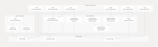
Sources: frontend/components/navbar.tsx1-397 frontend/components/mobile-bottom-nav.tsx1-209 frontend/components/floating-action-button.tsx1-109 frontend/components/cold-mail/ResumeSelection.tsx1-697
Navigation Components
Desktop Sidebar Navigation
The Navbar component provides the primary navigation interface for desktop and tablet devices. It implements a collapsible sidebar with role-based menu items and user session management.
Component Structure
| Component Part | File Location | Purpose |
|---|---|---|
| Main Container | frontend/components/navbar.tsx41-236 | Desktop sidebar with collapse functionality |
| Tablet Navigation | frontend/components/navbar.tsx239-391 | Top bar navigation for tablet breakpoint |
| Mobile Navigation | Delegated to MobileBottomNav |
Bottom navigation for mobile devices |
Key Features
Collapsible State Management:
const { isCollapsed, setIsCollapsed } = useSidebar();
The sidebar uses a context provider to maintain collapse state across renders. Width transitions between 72px (collapsed) and 288px (expanded).
Navigation Items: Navigation items are imported from frontend/lib/navigation.ts25-46 and include:
navItems: Main navigation links (Home, About, Job Seekers, Recruiters)actionItems: Quick action shortcuts with descriptionsmobileNavItems: Mobile-specific navigation configuration
Session-Based Rendering:
const { data: session, status } = useSession();
The navigation adapts based on authentication state, showing different options for authenticated vs. unauthenticated users at frontend/components/navbar.tsx146-234
Sources: frontend/components/navbar.tsx28-397 frontend/lib/navigation.ts1-109
Mobile Bottom Navigation
The MobileBottomNav component provides a modern, interactive navigation bar at the bottom of the screen for mobile devices.
Interactive Menu Integration
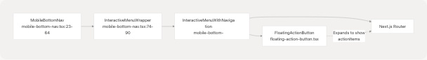
Component Responsibilities
The mobile navigation system is split into three layers:
-
MobileBottomNav frontend/components/mobile-bottom-nav.tsx23-64
- Determines active route based on
pathname - Handles navigation logic via
router.push() - Manages visibility (hidden on screens ≥640px)
- Determines active route based on
-
InteractiveMenuWithNavigation frontend/components/mobile-bottom-nav.tsx100-206
- Renders navigation buttons with active state
- Manages
textRefsanditemRefsfor dynamic styling - Splits navigation into left items (0-1) and right items (2-3) with FAB spacer
-
FloatingActionButton frontend/components/floating-action-button.tsx11-108
- Expands to show
actionItemsfrom navigation config - Positioned in center gap between left/right nav items
- Uses Framer Motion for animation effects
- Expands to show
Sources: frontend/components/mobile-bottom-nav.tsx1-209 frontend/components/floating-action-button.tsx1-109 frontend/components/ui/modern-mobile-menu.tsx1-121
Floating Action Button
The FAB provides quick access to major features from any page on mobile devices.
Expansion Behavior
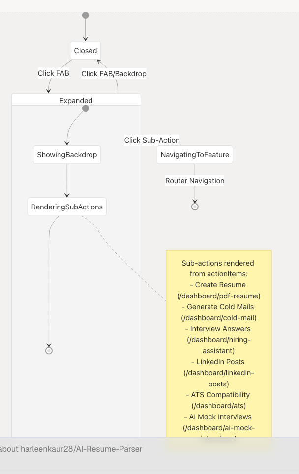
Animation System:
- Sub-actions animate in with staggered delays (100ms per item) at frontend/components/floating-action-button.tsx36-43
- Main button rotates 45° when expanded at frontend/components/floating-action-button.tsx84
- Backdrop provides visual separation and click-to-close functionality at frontend/components/floating-action-button.tsx94-102
Z-Index Layering:
| Layer | Z-Index | Component |
|---|---|---|
| Backdrop | 50 | Semi-transparent overlay |
| Main FAB | 60 | Plus/X button |
| Sub-actions | 70 | Expandable action buttons |
Sources: frontend/components/floating-action-button.tsx1-109 frontend/lib/navigation.ts71-108
ResumeSelection Component
The ResumeSelection component is a complex, reusable component used in multiple features (Cold Mail Generator, Hiring Assistant) to provide consistent resume selection/upload functionality.
Component Modes and Data Flow
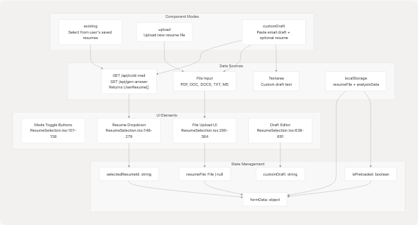
Sources: frontend/components/cold-mail/ResumeSelection.tsx54-696
Mode-Specific Behavior
Existing Resume Mode
When resumeSelectionMode === "existing":
- Fetches user resumes from API endpoint on mount at frontend/app/dashboard/cold-mail/page.tsx75-93
- Displays dropdown with resume metadata (customName, candidateName, predictedField, uploadDate)
- Auto-populates form fields when resume is selected at frontend/components/cold-mail/ResumeSelection.tsx210-227
Dropdown Implementation:
- Uses
AnimatePresencefor smooth transitions at frontend/components/cold-mail/ResumeSelection.tsx185-278 - Max height of 256px with overflow scroll for large lists
- Shows
Loadercomponent during fetch at frontend/components/cold-mail/ResumeSelection.tsx194-201
Upload Mode
When resumeSelectionMode === "upload":
- Presents file input with drag-and-drop UI at frontend/components/cold-mail/ResumeSelection.tsx290-363
- Validates file types:
.pdf,.doc,.docx,.txt,.md - For text files, previews first 500 characters at frontend/components/cold-mail/ResumeSelection.tsx88-92
- Handles pre-loaded files from localStorage (from analysis page) at frontend/app/dashboard/cold-mail/page.tsx120-159
File Upload UI States:
| State | Visual Indicator | File Location |
|---|---|---|
| Empty | Upload icon with supported formats | ResumeSelection.tsx333-359 |
| File Selected | CheckCircle with filename | ResumeSelection.tsx308-331 |
| Pre-loaded | "Pre-loaded from analysis" message | ResumeSelection.tsx322-330 |
Custom Draft Mode
When resumeSelectionMode === "customDraft" (Cold Mail only):
- User can select existing resume OR upload new file (both optional) at frontend/components/cold-mail/ResumeSelection.tsx386-526
- Paste email draft in textarea at frontend/components/cold-mail/ResumeSelection.tsx642-647
- Provide edit instructions at frontend/components/cold-mail/ResumeSelection.tsx652-658
- Click "Edit My Draft" button to enhance draft at frontend/components/cold-mail/ResumeSelection.tsx660-679
- Enhanced draft displayed in separate section at frontend/components/cold-mail/ResumeSelection.tsx680-691
Sources: frontend/components/cold-mail/ResumeSelection.tsx1-697 frontend/app/dashboard/cold-mail/page.tsx34-805
Interface Definition
interface ResumeSelectionProps {
  resumeSelectionMode: "existing" | "upload" | "customDraft";
  setResumeSelectionMode: (mode) => void;
  userResumes: UserResume[];
  selectedResumeId: string;
  setSelectedResumeId: (id: string) => void;
  isLoadingResumes: boolean;
  showResumeDropdown: boolean;
  setShowResumeDropdown: (show: boolean) => void;
  resumeFile: File | null;
  setResumeFile: (file: File | null) => void;
  resumeText: string;
  setResumeText: (text: string) => void;
  isPreloaded: boolean;
  setIsPreloaded: (pre: boolean) => void;
  formData: any;
  setFormData: (cb: (prev: any) => any) => void;
  customDraft: string;
  setCustomDraft: (draft: string) => void;
  editInstructions: string;
  setEditInstructions: (instructions: string) => void;
  customDraftEdited: string;
  setCustomDraftEdited: (edited: string) => void;
  isEditing: boolean;
  handleCustomDraftEdit: () => void;
  handleInputChange: (field: string, value: string) => void;
}
Note: The Hiring Assistant version uses a simpler interface without customDraft props, as it only supports existing and upload modes at frontend/app/dashboard/hiring-assistant/page.tsx59-61
Sources: frontend/components/cold-mail/ResumeSelection.tsx26-52
Toast Notification System
The toast system provides user feedback for success, error, and informational messages using Radix UI primitives.
Toast Architecture
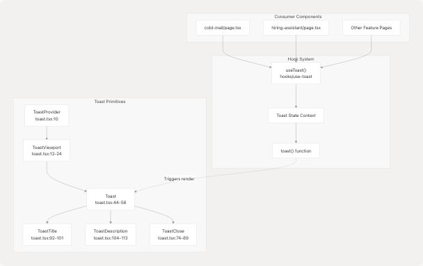
Sources: frontend/components/ui/toast.tsx1-131
Toast Variants and Styling
The toast component uses class-variance-authority for variant management:
| Variant | Background | Border | Use Case |
|---|---|---|---|
default |
from-white/15 to-white/5 |
border-white/20 |
Success, info messages |
destructive |
from-red-500/20 to-red-600/10 |
border-red-400/30 |
Error messages |
Visual Properties:
- Backdrop blur effect:
backdrop-blur-xlat frontend/components/ui/toast.tsx28 - Rounded corners:
rounded-xl - Shadow:
shadow-2xl - Animation: Slide in from top on desktop, bottom on mobile at frontend/components/ui/toast.tsx28-29
Usage Pattern
const { toast } = useToast();

// Success notification
toast({
  title: "Email Generated Successfully!",
  description: "Your cold email has been generated and is ready to use.",
});

// Error notification
toast({
  title: "Generation Failed",
  description: error instanceof Error ? error.message : "An error occurred.",
  variant: "destructive",
});
Common Use Cases:
- Resume upload success at frontend/app/dashboard/cold-mail/page.tsx151-155
- API request errors at frontend/app/dashboard/cold-mail/page.tsx336-344
- Validation failures at frontend/app/dashboard/cold-mail/page.tsx195-199
- Clipboard operations at frontend/app/dashboard/cold-mail/page.tsx350-357
Sources: frontend/components/ui/toast.tsx1-131 frontend/app/dashboard/cold-mail/page.tsx10 frontend/app/dashboard/hiring-assistant/page.tsx10
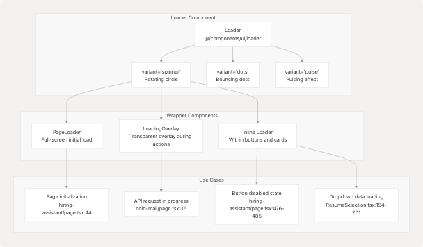
Loader Components
The application uses multiple loader patterns to indicate processing states.
Loader Variants and Usage
Sources: frontend/app/dashboard/cold-mail/page.tsx9 frontend/app/dashboard/hiring-assistant/page.tsx9 frontend/components/cold-mail/ResumeSelection.tsx16
LoadingOverlay Implementation
Used in Cold Mail and Hiring Assistant pages to prevent interaction during API requests:
Features:
- Full-screen semi-transparent backdrop
- Centered spinner with status message
- Prevents user interaction via z-index layering
- Different messages for different states:
isGenerating: "Generating your email..." or "Generating answers..."isEditing: "Editing..." or "Enhancing your draft..."
Implementation Example:
<LoadingOverlay isGenerating={isGenerating} isEditing={isEditing} />
The component conditionally renders based on boolean flags at frontend/app/dashboard/cold-mail/page.tsx593
PageLoader Implementation
Used for initial page load simulation:
Behavior:
- Shows full-screen loader for ~100ms on page mount
- Prevents flash of unstyled content
- Smoothly transitions to main content
- Pattern used at frontend/app/dashboard/cold-mail/page.tsx35 and frontend/app/dashboard/hiring-assistant/page.tsx44
const [isPageLoading, setIsPageLoading] = useState(true);

useEffect(() => {
  const timer = setTimeout(() => setIsPageLoading(false), 100);
  return () => clearTimeout(timer);
}, []);
Sources: frontend/app/dashboard/cold-mail/page.tsx35-36 frontend/app/dashboard/hiring-assistant/page.tsx44
Inline Loader Usage
Inline loaders appear within buttons during form submission:
Button Loading State Example:
<Button disabled={isGenerating}>
  {isGenerating ? (
    <>
      <Loader variant="spinner" size="sm" className="mr-2" />
      Generating...
    </>
  ) : (
    <>
      <Send className="mr-3 h-5 w-5" />
      Generate Cold Email
    </>
  )}
</Button>
Visual Enhancements:
- Double spinner rings for emphasis at frontend/app/dashboard/cold-mail/page.tsx728-735
- Animated background gradient at frontend/app/dashboard/cold-mail/page.tsx719-721
- Progress indicator bar at bottom at frontend/app/dashboard/cold-mail/page.tsx768-772
Sources: frontend/app/dashboard/cold-mail/page.tsx701-774 frontend/app/dashboard/hiring-assistant/page.tsx456-512
File Upload Components
UploadResume Component
A standalone file upload component with form validation and progress indication.
Component Interface:
interface UploadResumeProps {
  onSuccess?: (result: any) => void;
  onError?: (error: string) => void;
}
Form Fields:
| Field | Type | Purpose | Validation |
|---|---|---|---|
file |
File | Resume file | Required, specific extensions |
customName |
string | User-defined name | Required, auto-filled from filename |
showInCentral |
boolean | Visibility toggle | Optional |
File Handling Flow:
- User selects file via
<input type="file">at frontend/components/upload-resume.tsx88-95 - Extension extracted and default name set at frontend/components/upload-resume.tsx22-24
- On submit, creates FormData with file and metadata at frontend/components/upload-resume.tsx38-41
- Posts to
/api/analysisendpoint at frontend/components/upload-resume.tsx43-46 - Handles response and triggers callbacks at frontend/components/upload-resume.tsx48-60
Loading State: The component displays a spinner during upload with "Analyzing..." text at frontend/components/upload-resume.tsx142-165
Sources: frontend/components/upload-resume.tsx1-184
Design System Integration
Color Palette
All shared components use the consistent color scheme:
| Color Variable | Hex Value | Usage |
|---|---|---|
| Primary Accent | #76ABAE |
Active states, buttons, highlights |
| Dark Background | #222831 |
Primary background |
| Secondary Background | #31363F |
Cards, dropdowns |
| Light Text | #EEEEEE |
Primary text |
| Muted Text | #EEEEEE/70 |
Secondary text |
Component Consistency:
- All interactive elements use
#76ABAEfor hover/active states - Backdrop blur (
backdrop-blur-xl) used consistently for glassmorphism effect - Border color
border-white/10orborder-white/20for subtle separation - Gradient backgrounds:
from-white/5 to-white/10for cards
Sources: frontend/components/navbar.tsx66 frontend/components/floating-action-button.tsx67 frontend/components/cold-mail/ResumeSelection.tsx112
Animation Patterns
Shared animation library using Framer Motion:
Standard Transitions:
- Fade in:
initial={{ opacity: 0 }}→animate={{ opacity: 1 }} - Slide in:
initial={{ y: 20 }}→animate={{ y: 0 }} - Scale:
whileHover={{ scale: 1.01 }},whileTap={{ scale: 0.99 }}
Duration Standards:
- Quick transitions: 200-300ms
- Standard transitions: 300-500ms
- Complex animations: 800ms with stagger delays
Example Usage:
<motion.div
  initial={{ opacity: 0, y: 20 }}
  animate={{ opacity: 1, y: 0 }}
  transition={{ duration: 0.8, delay: 0.4 }}
>
  {/* Component content */}
</motion.div>
Sources: frontend/app/dashboard/cold-mail/page.tsx597-602 frontend/components/floating-action-button.tsx36-52
Component Reusability Analysis
Cross-Feature Component Usage
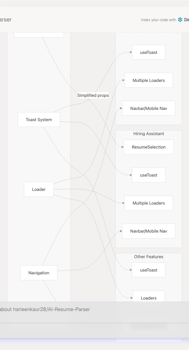
Component Adaptation Pattern:
The ResumeSelection component demonstrates good reusability through:
- Conditional Features:
customDraftmode only in Cold Mail - Prop Flexibility: Different prop sets for different use cases
- Consistent Interface: Core functionality (existing/upload) works identically
- Auto-population: Intelligently fills form fields from resume metadata
Sources: frontend/components/cold-mail/ResumeSelection.tsx26-52 frontend/app/dashboard/cold-mail/page.tsx656-682 frontend/app/dashboard/hiring-assistant/page.tsx434-451
Component Library Structure
| Component Category | Location | Reusability Level |
|---|---|---|
| Primitive UI | components/ui/* |
High - Used everywhere |
| Navigation | components/navbar.tsx, components/mobile-bottom-nav.tsx |
High - Global layout |
| Feature-Shared | components/{feature}/ResumeSelection.tsx |
Medium - 2-3 features |
| Feature-Specific | components/{feature}/*Panel.tsx |
Low - Single feature |
| Layout Wrappers | LoadingOverlay, PageLoader |
Medium - Multiple features |
Design Principle:
Components become more specialized as they move from ui/ → root components/ → components/{feature}/. The most reusable primitives (Button, Input, Card) are in ui/, while feature-specific compositions are nested deeper.
Sources: frontend/components/navbar.tsx frontend/components/ui/toast.tsx frontend/components/cold-mail/ResumeSelection.tsx