Detailed Analysis View
- frontend/app/dashboard/analysis/[id]/page.tsx
- frontend/app/dashboard/linkedin-posts/page.tsx
- frontend/components/linkedin-posts-button.tsx
- frontend/lib/markdown-renderer.tsx
Purpose and Scope
The Detailed Analysis View displays comprehensive resume analysis results to authenticated users after their resume has been processed by the Resume Analysis Service (see 3.1). This page presents structured information including skills analysis, work experience, projects, education, and optional sections like publications, certifications, and achievements. Users access this view by navigating from the Resume Upload & Analysis page (see 4.5.2) or directly via the route /dashboard/analysis/[id].
This document covers the frontend implementation, data model, layout architecture, and rendering logic. For backend analysis processing, see 3.1.3. For data persistence, see 5.1.
Route and File Structure
The Detailed Analysis View is implemented as a Next.js dynamic route page located at frontend/app/dashboard/analysis/[id]/page.tsx:1-834. The [id] parameter represents the unique resume identifier (UUID) stored in the PostgreSQL database.
Route Pattern:
- URL:
/dashboard/analysis/[id] - Example:
/dashboard/analysis/550e8400-e29b-41d4-a716-446655440000 - Protected: Requires authenticated session via NextAuth middleware
Key Dependencies:
framer-motion: Animation library for page transitionsnext-auth/react: Session management viauseSessionhooklucide-react: Icon library for UI elements- Custom UI components from
@/components/ui/* - Markdown renderer from
@/lib/markdown-renderer
Data Flow Architecture
The following diagram illustrates how analysis data flows from the API through the component state to the rendered UI:
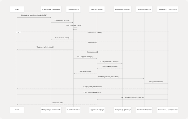
Data Fetching Implementation:
The component uses useEffect to fetch data on mount frontend/app/dashboard/analysis/[id]/page.tsx:119-147:
useEffect(() => {
    if (status === "loading") return;
    if (!session) {
        router.push("/auth/signin");
        return;
    }

    const fetchAnalysis = async () => {
        try {
            const response = await fetch(`/api/resumes/${params.id}`);
            if (!response.ok) {
                throw new Error(errorData.message || "Failed to fetch analysis");
            }
            const result = await response.json();
            setAnalysisData(result.data);
        } catch (err) {
            setError(err instanceof Error ? err.message : "Failed to fetch analysis");
        } finally {
            setLoading(false);
        }
    };

    if (params.id) {
        fetchAnalysis();
    }
}, [params.id, session, status, router]);
Data Model Interface
The AnalysisData interface defines the complete structure of data displayed on this page:
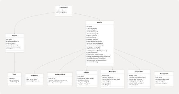
Interface Definition:
The TypeScript interface is defined at frontend/app/dashboard/analysis/[id]/page.tsx:33-109 and matches the Prisma schema from the backend. Key characteristics:
- Required fields: Basic info (name, email), skills, work experience, projects, education
- Optional fields: Publications, positions of responsibility, certifications, achievements (nullable arrays)
- Nested objects: All sections use structured objects rather than flat strings
- Type safety: Enforced through TypeScript for compile-time validation
Layout Architecture
The page uses a responsive two-column layout with a sticky header:
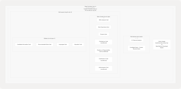
Responsive Behavior:
| Breakpoint | Layout | Stack Order |
|---|---|---|
| Mobile (< 1280px) | Single column, full width | Main content first, then sidebar |
| Desktop (≥ 1280px) | Two columns (2:1 ratio) | Main content left, sidebar right |
Styling System:
- Background: Gradient from
#222831→#31363F→#222831 - Cards:
backdrop-blur-lg bg-white/5 border-white/10 - Text colors:
#EEEEEE(primary),#76ABAE(accent) - Spacing:
space-y-8between major sections
Component Hierarchy and Rendering Logic
The following diagram maps UI sections to their rendering logic and data sources:
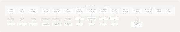
Conditional Rendering Pattern:
Optional sections use a consistent pattern frontend/app/dashboard/analysis/[id]/page.tsx:395-584:
{analysis.publications && analysis.publications.length > 0 && (
    <Card className="backdrop-blur-lg bg-white/5 border-white/10">
        <CardHeader>
            <CardTitle className="text-[#EEEEEE] flex items-center">
                <BookOpen className="mr-2 h-5 w-5 text-[#76ABAE]" />
                Publications
            </CardTitle>
        </CardHeader>
        <CardContent className="space-y-6">
            {analysis.publications.map((publication, index) => (
                // Render publication item
            ))}
        </CardContent>
    </Card>
)}
This pattern is repeated for:
- Publications frontend/app/dashboard/analysis/[id]/page.tsx:395-448
- Positions of Responsibility frontend/app/dashboard/analysis/[id]/page.tsx:451-490
- Certifications frontend/app/dashboard/analysis/[id]/page.tsx:493-545
- Achievements frontend/app/dashboard/analysis/[id]/page.tsx:548-584
Skills Analysis Section
The Skills Analysis section displays skill proficiency as progress bars with percentage values:
Implementation:
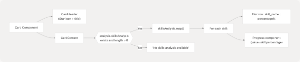
Code Structure:
Located at frontend/app/dashboard/analysis/[id]/page.tsx:242-271, each skill is rendered with:
- Name and percentage display: Flex container with space-between
- Progress bar: Uses
Progresscomponent from@/components/ui/progress - Styling: Accent color
#76ABAEfor percentage text
Data Format:
skillsAnalysis: [
    { skill_name: "Python", percentage: 95 },
    { skill_name: "Machine Learning", percentage: 85 },
    // ...
]
Work Experience Section
The Work Experience section displays professional history with role, company, duration, and bullet points:
Rendering Flow:
Markdown Rendering:
Bullet points use the renderMarkdown function from frontend/lib/markdown-renderer.tsx65-133 to support:
- Bold text:
**text**→ styled withtext-[#76ABAE] font-bold - Links:
<FileRef file-url="https://github.com/harleenkaur28/AI-Resume-Parser/blob/b2bbd83d/text" undefined file-path="text">Hii</FileRef>→ clickable anchor tags - List items: Converted to
<ul>with<li>elements
Example usage at frontend/app/dashboard/analysis/[id]/page.tsx:304-306:
<span className="inline">
    {renderMarkdown(point)}
</span>
Projects Section
The Projects section displays project details with technologies, links, and descriptions:
Component Structure:
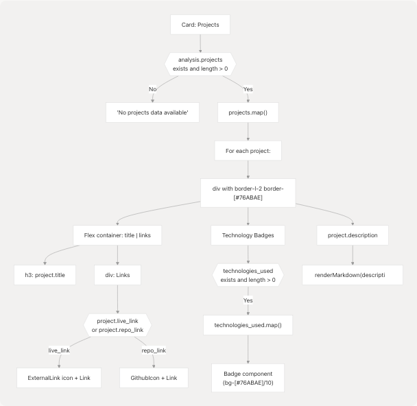
Link Handling:
Projects can have two types of links frontend/app/dashboard/analysis/[id]/page.tsx:340-364:
- Live Link (
project.live_link): Displayed withExternalLinkicon - Repository Link (
project.repo_link): Displayed withGithubIcon
Both links:
- Open in new tab (
target="_blank") - Include
rel="noopener noreferrer"for security - Use accent color with hover effect:
text-[#76ABAE] hover:text-white
Technology Badges:
Technologies are displayed as styled badges frontend/app/dashboard/analysis/[id]/page.tsx:366-379:
- Background:
bg-[#76ABAE]/10 - Border:
border-[#76ABAE]/30 - Text color:
text-[#76ABAE] - Layout: Flex wrap for responsive display
Publications Section (Conditional)
The Publications section appears only when the candidate has publications in their resume:
Conditional Rendering:
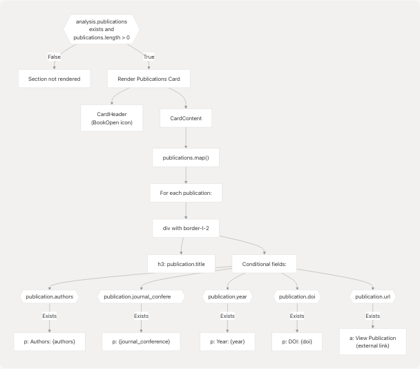
Field Display Logic:
Each publication field is conditionally rendered frontend/app/dashboard/analysis/[id]/page.tsx:413-442:
| Field | Display Pattern | Styling |
|---|---|---|
title |
Always shown | text-[#EEEEEE] font-semibold mb-2 |
authors |
If exists: "Authors: {authors}" | text-[#76ABAE] |
journal_conference |
If exists: {journal_conference} | text-[#EEEEEE]/80 |
year |
If exists: "Year: {year}" | text-[#EEEEEE]/60 |
doi |
If exists: "DOI: {doi}" | text-[#EEEEEE]/60 |
url |
If exists: "View Publication" link | text-[#76ABAE] hover:underline |
Positions of Responsibility Section (Conditional)
Similar to Publications, this section renders only when data exists:
Data Structure:
positionsOfResponsibility: [
    {
        title: string,
        organization: string,
        duration?: string,
        description?: string
    }
]
Rendering Logic:
Located at frontend/app/dashboard/analysis/[id]/page.tsx:451-490, each position displays:
- Title:
h3with semibold font - Organization: Primary accent color (
text-[#76ABAE]) - Duration (optional): If exists, shown below organization
- Description (optional): If exists, rendered with
renderMarkdown()for formatting support
Certifications Section (Conditional)
The Certifications section displays professional certifications with detailed metadata:
Certification Fields:
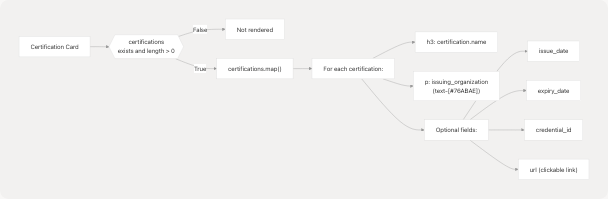
Field Display:
Implementation at frontend/app/dashboard/analysis/[id]/page.tsx:503-542:
| Field | Display | Style |
|---|---|---|
name |
Required, always shown | text-[#EEEEEE] font-semibold mb-2 |
issuing_organization |
Required | text-[#76ABAE] |
issue_date |
Optional: "Issued: {date}" | text-[#EEEEEE]/80 |
expiry_date |
Optional: "Expires: {date}" | text-[#EEEEEE]/80 |
credential_id |
Optional: "ID: {id}" | text-[#EEEEEE]/60 |
url |
Optional: "View Certificate" link | text-[#76ABAE] hover:underline |
Achievements Section (Conditional)
The Achievements section displays awards, recognitions, and accomplishments:
Achievement Structure:
achievements: [
    {
        title: string,
        description?: string,
        year?: string,
        category?: string
    }
]
Rendering Implementation:
Located at frontend/app/dashboard/analysis/[id]/page.tsx:548-584, each achievement shows:
- Title: Main heading in semibold font
- Category Badge (optional): If exists, displayed as colored badge before other details
- Year (optional): If exists, shown in accent color
- Description (optional): If exists, rendered with markdown support
Category Badge Styling:
<Badge className="bg-[#76ABAE]/10 text-[#76ABAE] border border-[#76ABAE]/30 text-xs mb-2">
    {achievement.category}
</Badge>
Sidebar: Candidate Information Card
The Candidate Information card displays personal details and social links:
Information Hierarchy:
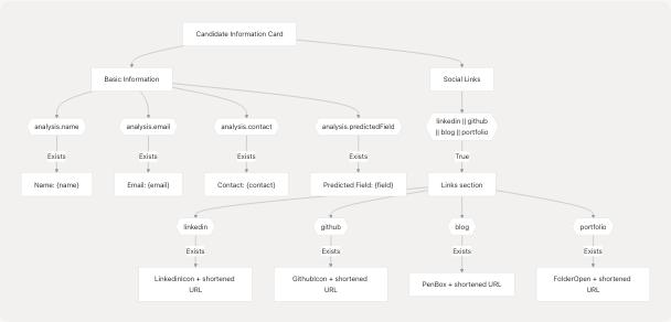
URL Shortening Logic:
Social links are displayed with shortened URLs for better UX. Implementation at frontend/app/dashboard/analysis/[id]/page.tsx:642-741:
LinkedIn/GitHub URL Processing:
const url = new URL(link);
// Show everything after hostname (strip leading '/')
return url.pathname.replace(/^\/+/, "") ||
       url.search.replace(/^\?/, "") ||
       url.hash.replace(/^#/, "");
Blog/Portfolio URL Processing:
const url = new URL(link);
const display = `${url.host}${url.pathname}${url.search}${url.hash}`.replace(/\/$/, "");
return display;
This ensures:
- LinkedIn shows:
in/usernameinstead ofhttps://linkedin.com/in/username - GitHub shows:
usernameinstead ofhttps://github.com/username - Blog/Portfolio shows:
domain.com/pathinstead of full URL with protocol
Sidebar: Recommended Roles Card
The Recommended Roles card displays AI-suggested job roles based on resume analysis:
Implementation:
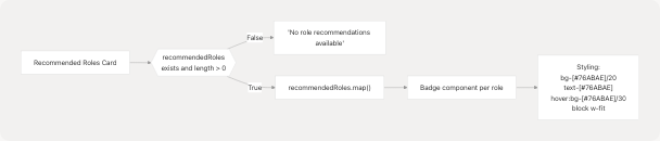
Each role is rendered as a clickable badge at frontend/app/dashboard/analysis/[id]/page.tsx:760-768. The badges use:
- Semi-transparent background for glass-morphism effect
- Accent color text
- Hover state for interactivity
- Block display with fit width for stacked appearance
Sidebar: Languages and Education Cards
These two cards display simple list information without complex formatting:
Languages Card:
Located at frontend/app/dashboard/analysis/[id]/page.tsx:779-801, displays:
- Each language in a simple text format
- No proficiency levels or details
- Falls back to "No language information available" if empty
Data structure:
languages: [
    { language: "English" },
    { language: "Spanish" },
    // ...
]
Education Card:
Located at frontend/app/dashboard/analysis/[id]/page.tsx:804-826, displays:
- Education details as simple paragraphs
- No structured breakdown (degree, institution, year separated)
- Falls back to "No education information available" if empty
Data structure:
education: [
    { education_detail: "Bachelor of Science in Computer Science, MIT, 2020" },
    { education_detail: "Master of Science in AI, Stanford, 2022" },
    // ...
]
Both cards use minimal styling to keep focus on the main content sections.
Interactive Features
Download Resume Button
The download button triggers a browser navigation to download the original resume file:
<Button
    onClick={() => {
        window.open(`/api/resumes/${params.id}/download`, "_blank");
    }}
    className="bg-[#76ABAE] hover:bg-[#76ABAE]/90"
>
    <Download className="mr-2 h-4 w-4" />
    Download Resume
</Button>
Located in the sticky header at frontend/app/dashboard/analysis/[id]/page.tsx:211-219, this button:
- Opens download endpoint in new tab
- Uses the same resume ID from the page URL
- Backend handles file retrieval and content-type headers
Back Navigation
The back button uses Next.js router for navigation frontend/app/dashboard/analysis/[id]/page.tsx:203-210:
<Button
    onClick={() => router.back()}
    variant="ghost"
    className="text-[#EEEEEE] hover:text-[#76ABAE]"
>
    <ArrowLeft className="mr-2 h-4 w-4" />
    Back
</Button>
This returns users to their previous page (typically the dashboard or resume upload page).
Markdown Rendering System
The page uses a custom markdown renderer for formatting descriptions and bullet points:
Markdown Renderer Architecture:
Supported Markdown Features:
Implementation in frontend/lib/markdown-renderer.tsx13-133:
| Syntax | Output | Styling |
|---|---|---|
**text** |
Bold text | text-[#76ABAE] font-bold |
<FileRef file-url="https://github.com/harleenkaur28/AI-Resume-Parser/blob/b2bbd83d/text" undefined file-path="text">Hii</FileRef> |
Hyperlink | text-[#76ABAE] hover:underline |
* item or - item |
List item | list-disc ml-4 space-y-1 |
## heading |
H2 heading | font-bold text-base mb-3 |
### heading |
H3 heading | font-semibold text-sm mb-2 |
Usage in Analysis Page:
The renderer is called for:
- Work experience bullet points frontend/app/dashboard/analysis/[id]/page.tsx:304
- Project descriptions frontend/app/dashboard/analysis/[id]/page.tsx:382
- Position descriptions frontend/app/dashboard/analysis/[id]/page.tsx:481
- Achievement descriptions frontend/app/dashboard/analysis/[id]/page.tsx:576
This provides consistent formatting across all text-heavy sections.
Animation and Transitions
The page uses Framer Motion for smooth entrance animations:
Animation Sequence:
Animation Configuration:
-
Sticky Header frontend/app/dashboard/analysis/[id]/page.tsx:196-200:
- Initial:
{ opacity: 0, x: -20 } - Animate:
{ opacity: 1, x: 0 } - Duration: 0.5s
- Initial:
-
Main Content frontend/app/dashboard/analysis/[id]/page.tsx:223-227:
- Initial:
{ opacity: 0, y: 20 } - Animate:
{ opacity: 1, y: 0 } - Duration: 0.8s, delay: 0.2s
- Initial:
These animations create a polished, professional entrance effect without overwhelming the user.
State Management and Error Handling
The component uses React hooks for state management:
State Variables:
const [analysisData, setAnalysisData] = useState<AnalysisData | null>(null);
const [loading, setLoading] = useState(true);
const [error, setError] = useState<string | null>(null);
State Flow Diagram:
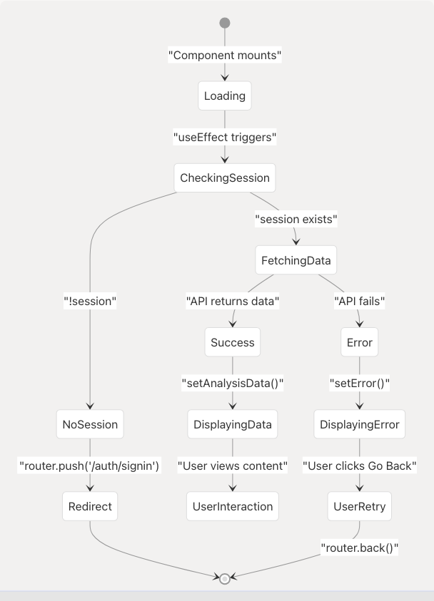
Error Handling:
Three error states are handled frontend/app/dashboard/analysis/[id]/page.tsx:149-190:
- Loading State: Displays centered spinner with "Loading analysis..." message
- Error State: Shows error message with "Go Back" button
- No Data State: Shows "No analysis data found" with "Go Back" button
All states use consistent styling with the app's color scheme.
Integration with Other Features
The Detailed Analysis View serves as a data source for other features via localStorage caching:
Cross-Feature Data Flow:
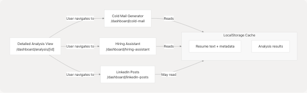
While the Detailed Analysis View itself doesn't write to localStorage, users typically arrive here from the Resume Upload page (4.5.2), which does cache the analysis data. This allows seamless transitions to other features that can pre-populate forms with the user's information.
Related Pages: