Dashboard Pages
Purpose and Scope
This document provides an overview of the dashboard system within the TalentSync frontend application. It covers the organization of dashboard pages, shared patterns, data flow between features, and component architecture. The dashboard serves as the central hub for both job seekers and recruiters to access AI-powered career tools.
For specific implementation details of individual dashboard features, see:
- Main Dashboard implementation: 4.5.1
- Resume Upload & Analysis: 4.5.2
- Detailed Analysis View: 4.5.3
- Cold Mail Generator: 4.5.4
- Hiring Assistant: 4.5.5
- LinkedIn Post Generator: 4.5.6
For authentication and access control, see 4.2. For navigation components, see 4.3.
Dashboard Architecture Overview
The dashboard follows a hub-and-spoke pattern where the main dashboard (/dashboard) acts as the central navigation point to specialized feature pages. All dashboard pages share common visual styling, loading patterns, and state management strategies.
Dashboard Route Structure
The dashboard is organized under the /dashboard route with the following structure:
| Route | Purpose | Primary Component |
|---|---|---|
/dashboard |
Main dashboard hub | frontend/app/dashboard/page.tsx |
/dashboard/seeker |
Resume upload interface | frontend/app/dashboard/seeker/page.tsx |
/dashboard/analysis/[id] |
Detailed resume analysis | Covered in 4.5.3 |
/dashboard/cold-mail |
Cold email generation | Covered in 4.5.4 |
/dashboard/hiring-assistant |
Interview preparation | Covered in 4.5.5 |
/dashboard/linkedin-posts |
LinkedIn content generation | Covered in 4.5.6 |
/dashboard/tips |
Career tips and advice | frontend/app/dashboard/tips/page.tsx |
/dashboard/ats |
ATS evaluation | Covered in recruiter features |
/dashboard/recruiter |
Recruiter dashboard | Covered in recruiter features |
Sources: frontend/app/dashboard/page.tsx1-2325
Main Dashboard Hub Architecture
The main dashboard page at /dashboard serves as the primary entry point and navigation hub. It displays user statistics, recent activity, and provides quick access to all features.
Dashboard Page Component Structure
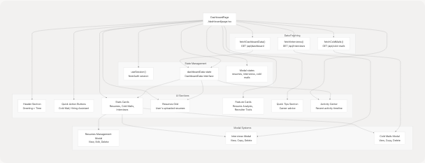
Sources: frontend/app/dashboard/page.tsx109-1051
Dashboard Data Interfaces
The main dashboard uses TypeScript interfaces to define the structure of data fetched from the backend.
DashboardData Interface
interface DashboardData {
  user: {
    name: string;
    email: string;
    image?: string;
  };
  stats: {
    totalResumes: number;
    totalColdMails: number;
    totalInterviews: number;
  };
  recentActivity: Array<{
    id: string;
    type: "resume" | "cold_mail" | "interview";
    title: string;
    description: string;
    date: string;
  }>;
  resumes: Array<{
    id: string;
    customName: string;
    uploadDate: string;
    predictedField?: string;
    candidateName?: string;
  }>;
}
Sources: frontend/app/dashboard/page.tsx57-82
Session Management Interfaces
Additional interfaces for viewing and managing user-generated content:
| Interface | Purpose | Key Fields |
|---|---|---|
InterviewSession |
Interview preparation sessions | role, companyName, questionsAndAnswers |
ColdMailSession |
Cold mail generation sessions | recipientName, companyName, emails |
Sources: frontend/app/dashboard/page.tsx84-107
Resume Upload and Analysis Flow
The seeker dashboard page (/dashboard/seeker) provides the primary interface for uploading and analyzing resumes. It uses the FileUpload component as its core functionality.
Seeker Dashboard Page Structure
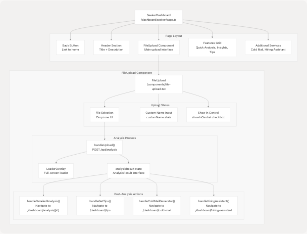
Sources: frontend/app/dashboard/seeker/page.tsx20-196 frontend/components/file-upload.tsx64-467
FileUpload Component API
The FileUpload component is the primary interface for resume analysis:
| Prop | Type | Description |
|---|---|---|
onUploadSuccess |
`() => void | undefined` |
Component Methods:
onDrop(acceptedFiles)- Handles file drop events from react-dropzonehandleUpload()- Uploads file and triggers analysis via/api/analysishandleDetailedAnalysis()- Navigates to full analysis page usingresumeIdhandleGetTips()- Navigates to tips page with job category and skillshandleColdMailGenerator()- Stores analysis data in localStorage and navigateshandleHiringAssistant()- Stores analysis data in localStorage and navigates
Sources: frontend/components/file-upload.tsx60-467
Data Flow Between Dashboard Features
Dashboard features share data through multiple mechanisms to provide a seamless user experience. The primary pattern is localStorage-based data transfer for analysis results.
Cross-Feature Data Sharing Pattern
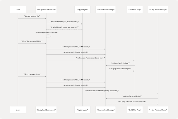
Sources: frontend/components/file-upload.tsx154-192
localStorage Data Structure
The following data is stored in localStorage for cross-feature sharing:
| Key | Data Structure | Purpose |
|---|---|---|
resumeFile |
{name, size, type, lastModified} |
File metadata for reference |
analysisData |
Full analysis object from API |
Resume analysis data including skills, experience, projects |
Data Stored in analysisData:
{
  id: string;
  name: string;
  email: string;
  contact?: string;
  predictedField: string;
  skillsAnalysis: Array<{skill_name, percentage}>;
  recommendedRoles: string[];
  languages: Array<{language}>;
  education: Array<{education_detail}>;
  workExperience: Array<{role, company_and_duration, bullet_points}>;
  projects: Array<{title, technologies_used, description}>;
  uploadedAt: string;
}
Sources: frontend/components/file-upload.tsx22-58 frontend/components/file-upload.tsx154-192
Modal Systems for Data Management
The main dashboard implements three modal systems for viewing and managing user data: resumes, interviews, and cold mails. Each modal provides CRUD operations and detailed views.
Resumes Management Modal
Located in the main dashboard, this modal allows users to view all resumes, rename them, and delete them.
Key Features:
- Full list of uploaded resumes with metadata
- Inline editing of
customName - Delete confirmation dialog
- Quick navigation to analysis page
- CRUD operations via API endpoints
API Operations:
| Operation | Method | Endpoint | Handler |
|---|---|---|---|
| Rename | PATCH | /api/resumes?id={resumeId} |
handleRenameResume() |
| Delete | DELETE | /api/resumes?id={resumeId} |
handleDeleteResume() |
Sources: frontend/app/dashboard/page.tsx260-377 frontend/app/dashboard/page.tsx1056-1234
Interviews Modal
Displays all interview preparation sessions with full question-answer pairs.
Features:
- List of interview sessions grouped by role and company
- Expandable Q&A sections
- Copy individual answers to clipboard
- Delete session functionality
- Lazy loading (fetched only when modal opens)
State Management:
const [showInterviewsModal, setShowInterviewsModal] = useState(false);
const [interviewsData, setInterviewsData] = useState<InterviewSession[]>([]);
const [isLoadingInterviews, setIsLoadingInterviews] = useState(false);
Sources: frontend/app/dashboard/page.tsx128-138 frontend/app/dashboard/page.tsx174-200 frontend/app/dashboard/page.tsx1235-1473
Cold Mails Modal
Displays all cold mail generation sessions with email content.
Features:
- Session-based organization (recipient + company)
- Multiple emails per session
- Copy email subject and body
- Delete session functionality
- Automatic refresh after deletion
API Operations:
| Operation | Method | Endpoint | Handler |
|---|---|---|---|
| Fetch | GET | /api/cold-mails |
fetchColdMails() |
| Delete | DELETE | /api/cold-mails?id={coldMailId} |
handleDeleteColdMail() |
Sources: frontend/app/dashboard/page.tsx202-257 frontend/app/dashboard/page.tsx316-343 frontend/app/dashboard/page.tsx1474-1746
Shared Visual and Interaction Patterns
All dashboard pages follow consistent design patterns for user experience cohesion.
Page Loading Pattern
Every dashboard page implements a page loading animation using Framer Motion:
const [isPageLoading, setIsPageLoading] = useState(true);

useEffect(() => {
  const timer = setTimeout(() => setIsPageLoading(false), 100);
  return () => clearTimeout(timer);
}, []);

// Render
<AnimatePresence>
  {isPageLoading && (
    <motion.div
      initial={{ opacity: 1 }}
      exit={{ opacity: 0 }}
      className="fixed inset-0 bg-gradient-to-br from-[#222831] via-[#31363F] to-[#222831] flex items-center justify-center z-50"
    >
      <Loader variant="pulse" size="xl" text="Loading your dashboard..." />
    </motion.div>
  )}
</AnimatePresence>
Sources: frontend/app/dashboard/page.tsx112 frontend/app/dashboard/page.tsx424-458 frontend/app/dashboard/seeker/page.tsx21-45
Loader Component Variants
The Loader component from @/components/ui/loader provides multiple variants:
| Variant | Use Case | Example Page |
|---|---|---|
dots |
Quick loading states | Tips page |
pulse |
Full-page loading | Dashboard pages |
spinner |
Inline loading | Data fetching |
default |
Complex animations | General purpose |
LoaderOverlay Component:
- Full-screen overlay with gradient background
- Used for major navigation transitions
- Accepts
text,variant, andsizeprops
Sources: frontend/components/ui/loader.tsx1-219
Gradient Background Pattern
All dashboard pages use a consistent gradient background:
<div className="min-h-screen bg-gradient-to-br from-[#222831] via-[#31363F] to-[#222831]">
  {/* Animated background elements */}
  <div className="absolute inset-0 overflow-hidden">
    <div className="absolute -top-10 -left-10 w-72 h-72 bg-[#76ABAE]/10 rounded-full blur-3xl animate-pulse"></div>
    <div className="absolute top-1/2 -right-20 w-96 h-96 bg-[#31363F]/30 rounded-full blur-3xl animate-pulse delay-1000"></div>
    <div className="absolute -bottom-20 left-1/3 w-80 h-80 bg-[#76ABAE]/15 rounded-full blur-3xl animate-pulse delay-2000"></div>
  </div>
  {/* Content */}
</div>
Color Scheme:
- Primary:
#76ABAE(teal accent) - Background:
#222831and#31363F(dark grays) - Text:
#EEEEEE(light gray)
Sources: frontend/app/dashboard/page.tsx461-467 frontend/app/dashboard/seeker/page.tsx48
Quick Actions and Navigation
The dashboard provides multiple navigation entry points to features.
Quick Action Buttons (Main Dashboard)
Located at the top of the main dashboard, these buttons provide one-click access to primary features:
<Link href="/dashboard/cold-mail">
  <Button className="bg-gradient-to-r from-[#76ABAE] to-[#5A8B8F]">
    <Mail className="h-5 w-5 mr-2" />
    Cold Mail Generator
    <Zap className="h-4 w-4 ml-2" />
  </Button>
</Link>

<Link href="/dashboard/hiring-assistant">
  <Button className="bg-gradient-to-r from-[#31363F] to-[#4C566A]">
    <Users className="h-5 w-5 mr-2" />
    Hiring Assistant
    <Target className="h-4 w-4 ml-2" />
  </Button>
</Link>
Sources: frontend/app/dashboard/page.tsx534-554
Stats Cards Navigation
Each stat card is clickable and opens its corresponding modal:
| Card | Click Action | Handler |
|---|---|---|
| Total Resumes | Opens resumes modal | onClick={() => setShowResumesModal(true)} |
| Cold Emails | Opens cold mails modal | onClick={handleShowColdMails} |
| Interview Sessions | Opens interviews modal | onClick={handleShowInterviews} |
Sources: frontend/app/dashboard/page.tsx557-686
Feature Cards Section
Two large feature cards provide access to main workflows:
- Resume Analysis Card
- Links to
/dashboard/seeker - Highlights: ATS Compatibility, Skill Gap Analysis, Recommendations
- Links to
- For Recruiters Card
- Links to
/dashboard/recruiter - Highlights: Candidate Matching, Bulk Processing, Question Generator
- Links to
Sources: frontend/app/dashboard/page.tsx789-890
Activity Center and Recent Activity
The Activity Center displays a timeline of user actions across all dashboard features.
Activity Timeline Structure
interface ActivityItem {
  id: string;
  type: "resume" | "cold_mail" | "interview";
  title: string;
  description: string;
  date: string;
}
Activity Icon Mapping:
| Activity Type | Icon | Color |
|---|---|---|
resume |
FileText |
#76ABAE (teal) |
cold_mail |
Mail |
blue-400 |
interview |
Users |
green-400 |
Empty State:
When no activity exists, the dashboard displays an onboarding message with quick action buttons to get started.
Sources: frontend/app/dashboard/page.tsx68-74 frontend/app/dashboard/page.tsx380-391 frontend/app/dashboard/page.tsx950-1050
Error Handling and User Feedback
Dashboard pages implement consistent error handling and user feedback patterns.
Toast Notifications
All CRUD operations display toast notifications using the useToast hook:
const { toast } = useToast();

// Success example
toast({
  title: "Success",
  description: "Resume deleted successfully",
});

// Error example
toast({
  title: "Error",
  description: error instanceof Error ? error.message : "Failed to delete resume",
  variant: "destructive",
});
Common Toast Usage:
- API fetch failures
- CRUD operation confirmations
- Clipboard copy confirmations
- Validation errors
Sources: frontend/app/dashboard/page.tsx144 frontend/app/dashboard/page.tsx156-168 frontend/app/dashboard/page.tsx268-284
Loading States
Multiple loading states are used throughout dashboard pages:
| State Variable | Purpose | Component |
|---|---|---|
isPageLoading |
Initial page load animation | AnimatePresence + Loader |
isLoadingData |
Dashboard data fetching | Inline Loader in cards |
isLoadingInterviews |
Interviews modal data | Loader in modal |
isLoadingColdMails |
Cold mails modal data | Loader in modal |
isUploading |
Resume upload/analysis | LoaderOverlay full-screen |
Sources: frontend/app/dashboard/page.tsx112 frontend/app/dashboard/page.tsx117 frontend/app/dashboard/page.tsx132-133 frontend/components/file-upload.tsx68
Tips Page Lazy Loading
The tips page uses React Suspense for lazy loading of the main client component:
// frontend/app/dashboard/tips/page.tsx
export default function TipsPage() {
  return (
    <Suspense
      fallback={
        <LoaderOverlay
          text="Generating personalized career tips..."
          variant="dots"
          size="xl"
        />
      }
    >
      <TipsClient />
    </Suspense>
  );
}
This pattern separates the loading boundary from the client component implementation, allowing for better code splitting and progressive loading.
Sources: frontend/app/dashboard/tips/page.tsx7-21
Dashboard Page Animations
All dashboard pages use Framer Motion for smooth animations and transitions.
Common Animation Patterns
Staggered Entry Animation:
// Cards appear sequentially
<motion.div
  initial={{ opacity: 0, y: 20 }}
  animate={{ opacity: 1, y: 0 }}
  transition={{ duration: 0.5, delay: 0.1 * index }}
>
Exit Animation:
<AnimatePresence>
  {condition && (
    <motion.div
      initial={{ opacity: 0 }}
      animate={{ opacity: 1 }}
      exit={{ opacity: 0 }}
    >
Hover Effects:
// Button hover translation
<Button className="group">
  <ArrowRight className="ml-2 h-5 w-5 group-hover:translate-x-1 transition-transform" />
</Button>
Sources: frontend/app/dashboard/page.tsx448-458 frontend/app/dashboard/page.tsx491-531 frontend/app/dashboard/page.tsx558-599
Summary
The dashboard system implements a cohesive set of pages that share:
- Consistent visual design with gradient backgrounds and color scheme
- Uniform loading patterns using
LoaderandLoaderOverlaycomponents - Modal systems for data management (resumes, interviews, cold mails)
- localStorage-based data sharing between features
- Toast notifications for user feedback
- Framer Motion animations for smooth transitions
- React hooks for state management (
useState,useEffect,useSession,useRouter)
The hub-and-spoke architecture ensures users can easily navigate between features while maintaining context through localStorage data transfer. Each specialized page focuses on a specific workflow while maintaining visual and interaction consistency with the overall dashboard system.